
Contents
Fourteen sheets. One sheet, one topic. The rules live in this left column; the right column is the evidence.
43 products photographed, 172 plates in the edition.
 ePeps Brand BookContents
The idea
Warm first. Most of what ePeps puts out is a warm page: cream ground, ink type, an ember accent, a white vial standing in its own light. That is the default for the site, the product pages and the print. It is where the brand lives.
The product is the subject. Every frame is a vial or a box, photographed properly, label square to camera. No props that compete with it, no second vial, nothing in the frame that is not the product or the light on it.
Black is a picture, not a page. The eclipse and the ring are photography looks for when a shot needs air — a hero, a campaign, an ad. They sit inside a warm page; they are never the page.
Order of use: cream, ink, ember, glass, then the dark plates. “Precision purity in every vial.” is the only line.
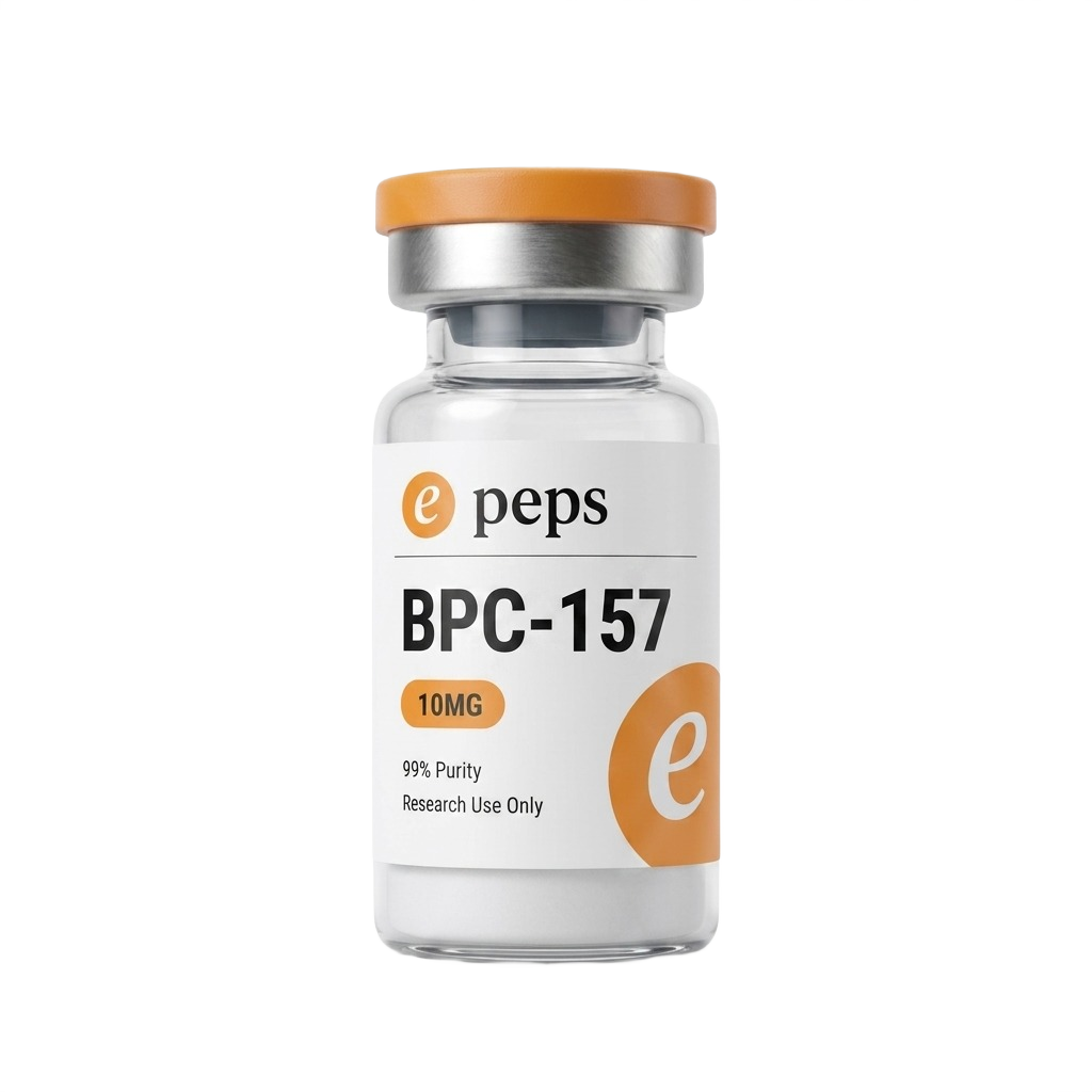 The page · cream
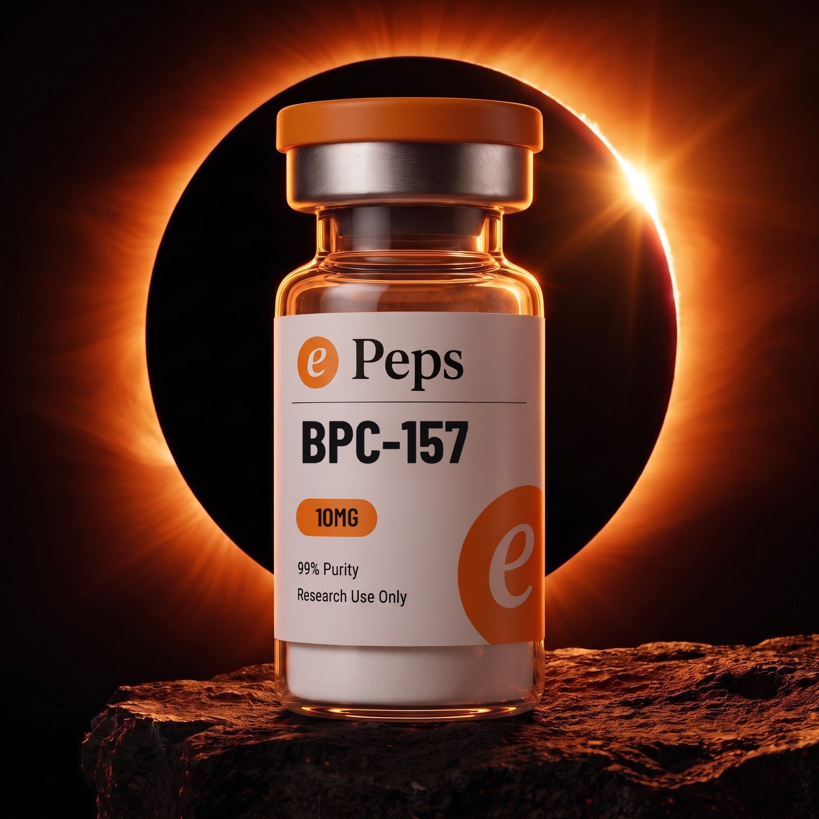 The picture · corona
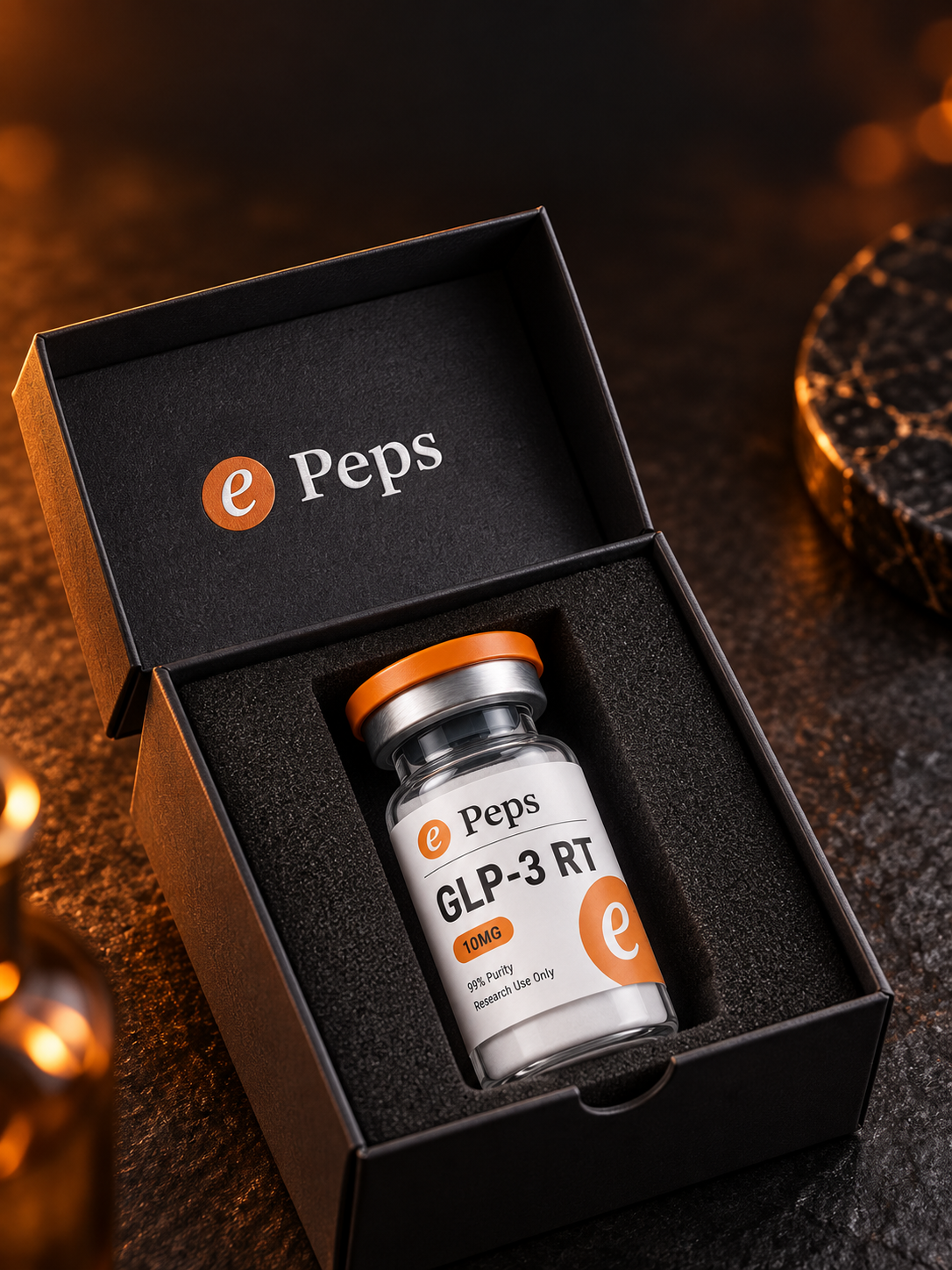 The object · the boxePeps Brand BookThe idea
Identity
Three things, in order. The wordmark first: the ember disc and Peps exactly as printed on the label, ink on cream, white on photography. Where there is room for the wordmark, the wordmark is used.
The disc second. The ember oval with the white italic e, taken off the label and used on its own: the favicon, the avatar, the app icon, the watermark printed large and cropped on the right of every label. It is the one piece of brand hardware.
The cropped disc third. Bled off an edge at a size where the e is still legible, it is a graphic device rather than a logo — the label does this and nothing else may.
The P is capital. The label, the box and every screen the site renders set Peps. One asset disagrees: e-peps-wordmark.png is older artwork setting peps lowercase, and it is still what the site hands search engines as its logo. It should be redrawn to match; until it is, do not use it anywhere a person can see it.
Clear space on all sides equals the height of the disc. Under 24 px the wordmark goes, and the disc stands alone.
Current · capital P · the label and every screen

Legacy · lowercase · do not use
First · white on photographySecond · the discSecond · white on the box lidThird · cropped on the labelePeps Brand BookIdentityColour
Cream is the ground. Ink is the type. Ember is the one pop. The warm page is where the brand lives: cream ground, ink type, tan rules, ember accents. Ember is the label’s own orange, #F69920, and on the page it is a pill, a link, a button and the mark — not a surface.
Glass is not a colour. It is ember through amber carrying whatever is behind it: warm on the bench, near-black on the plates. That carry is what makes a frame ePeps and not a stock photo.
The hierarchy folds down from cream. Cream with ink. Cream with a warm dark panel. Cream with the ember pop. Only then the black grounds, and those are pictures, never pages. A black screen is the exception and it has to earn it.
Every value below is either sampled from the supplied artwork or already shipping in the storefront. The right-hand column says which.
Ember
| HEX | #F69920 |
| RGB | 246 153 32 |
| SRC | Sampled from the mark |
The mark and the cap. The one orange that is the brand.
Amber
| HEX | #F4A237 |
| RGB | 244 162 55 |
| SRC | In use, storefront |
The lit accent. Pills, rules, the glow in the photography.
Burnt
| HEX | #A95C0C |
| RGB | 169 92 12 |
| SRC | In use, storefront |
Buttons and type on cream. The colour that carries weight.
Cocoa
| HEX | #2A170B |
| RGB | 42 23 11 |
| SRC | In use, storefront |
The warm dark. Cards and panels standing on cream.
Ink
| HEX | #171717 |
| RGB | 23 23 23 |
| SRC | In use, storefront |
The type. Near-black, the same black as the label.
Void
| HEX | #000000 |
| RGB | 0 0 0 |
| SRC | The plates and the box |
The photographic ground. Never a page.
Cream
| HEX | #FFF1E3 |
| RGB | 255 241 227 |
| SRC | In use, storefront |
The page. Where the brand lives when it is not a photograph.
Paper
| HEX | #FFFBF5 |
| RGB | 255 251 245 |
| SRC | In use, storefront |
The sheet. Sections and cards sitting on cream.
Tan
| HEX | #FFE4C2 |
| RGB | 255 228 194 |
| SRC | In use, storefront |
Rules, captions, highlights. Never a fill.
Glass
| HEX | — |
| RGB | — |
| SRC | Not a colour |
Ember through amber, carrying whatever is behind it.
Cream · the ground
Ink · the type
Ember · the pop
Void · the plates only
ePeps Brand BookColourType
Open Sauce One carries the brand. It is the typeface the brand kit supplied and it is self-hosted here in seven weights. It sets the display, the headings, the body and the interface. Set display tight — around −0.045em — and heavy, at 800.
The serif is the wordmark and nothing else. The Peps in the lockup is drawn artwork. It is never used to set a headline, a paragraph or a product name; anywhere it appears that is not the wordmark, it is a mistake.
The label is condensed. The compound name on the vial is set in a condensed bold grotesque, because the label is narrow and nothing else fits at that size. The printed labels are supplied artwork, so the drawn face is not confirmed; Barlow Condensed is already loaded by the site and is the match to use when that role has to be set in live type. It belongs on packaging and in tables of compounds, never on a page.
Mono is the hood. Batch numbers, purity, lot, anything that is data. It is the only place the brand is allowed to look like an instrument.
Open Sauce One · 800 · display
Precision purity
300400500600700800900
The wordmark serif · artwork only
Peps
Never sets a headline, a paragraph or a product nameCondensed bold · 700 · the label role
BPC-157
Set here in Barlow Condensed · packaging and compound tables onlyEPEPS / BATCH
compoundBPC-157
mass10.00 mg
purity99%
RESEARCH USE ONLY
ePeps Brand BookTypeWords
There is one line. “Precision purity in every vial.” is the only tagline. Everything else on a screen is the name of a thing, a number, or a plain sentence that helps someone buy.
The label is the safest copy there is. Compound name, dose, 99% purity, research use only. Those four facts are printed on the vial, so they can be repeated anywhere without inventing a claim.
The category has one hard line and it is not stylistic. Nothing ePeps publishes describes a result in a person. No benefit, no dose protocol, no before and after, no second-person instruction. A sentence that would make sense addressed to a patient is the wrong sentence. This is the rule most likely to be broken by someone writing an ad in a hurry, and it is the one with consequences.
This book is full of instructions. Shot orders, grounds, framing rules. None of them is copy. If a phrase in here tells you how to do something, it never appears in front of a customer.
Precision purity in every vial.
Say this · the only taglineBPC-157 · 10 MG
99% PURITY
RESEARCH USE ONLY
Say this · facts off the label99% PURITY
RESEARCH USE ONLY
Heals your gut in 14 days
Never · a result in a personRun 250 mcg twice daily
Never · a dose protocolCorona first, ring second
Never · it is a shot orderSold strictly for laboratory research use only — not for human or veterinary use. 21+.
Say this · the standing disclaimerePeps Brand BookWordsThe sets
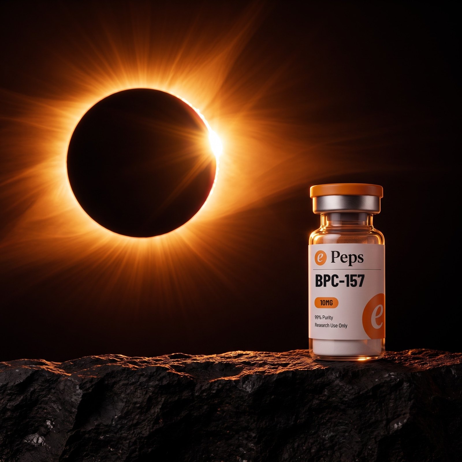
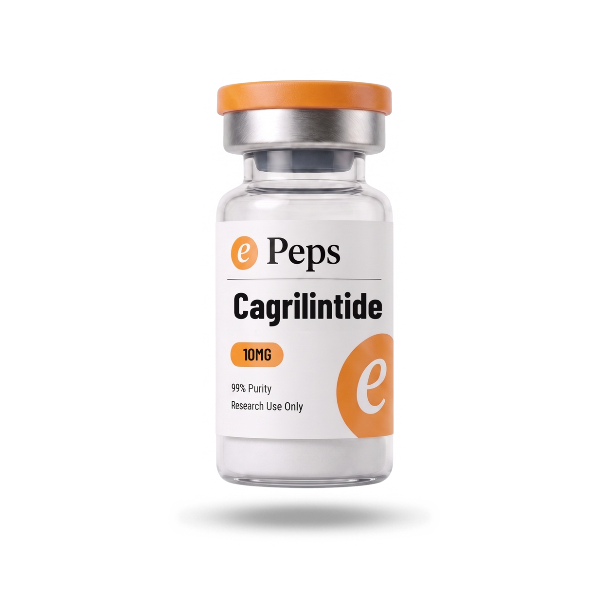
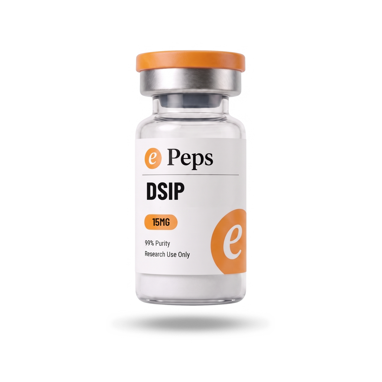
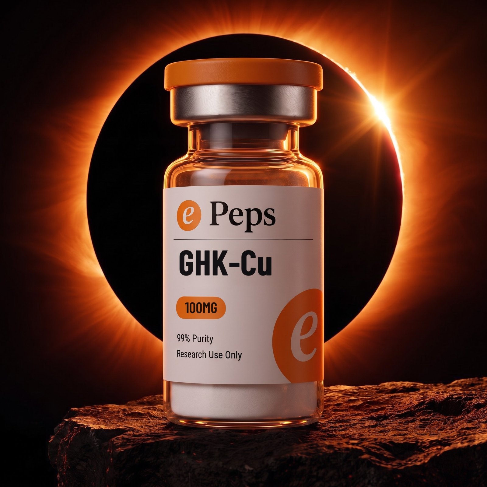
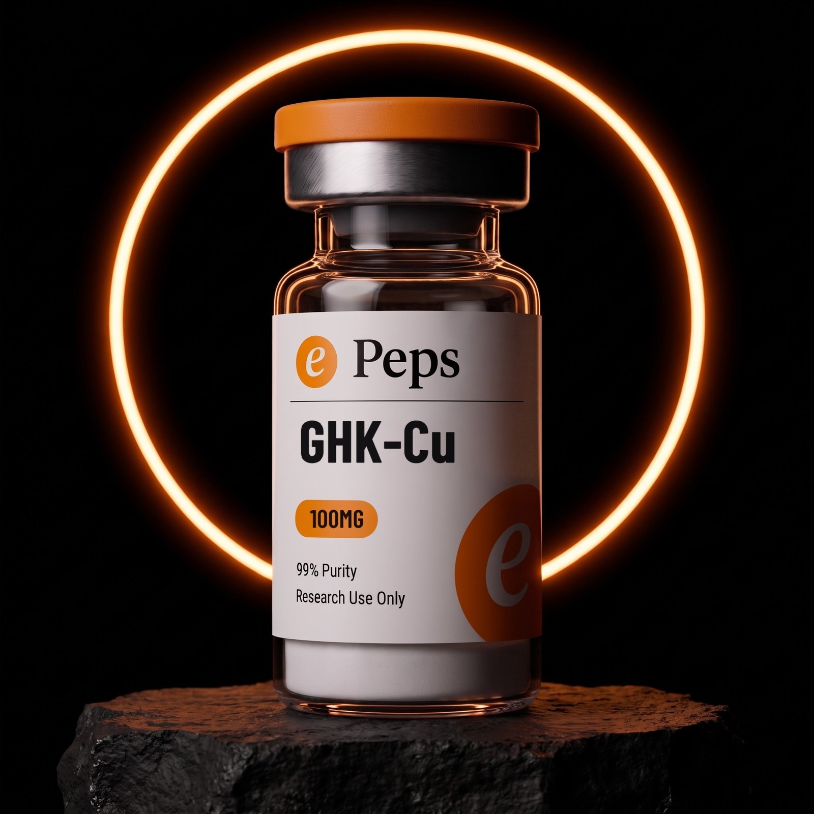
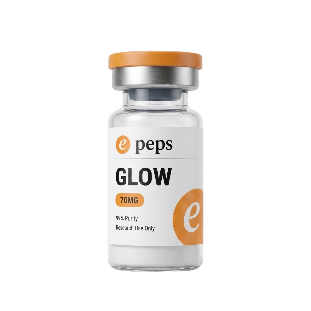
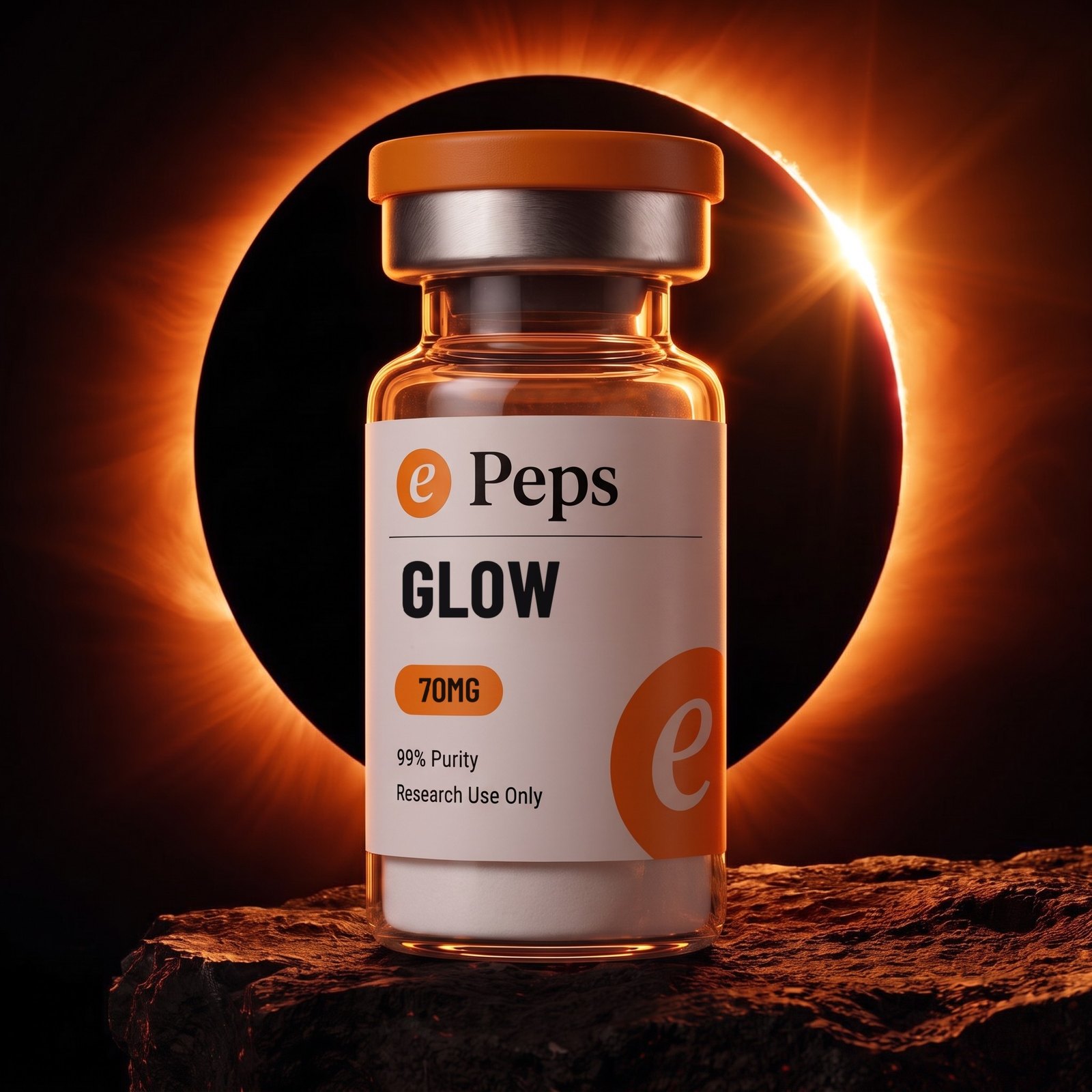
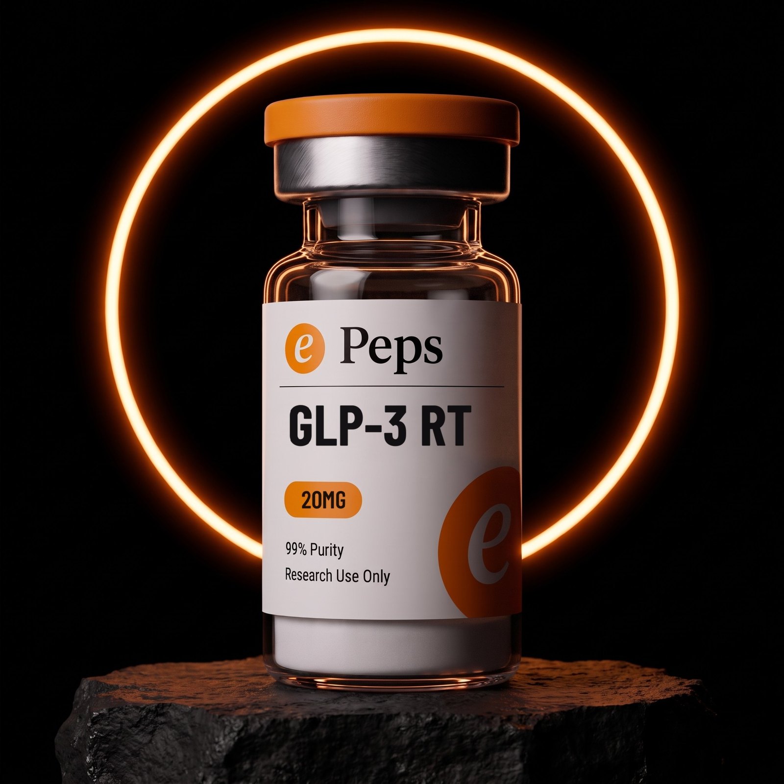
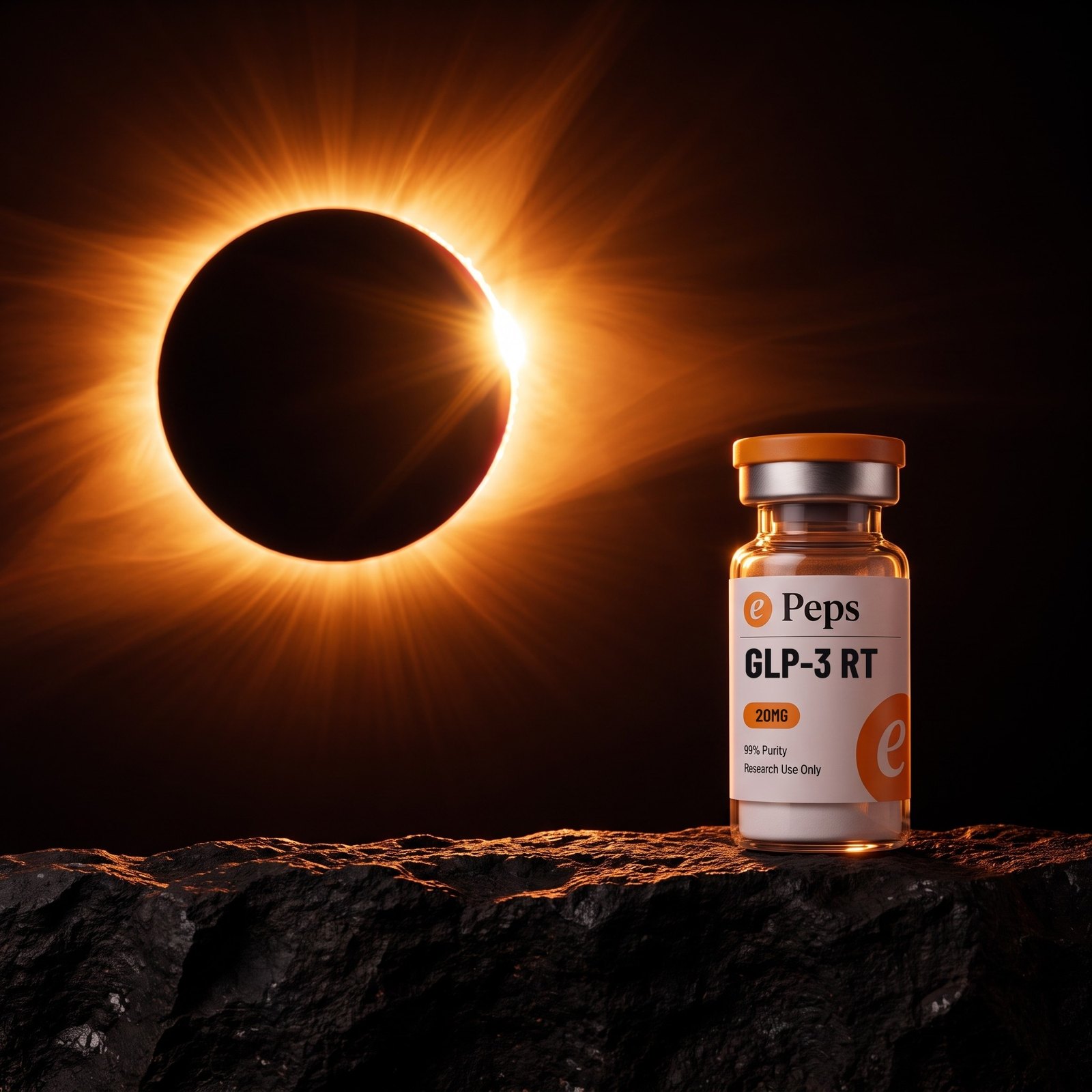
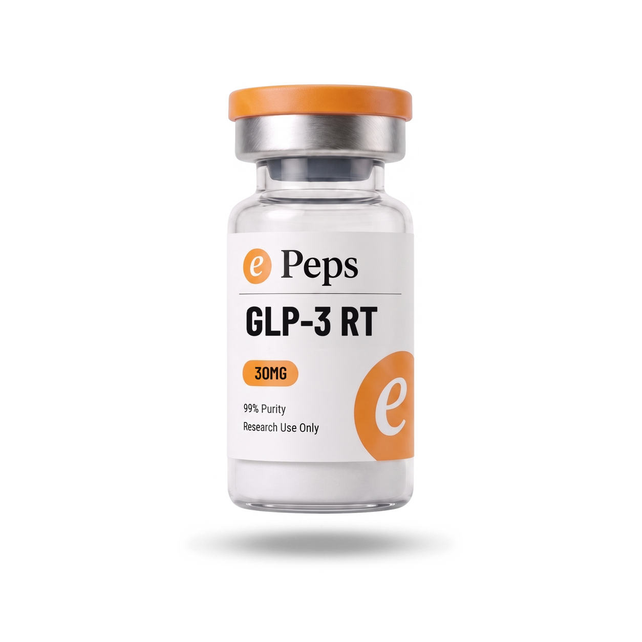
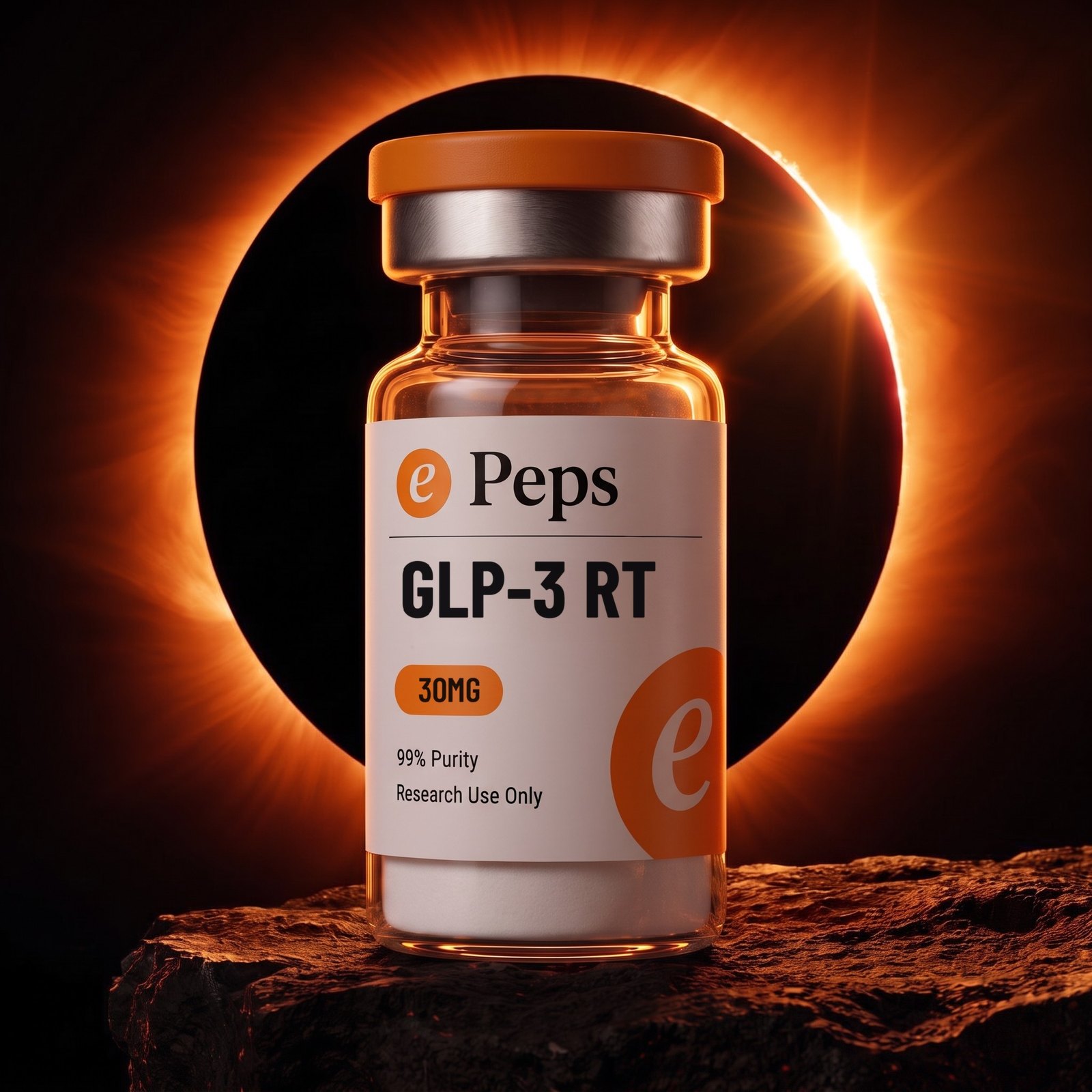
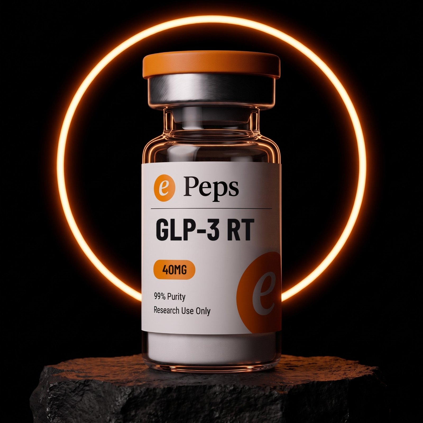
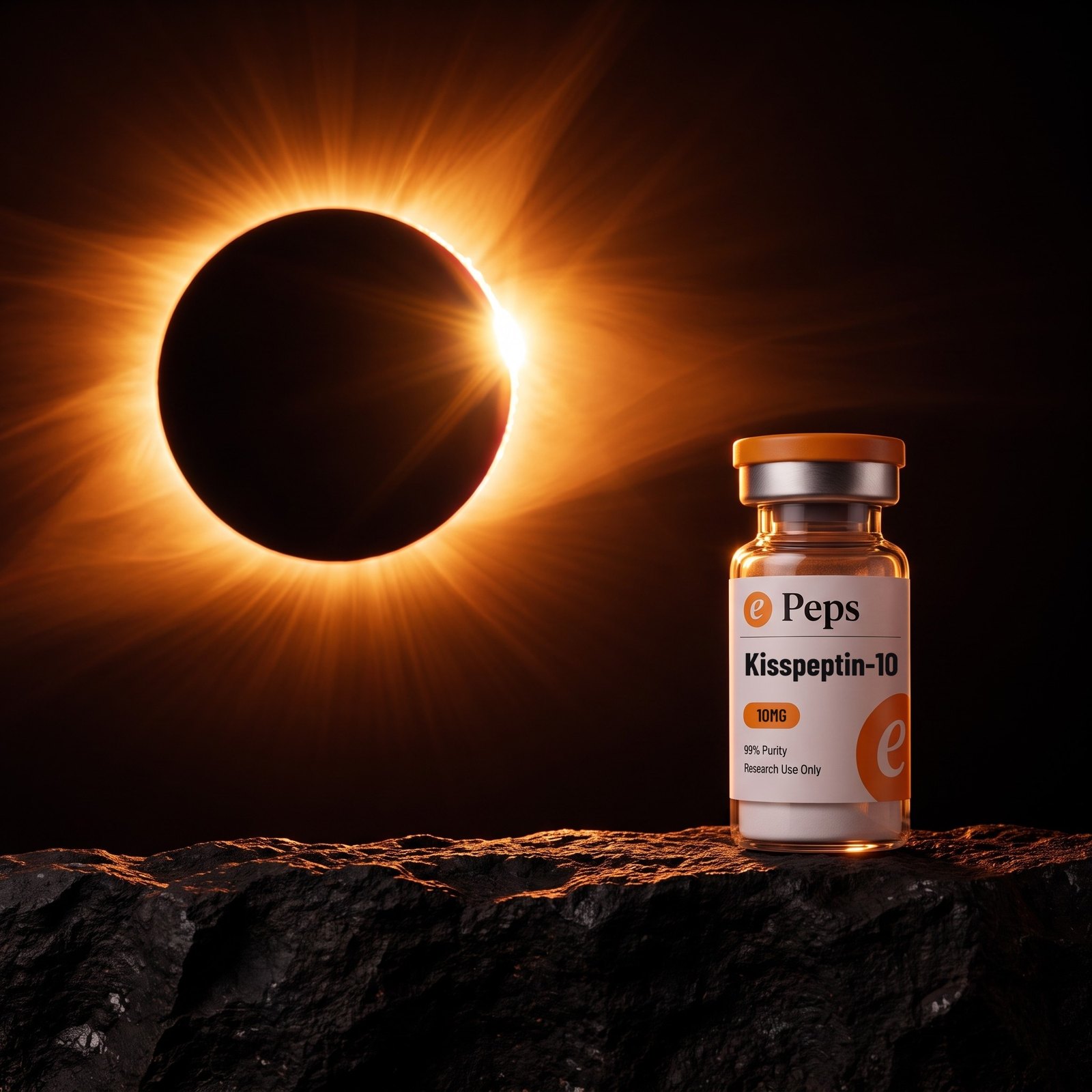
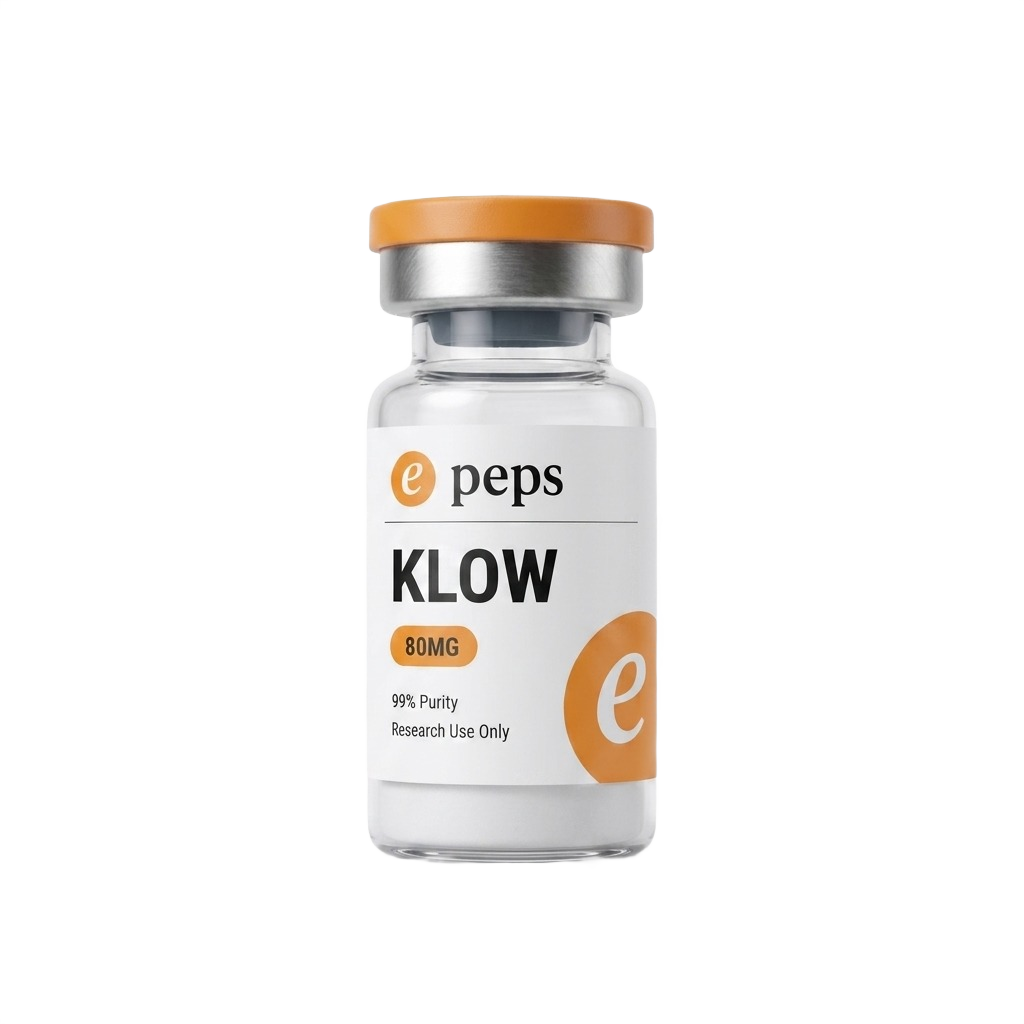
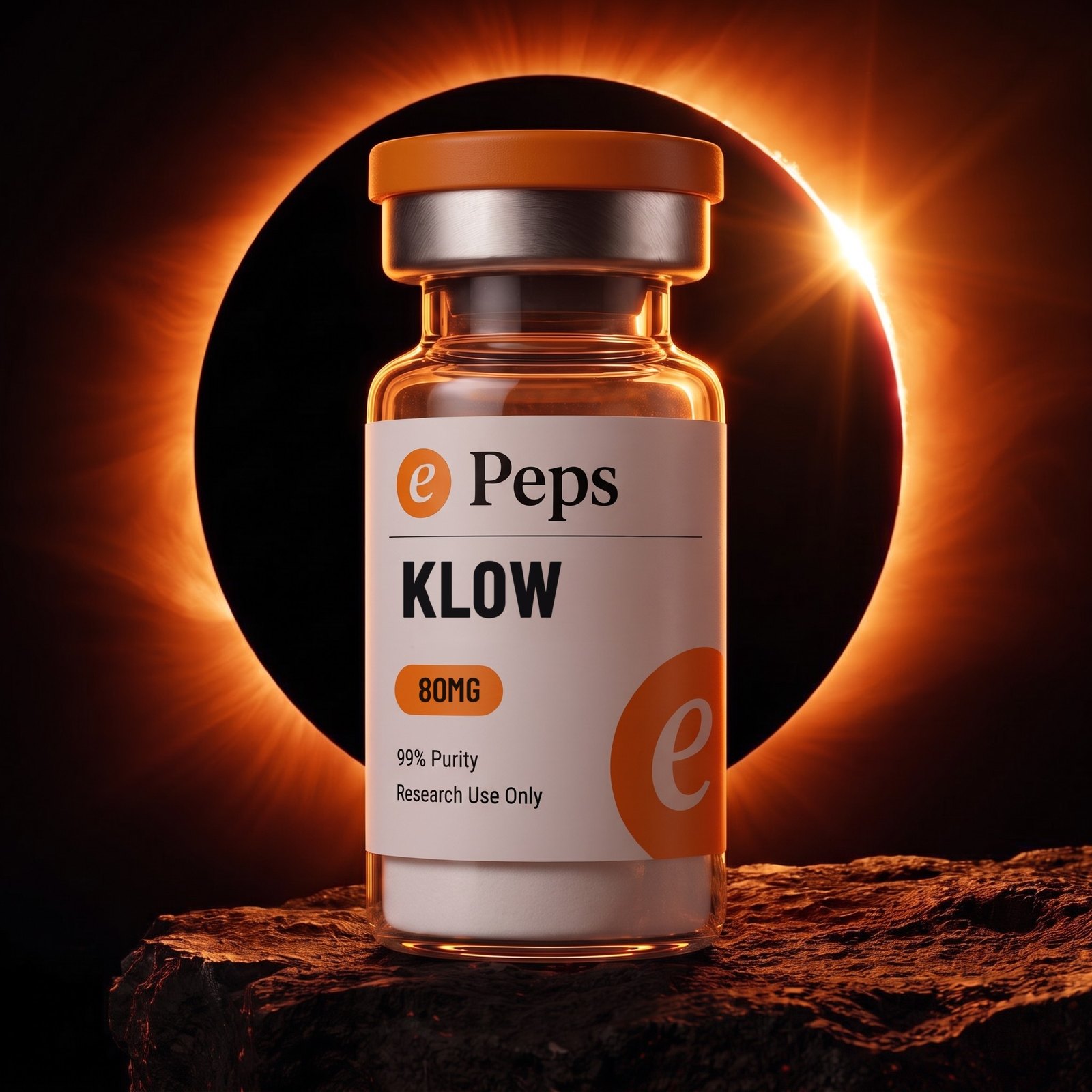
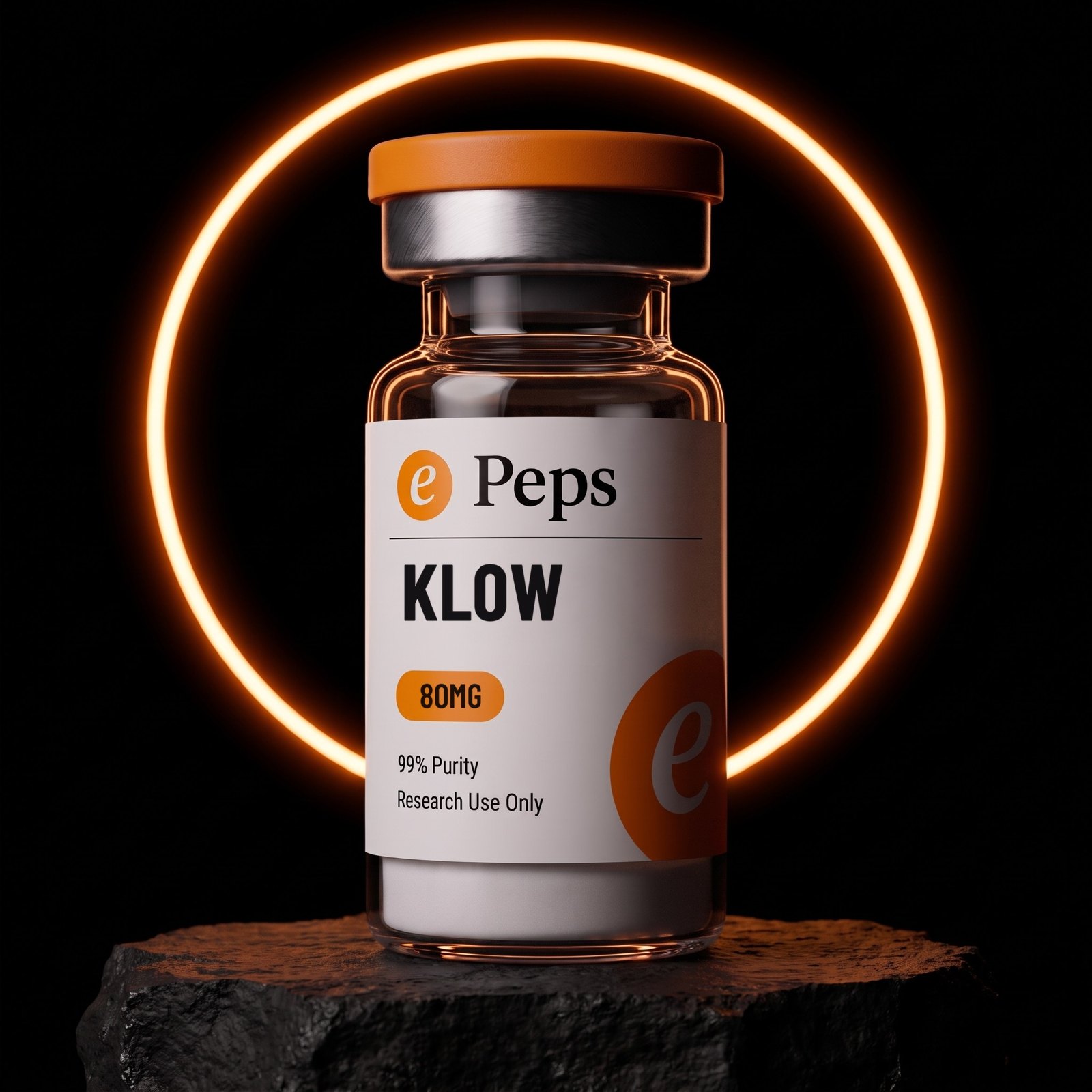
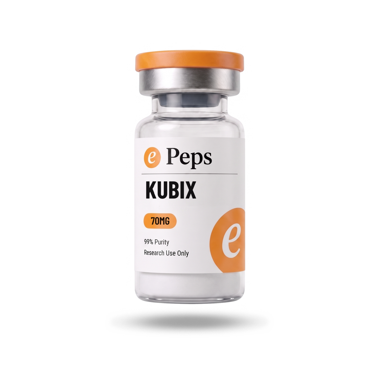
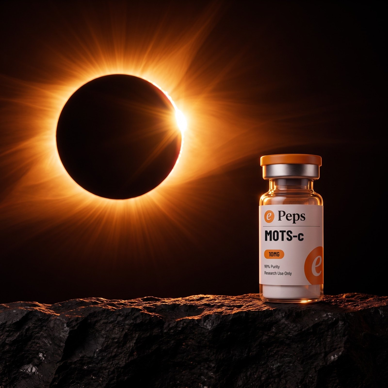
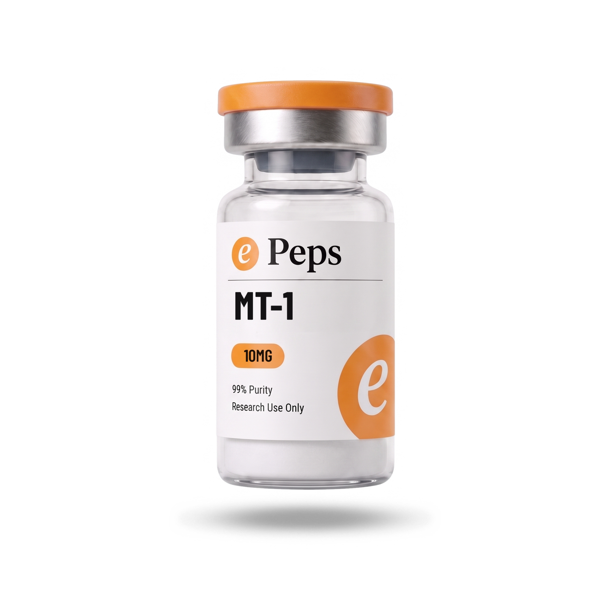
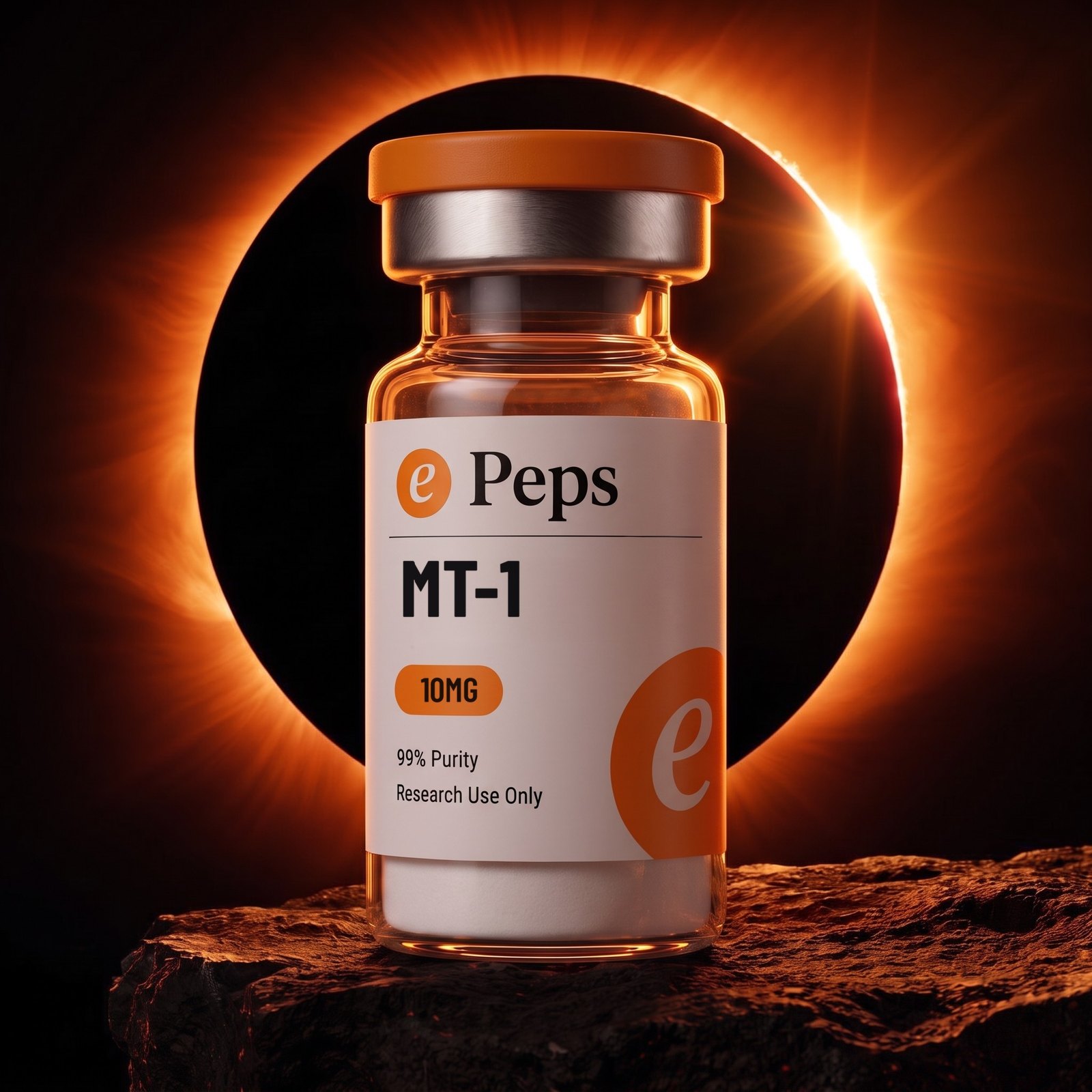
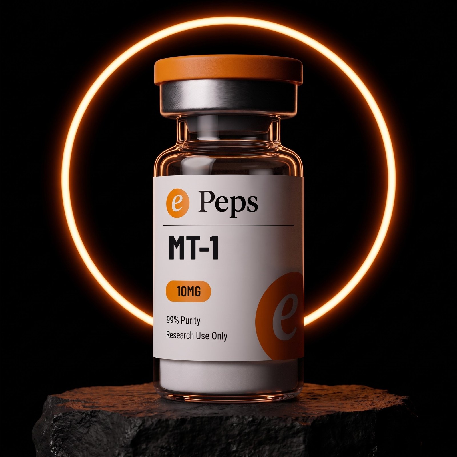
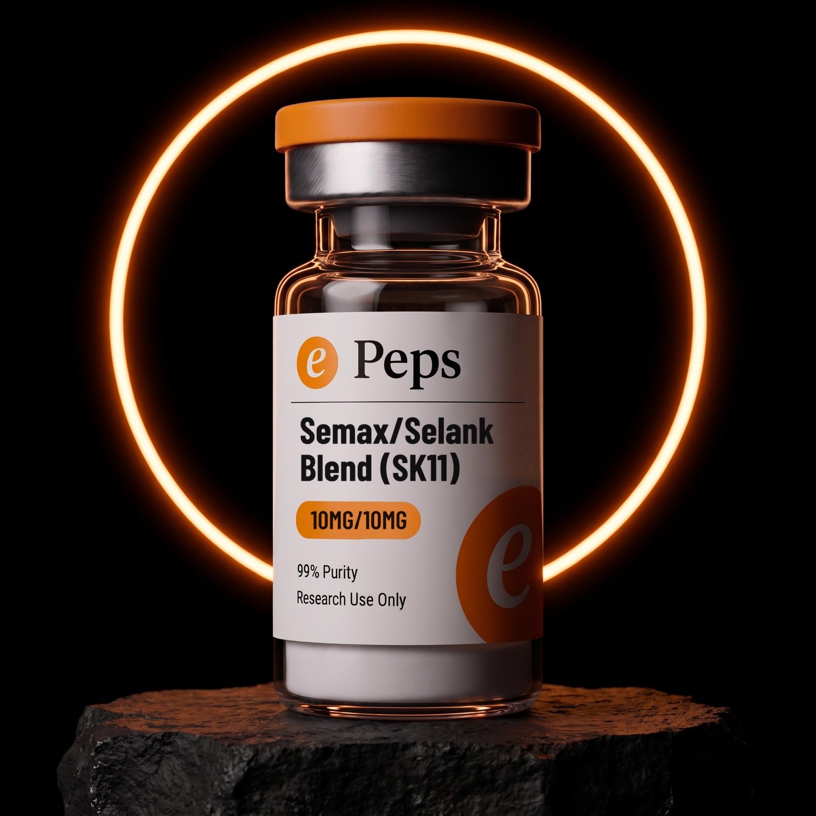
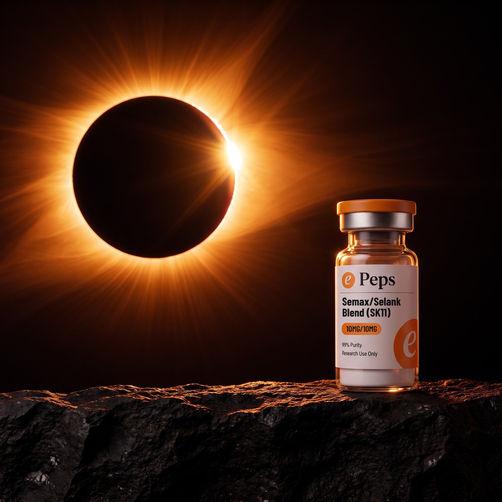
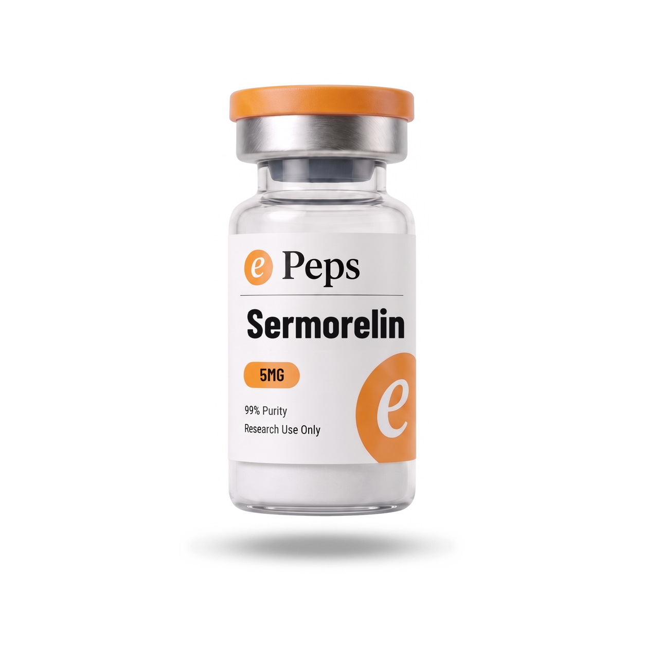
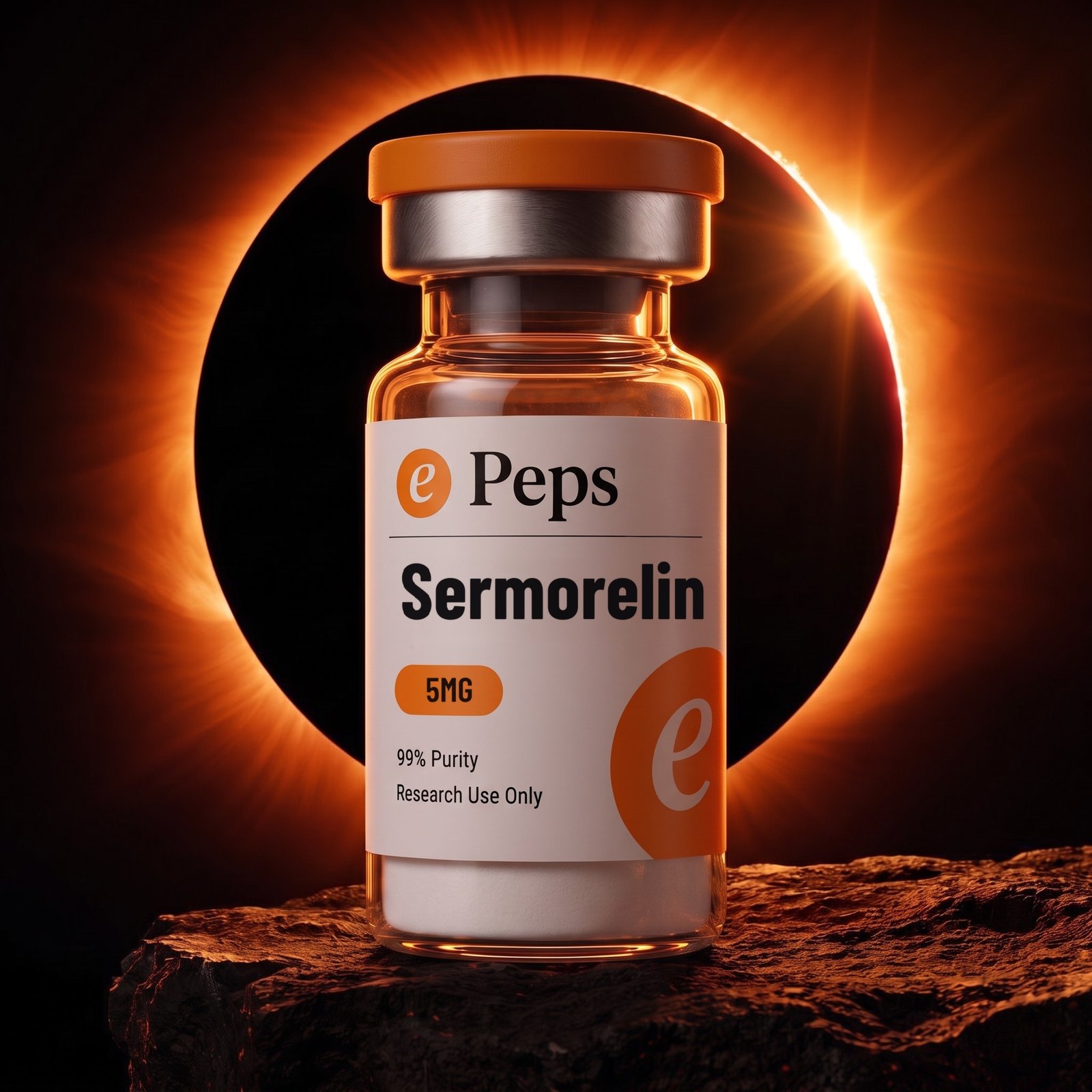
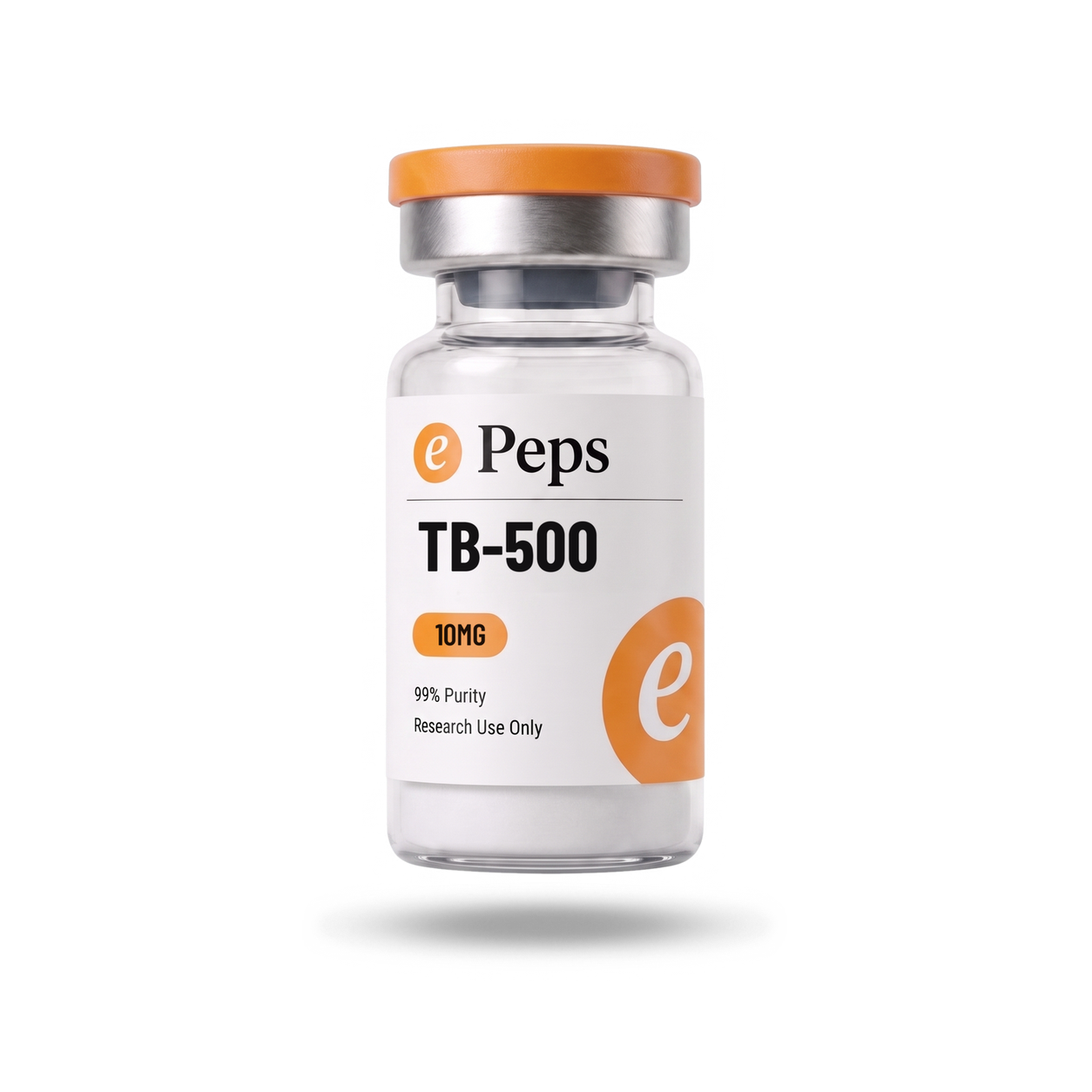
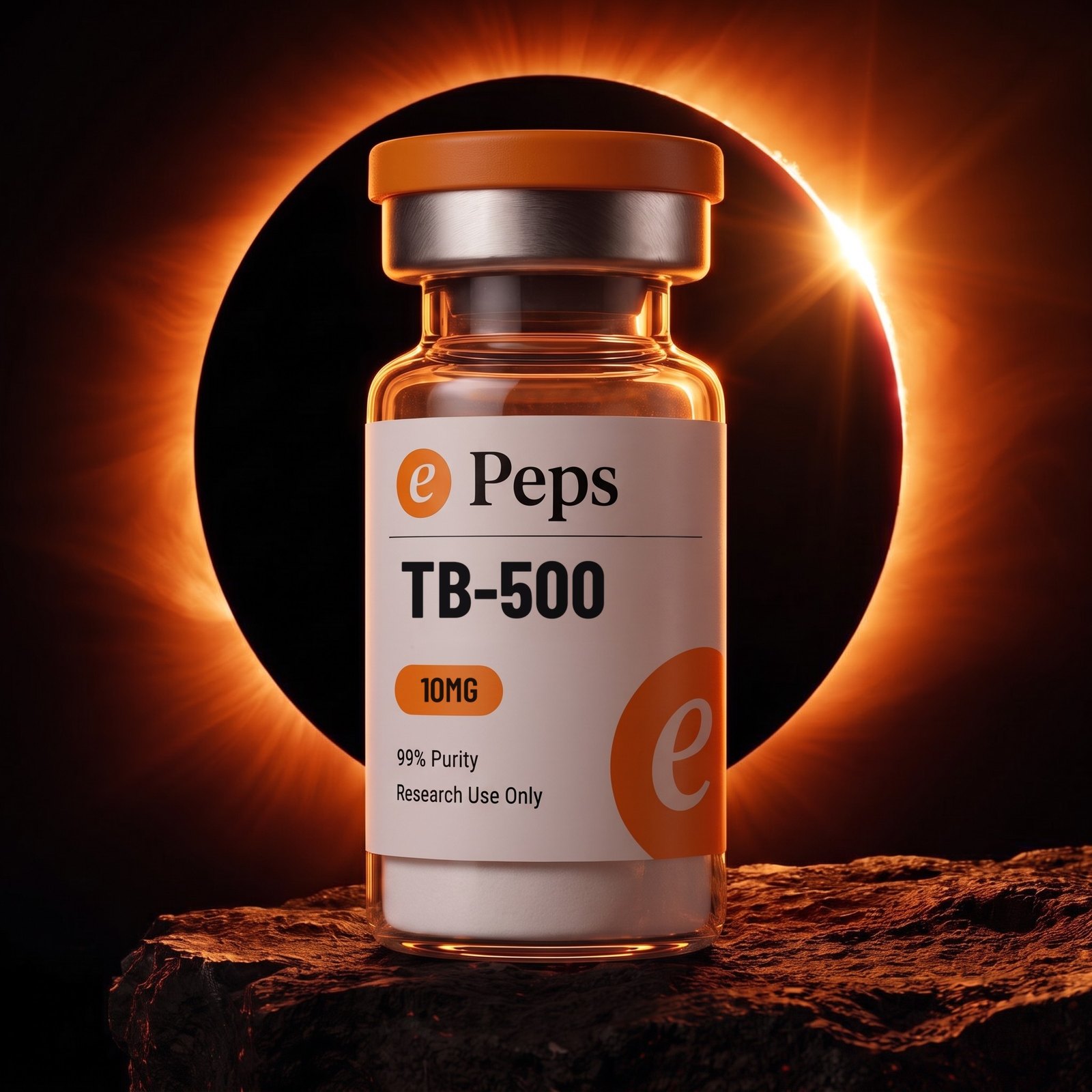
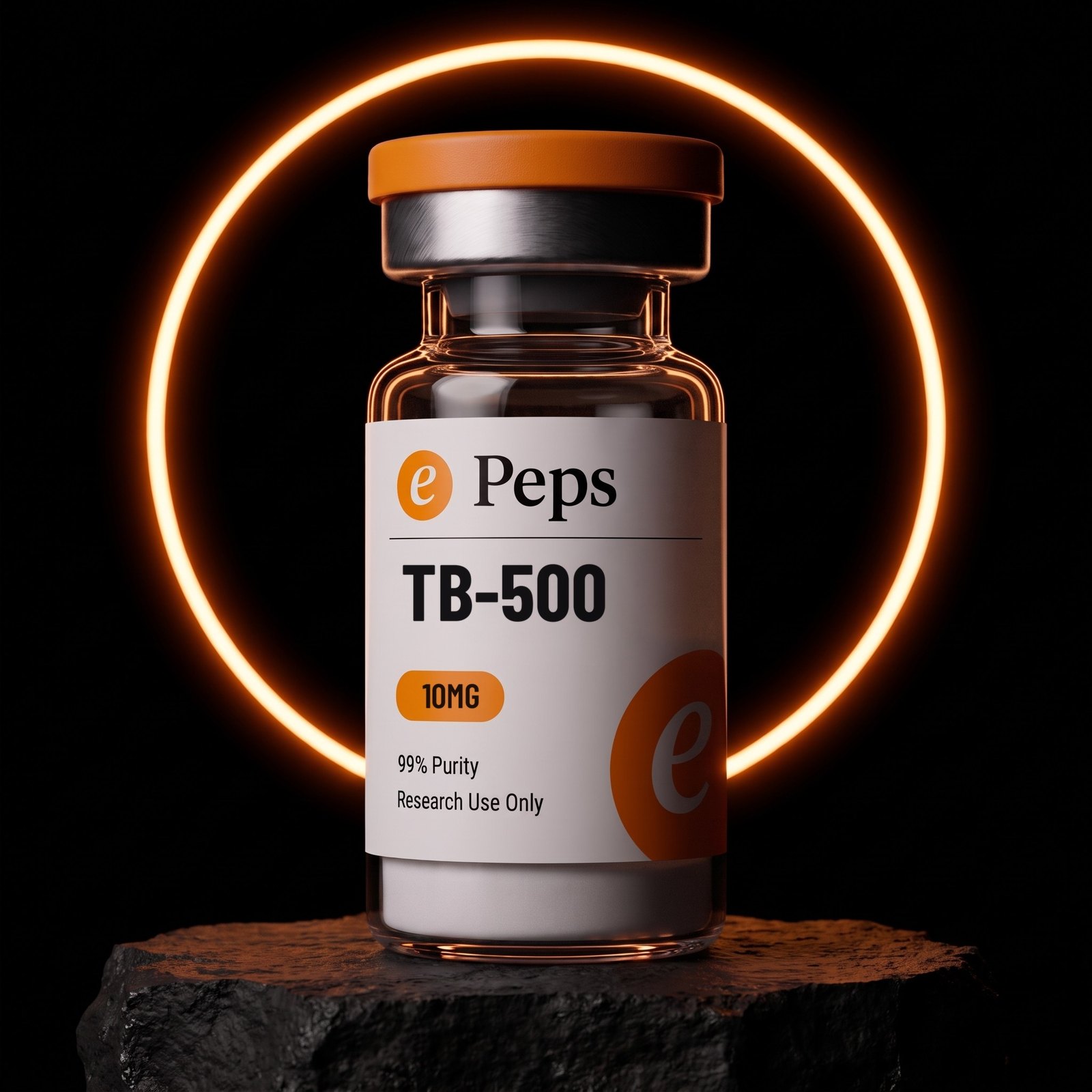
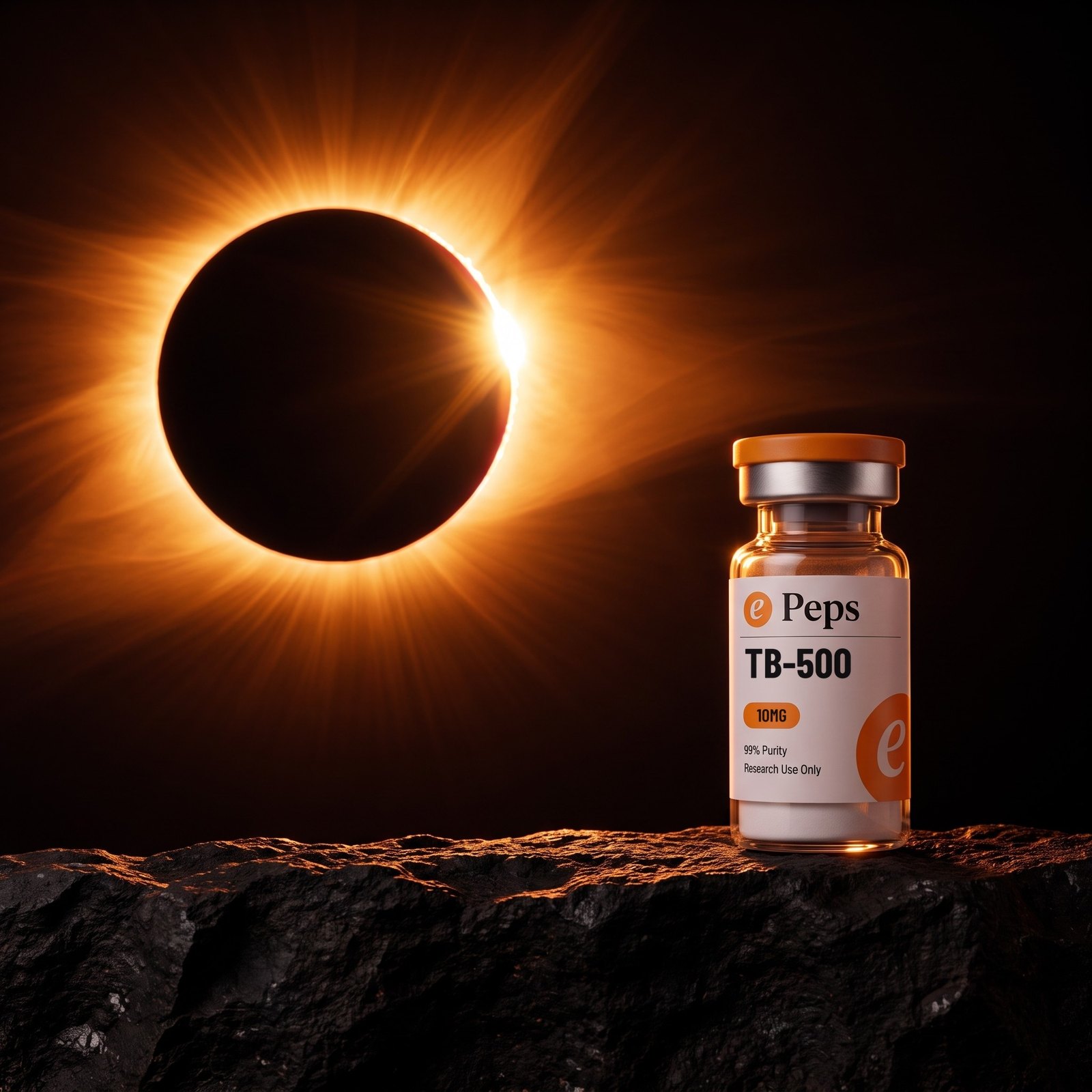
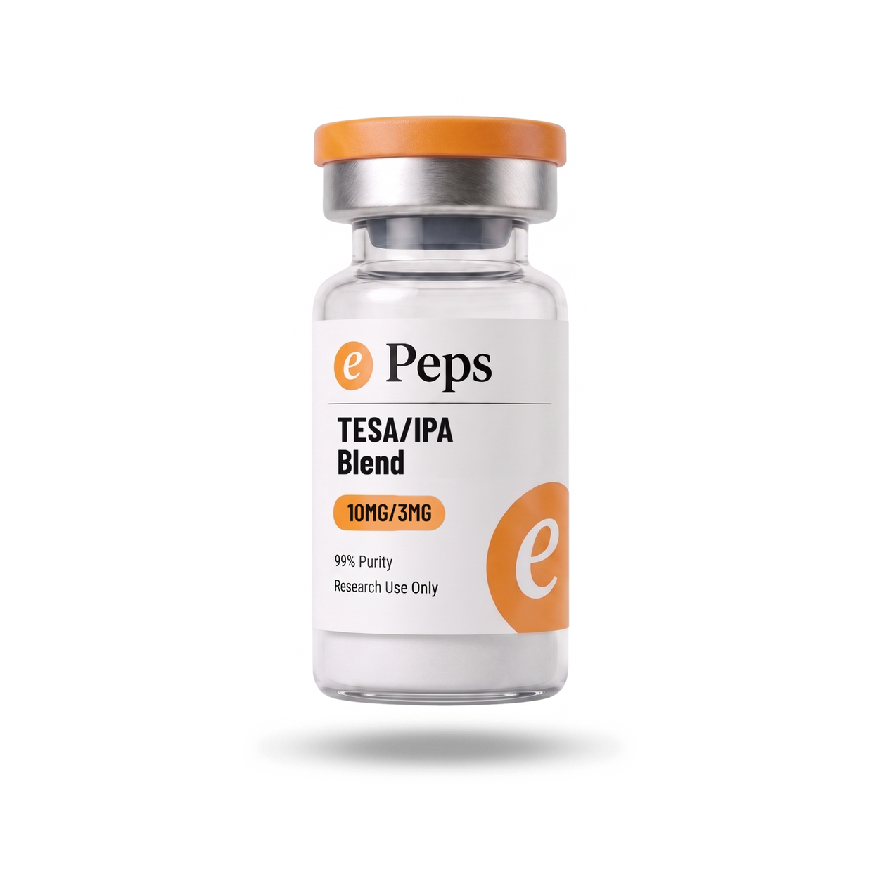
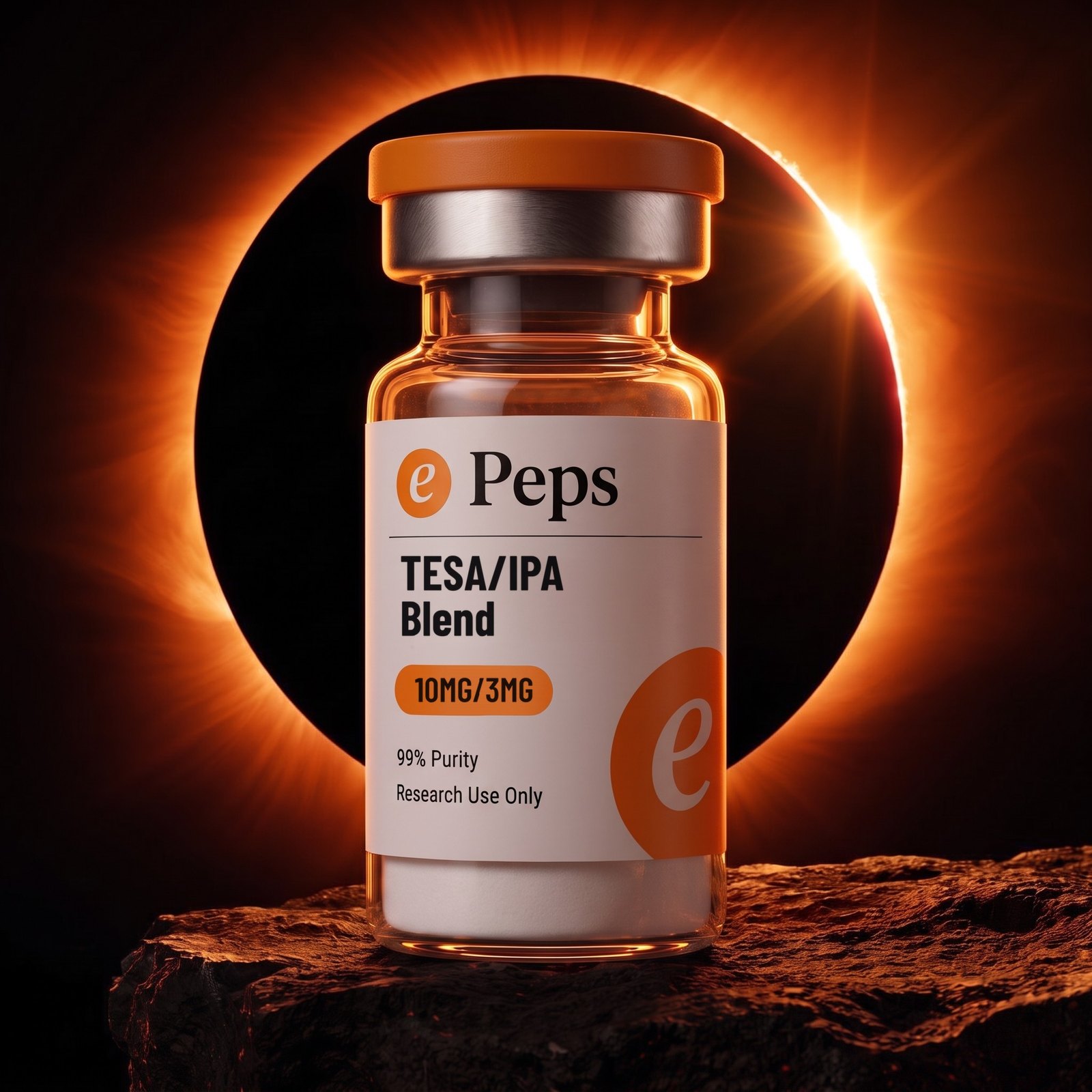
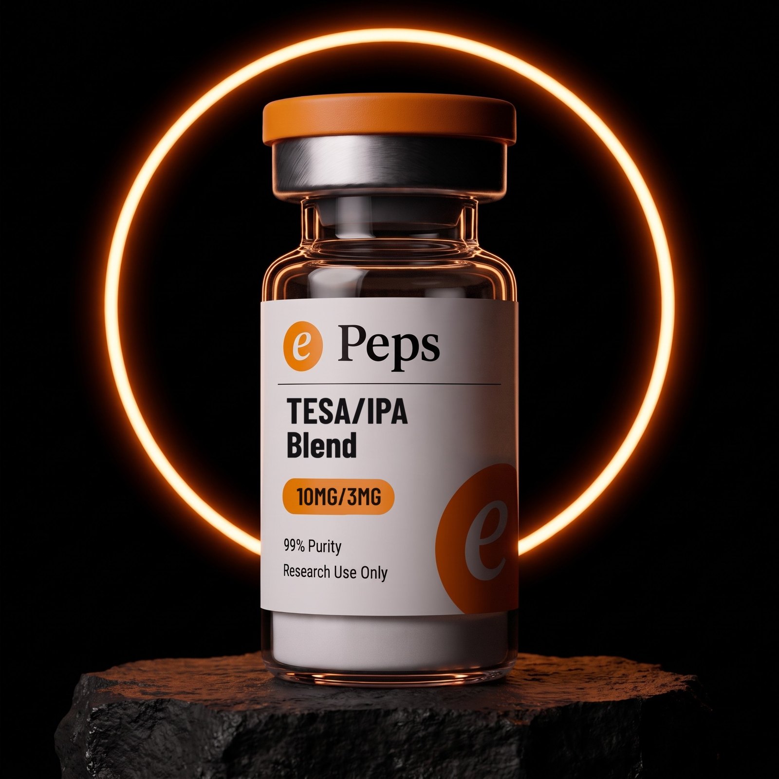
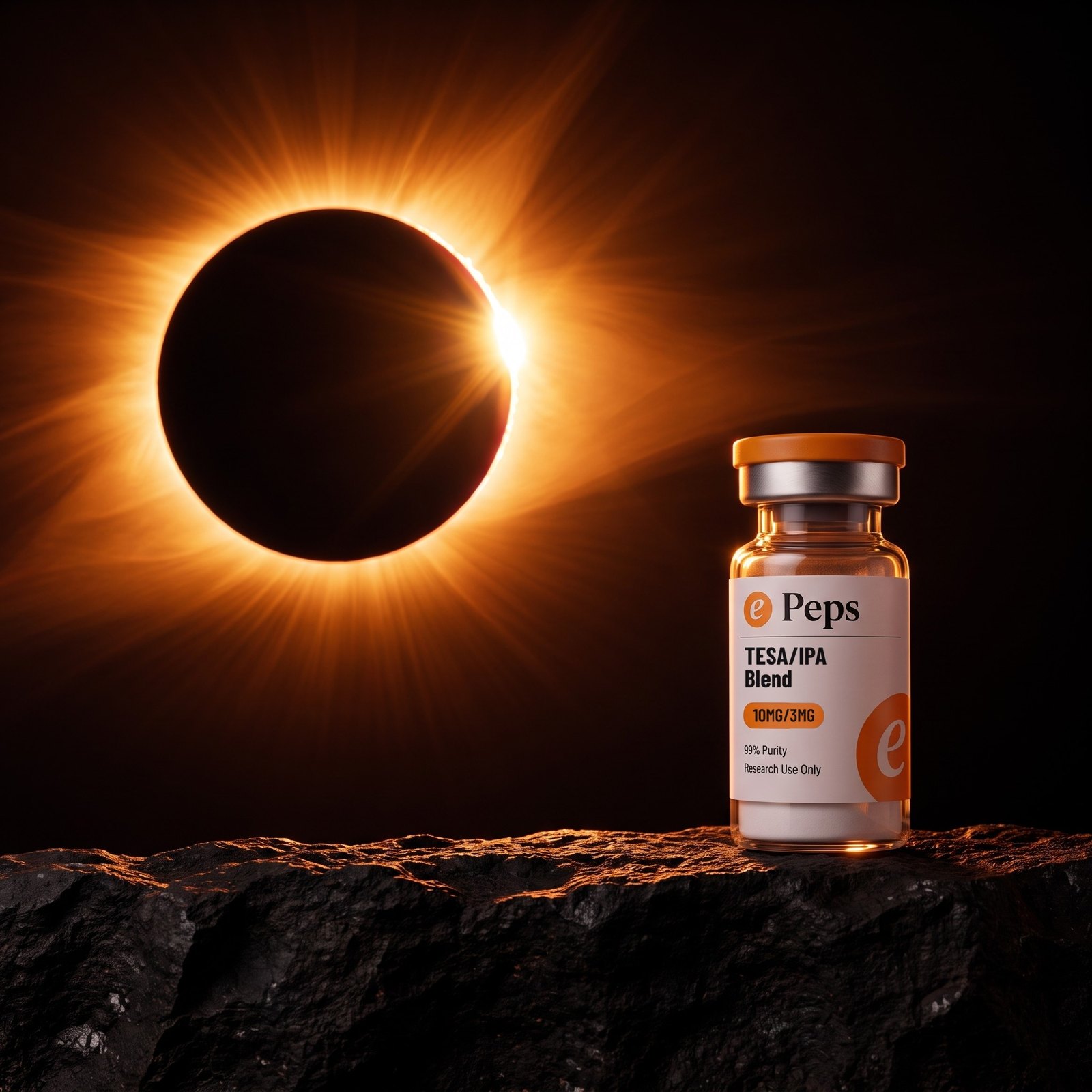
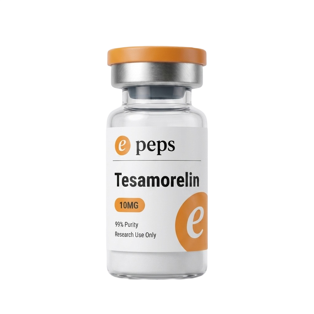
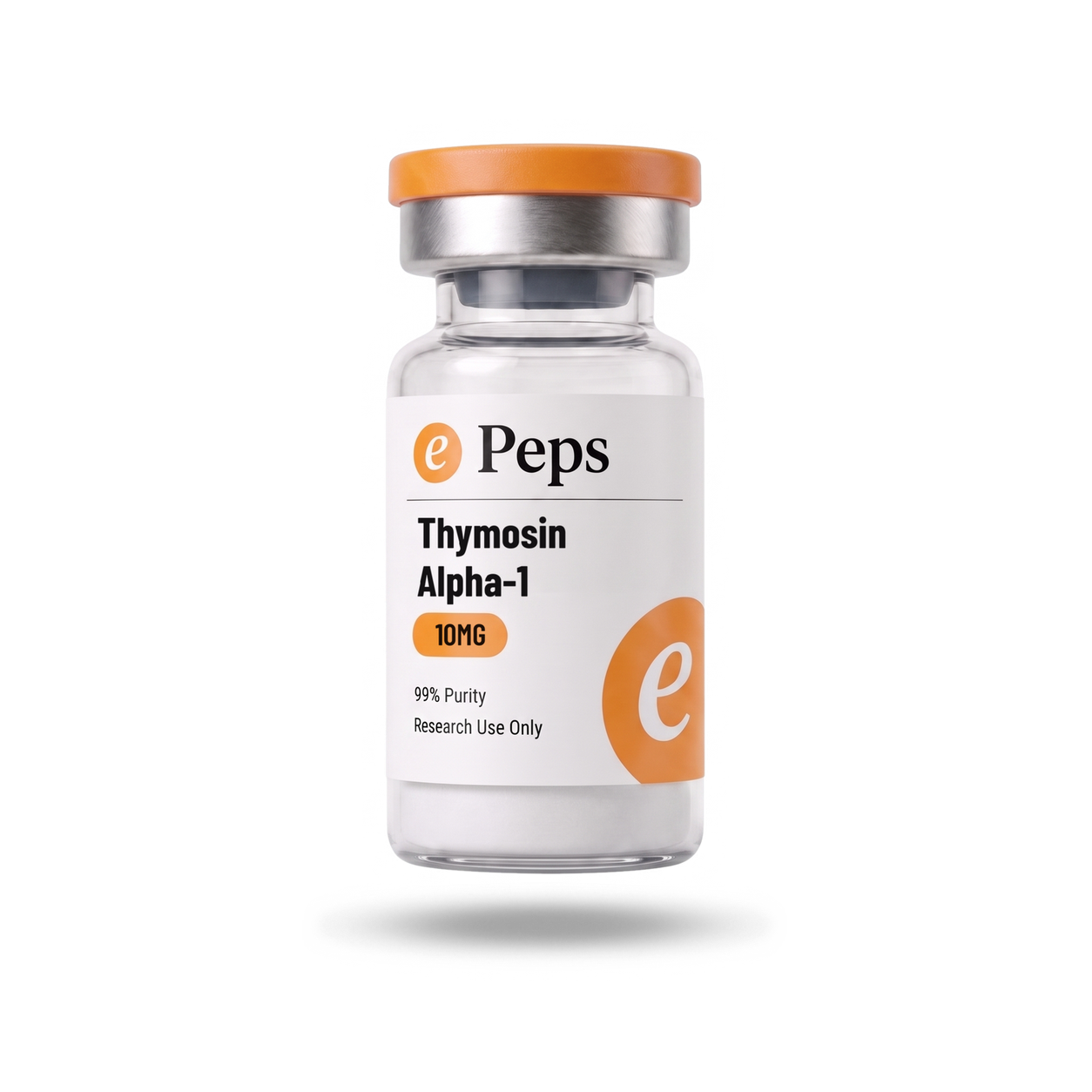
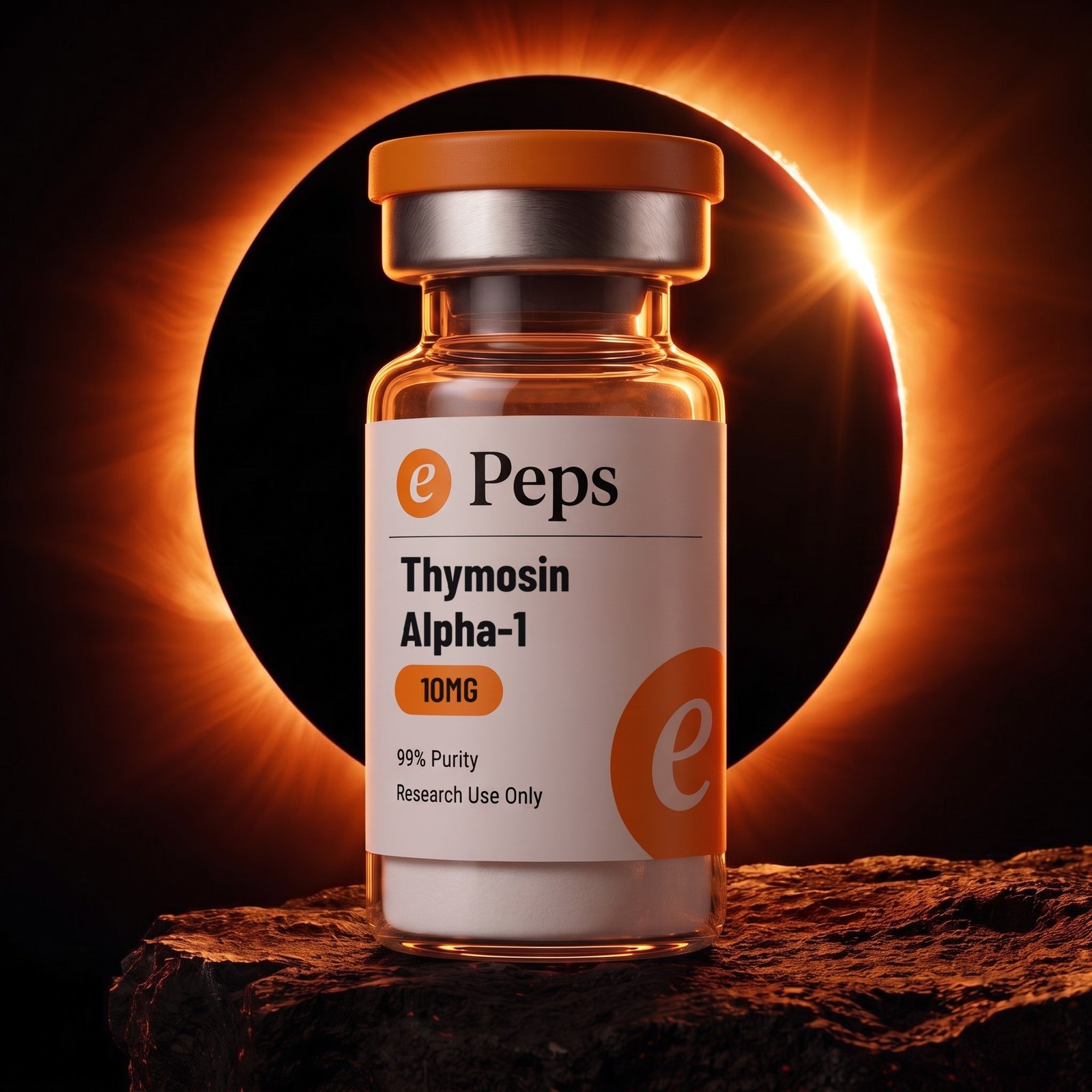
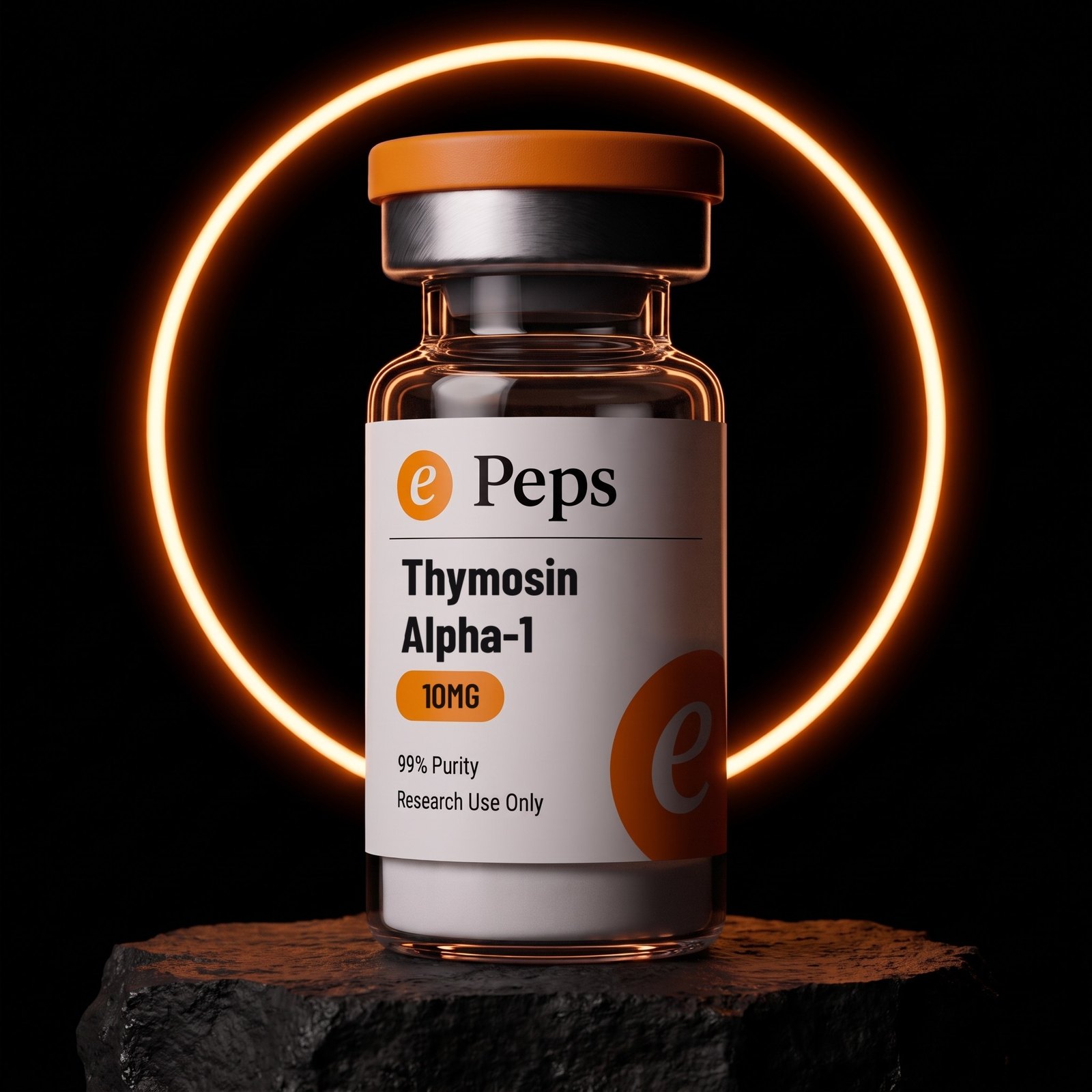
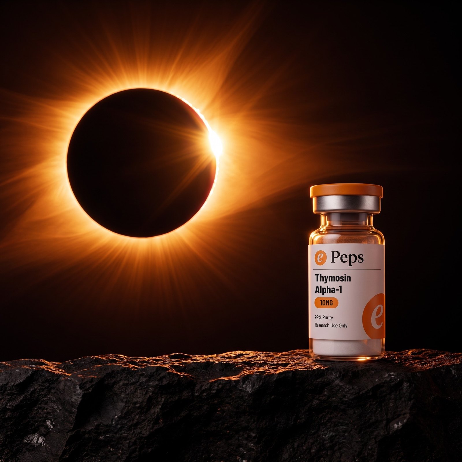
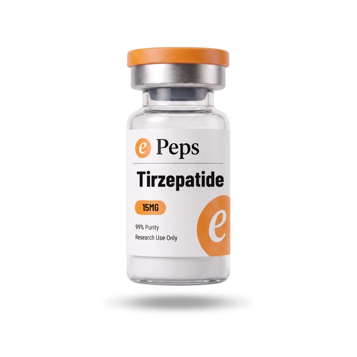
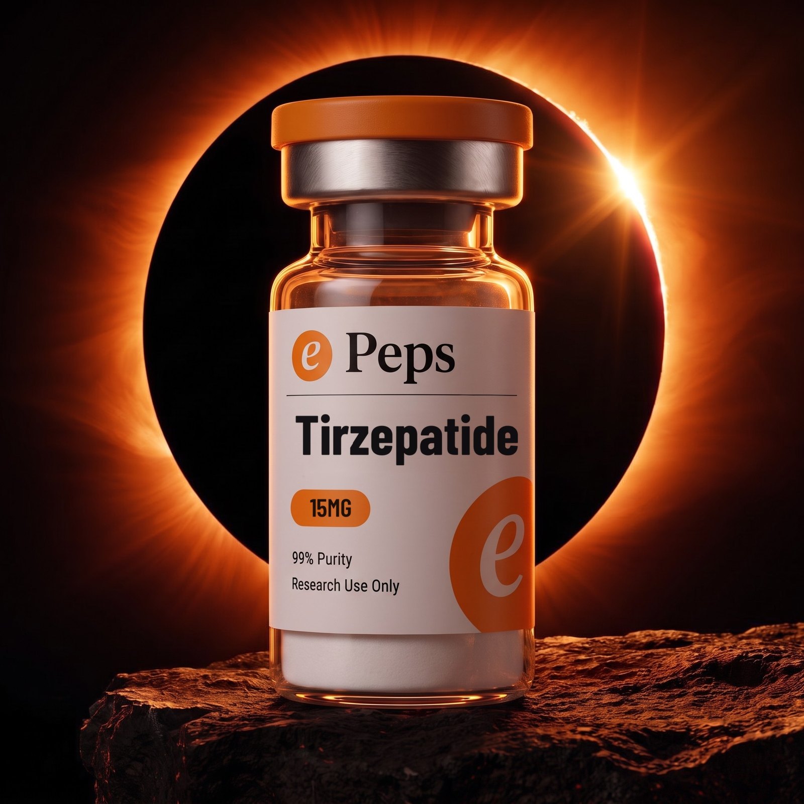
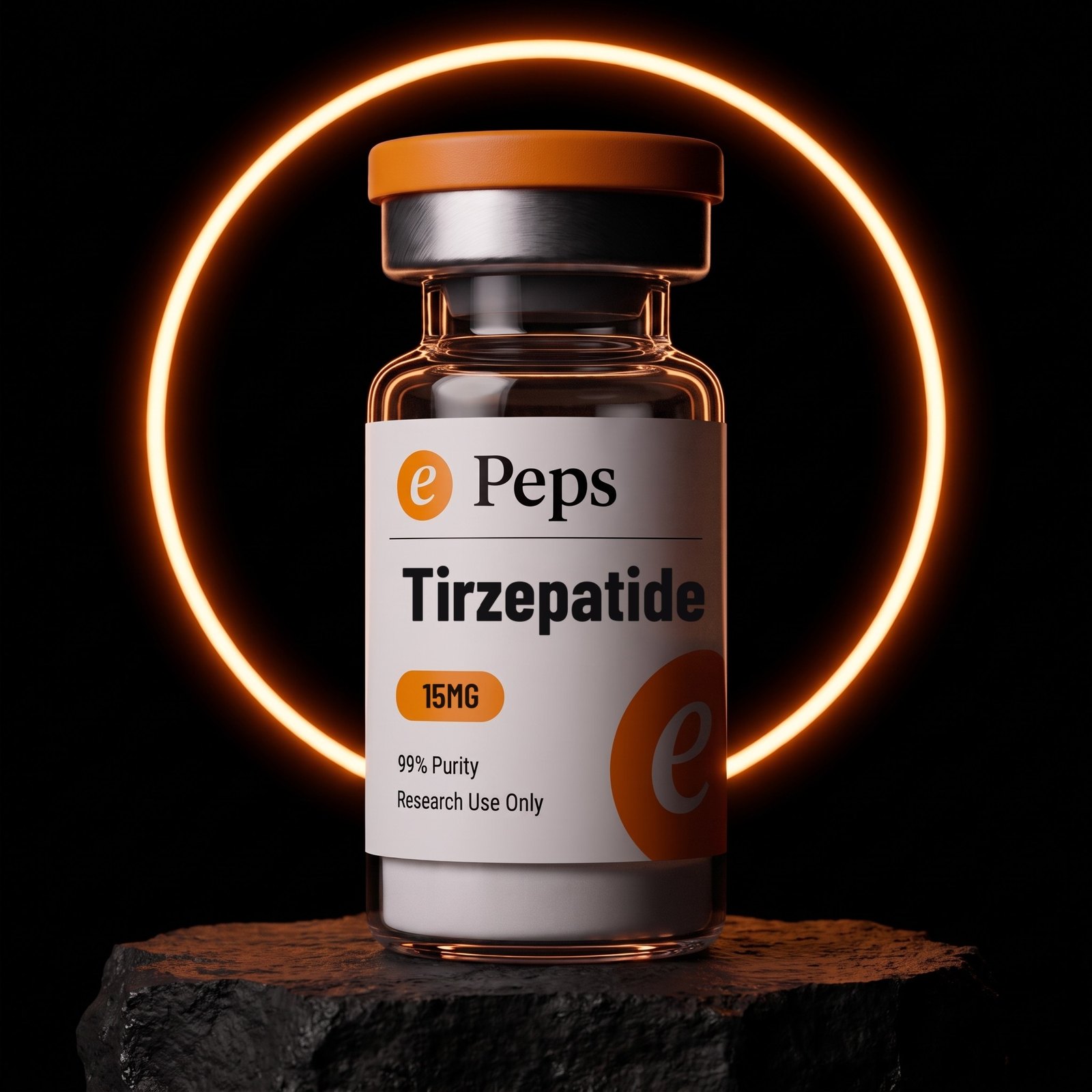
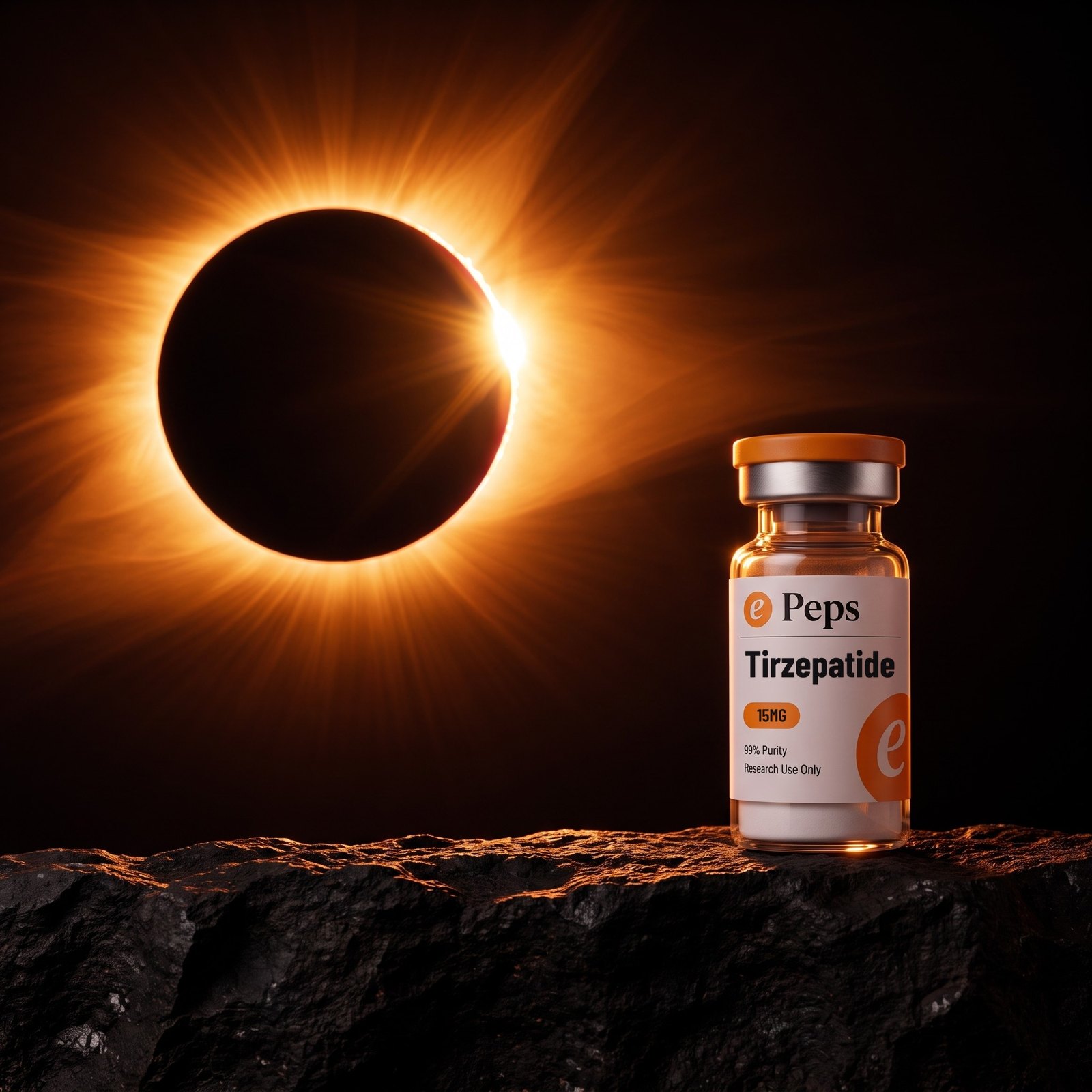
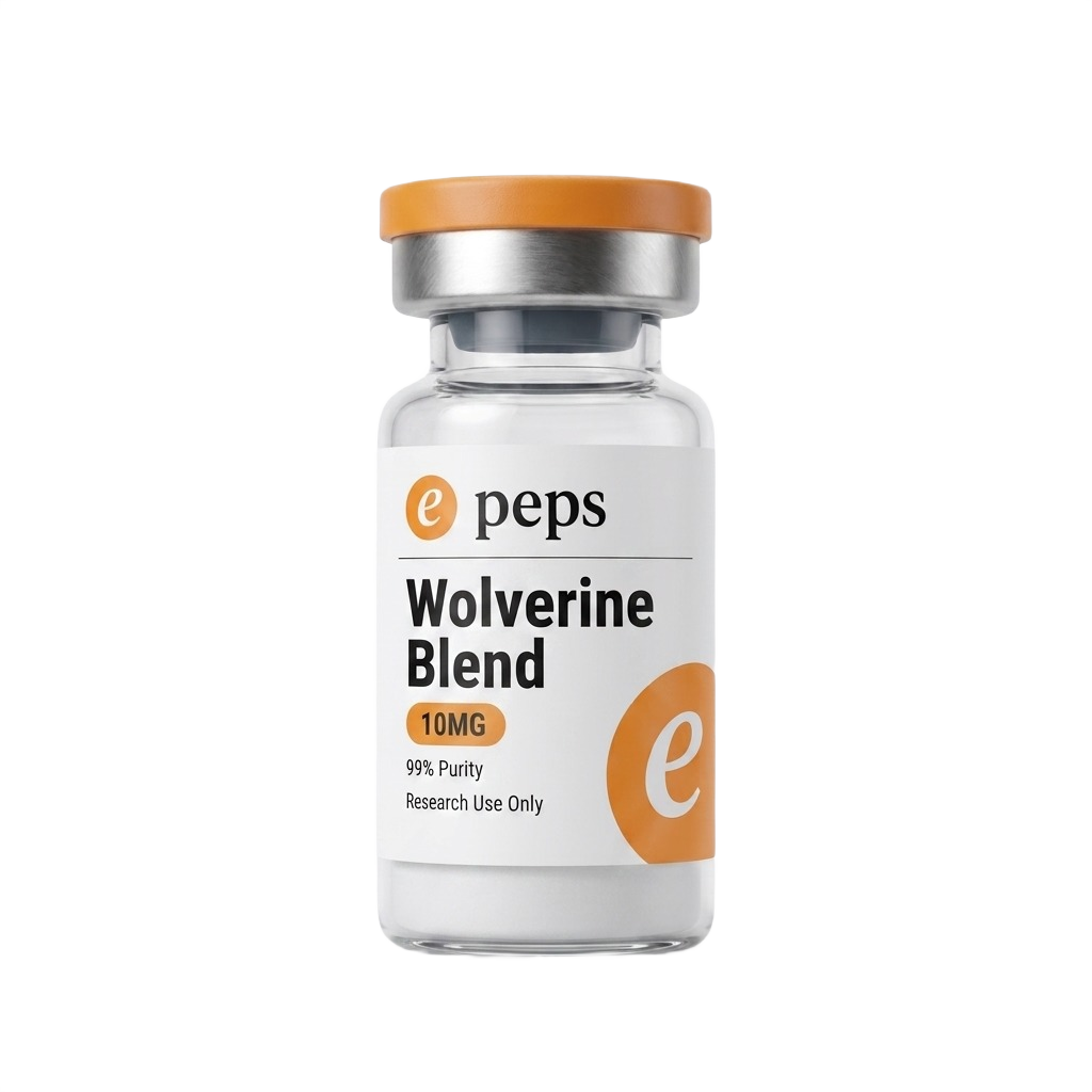
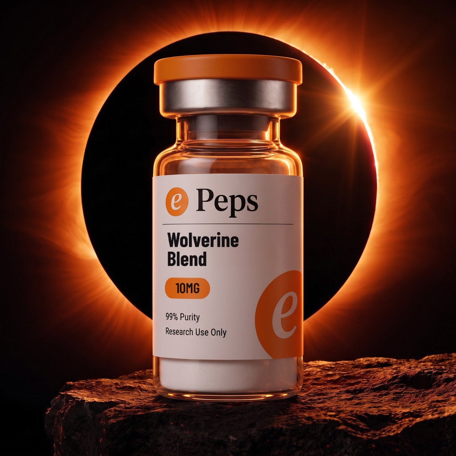
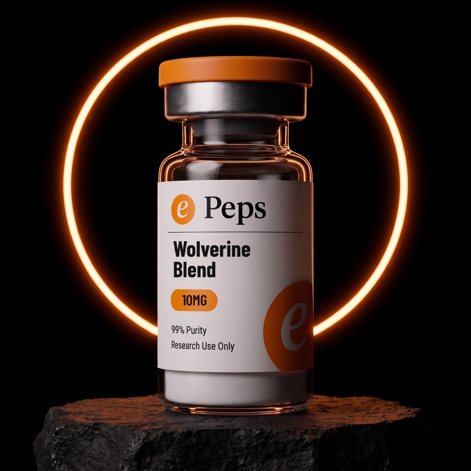
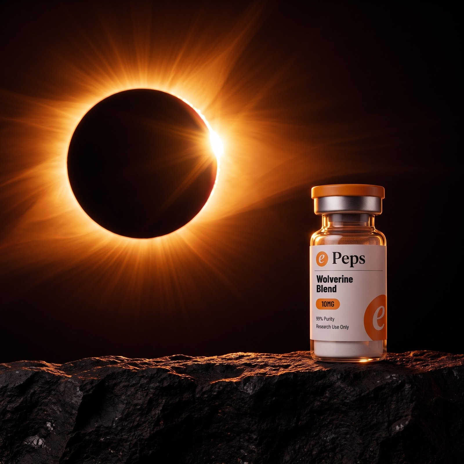
Four frames exist for every product. The card on white, the corona, the ring and the wide. Every SKU has all four, shot the same way, so any two products can sit beside each other without a reshoot. Nothing else is a product ground.
The card is the default and the only one that is a page. The three dark frames are photographs. They carry the brand into a carousel, an ad or the top of a landing page; they never become the colour of a screen.
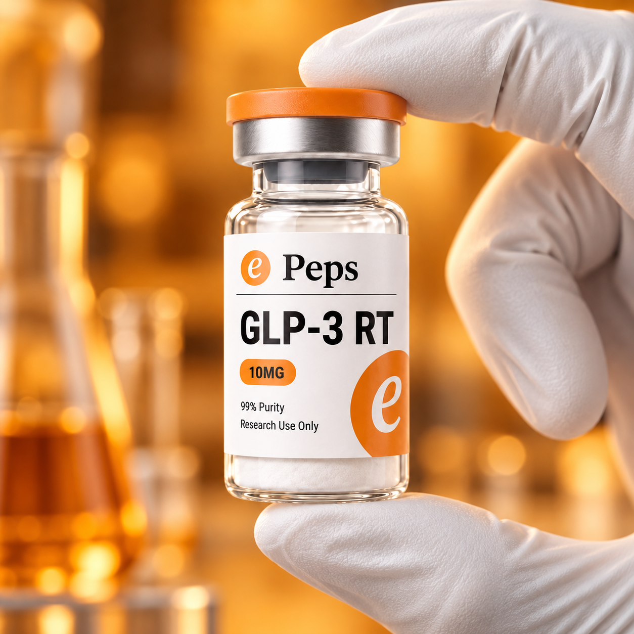
Two further sets exist and neither is per-SKU. The bench is the warm laboratory frame with the gloved hand, for trust and about-us. The box is the unboxing frame, for packaging and delivery.
Order of use: card, corona, ring, wide. Bench and box sit outside the running order and are used once each, at most, on a page.
01 · the card02 · the corona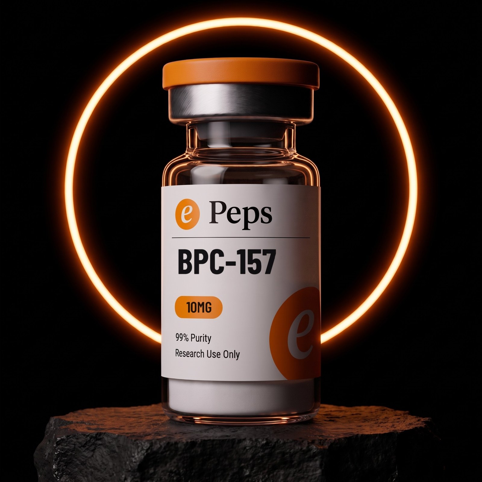 03 · the ring
 04 · the wide
 Outside the order · the benchOutside the order · the boxePeps Brand BookThe sets
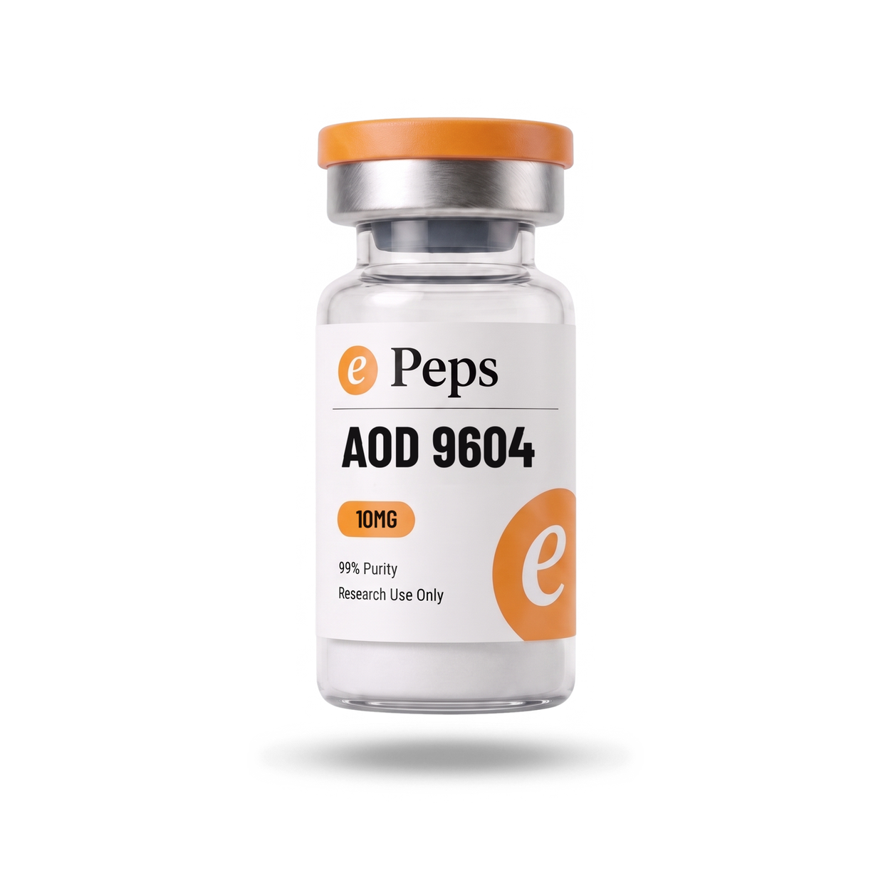
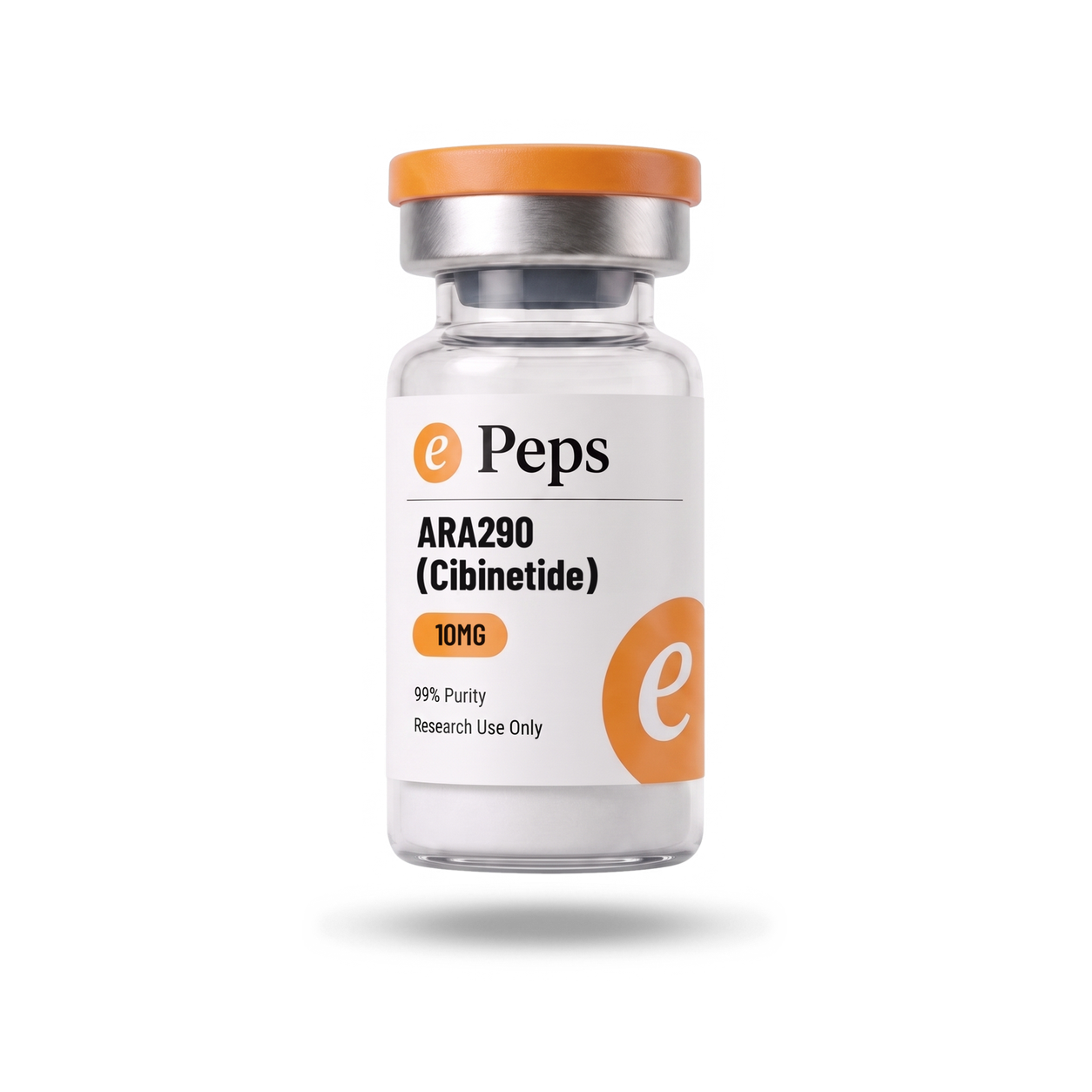
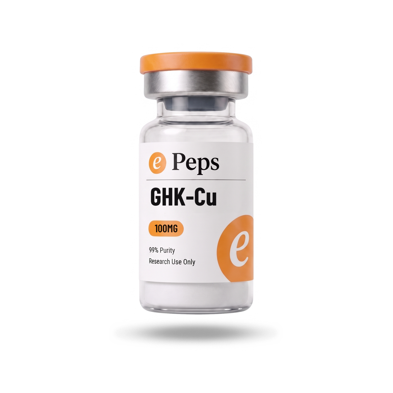
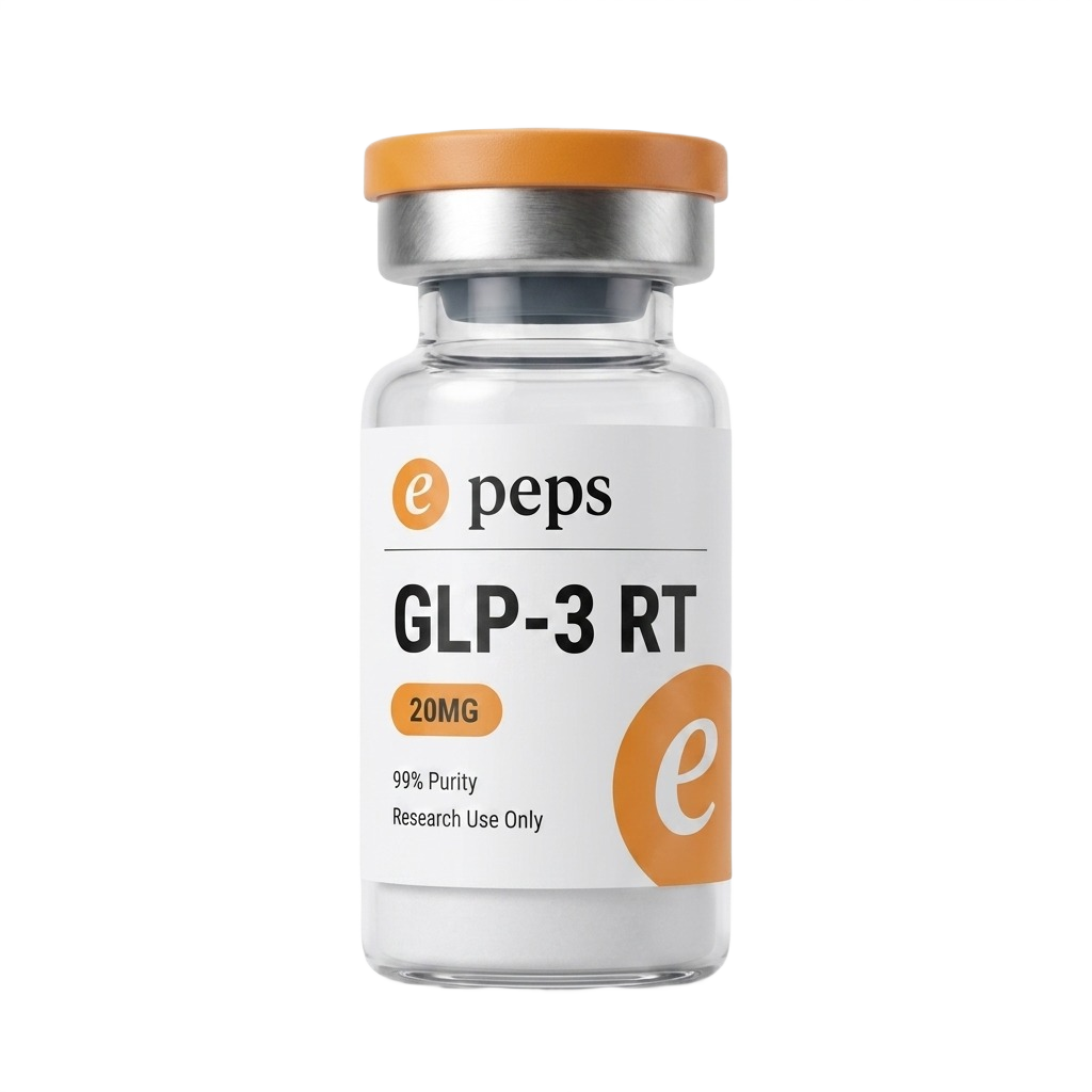
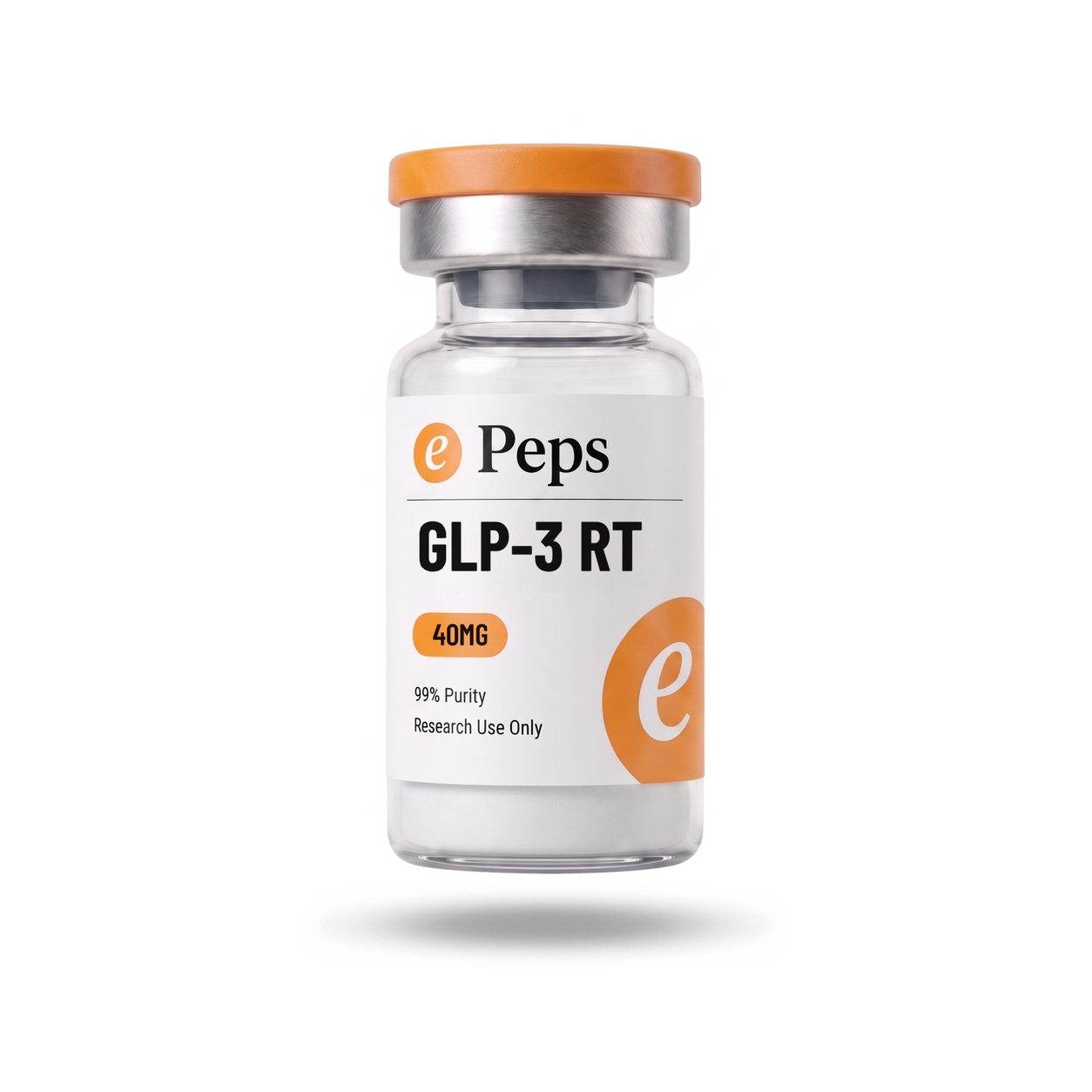
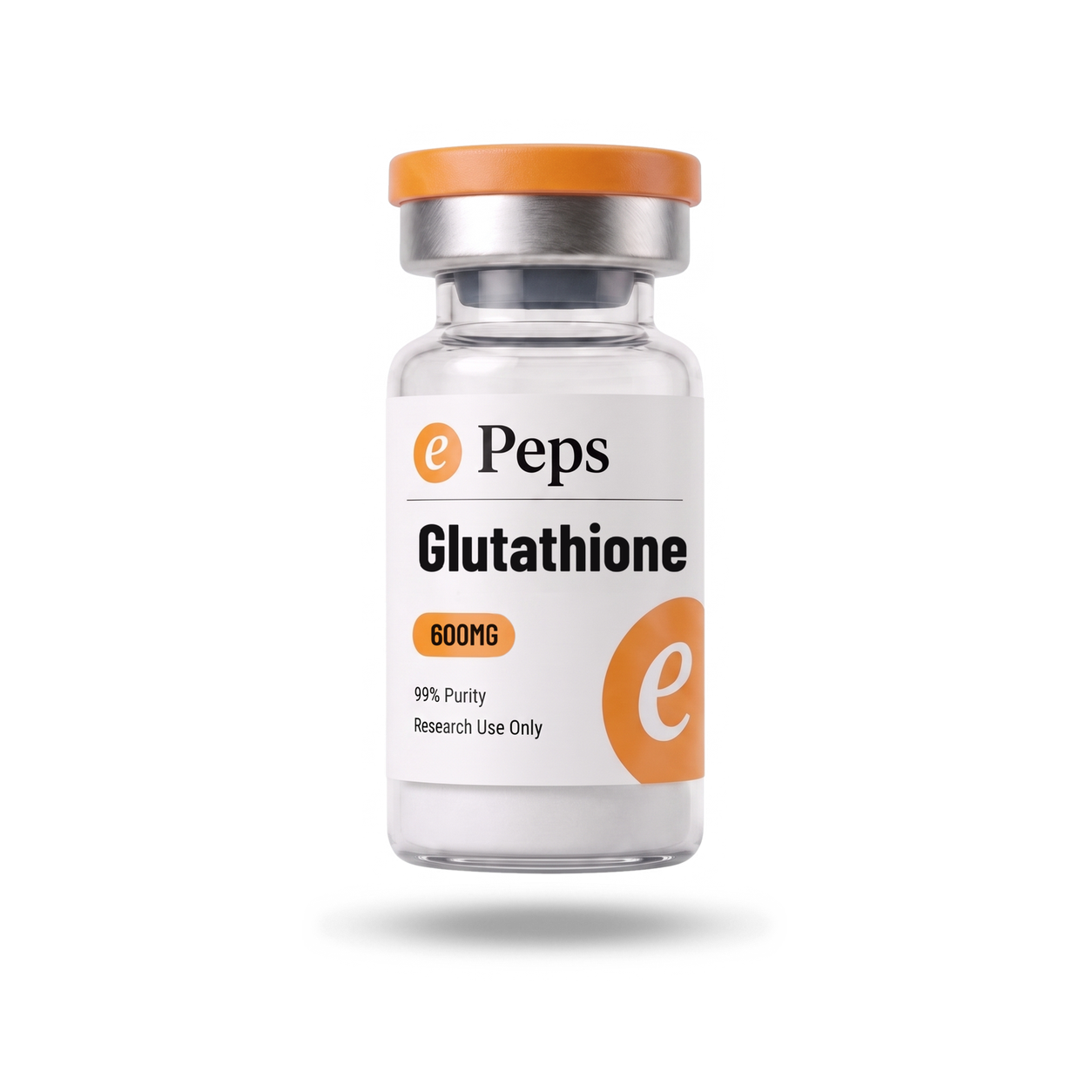
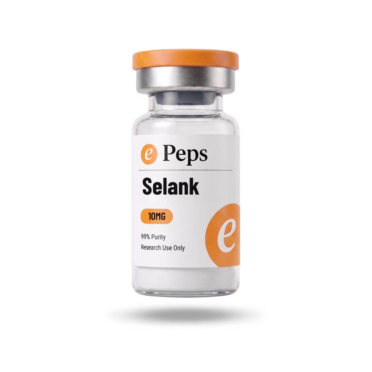
The card
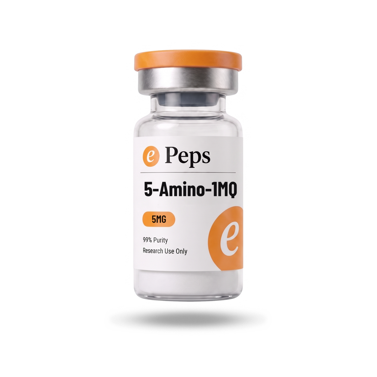
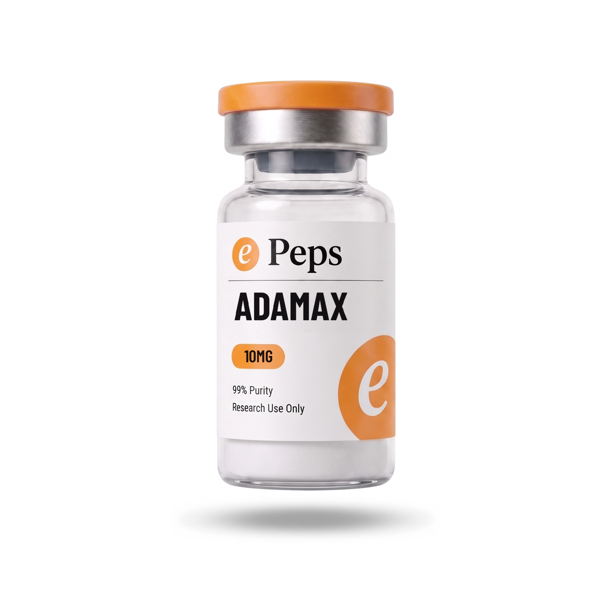
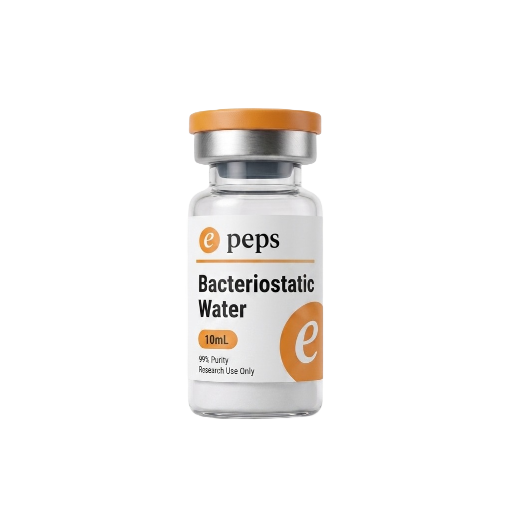
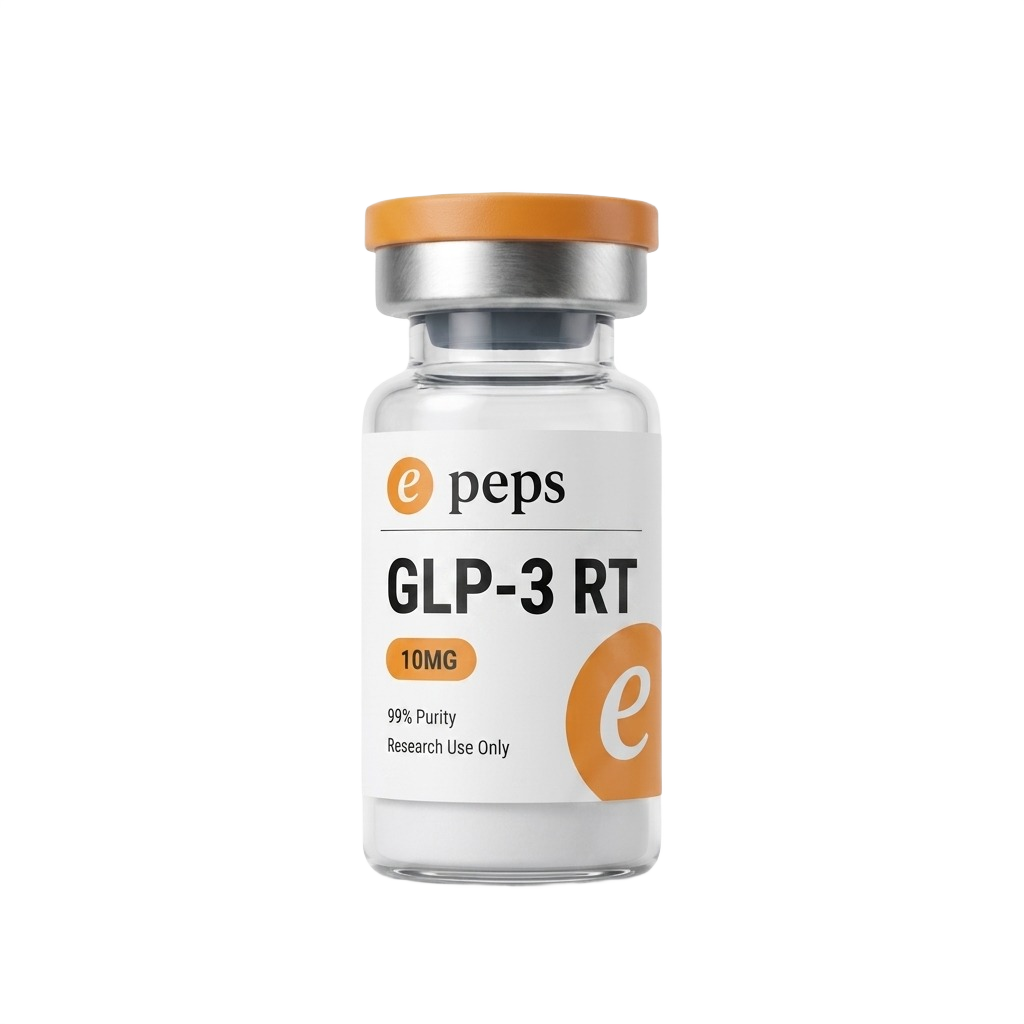
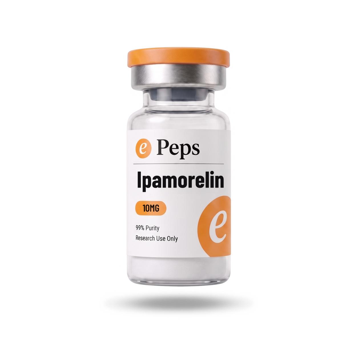
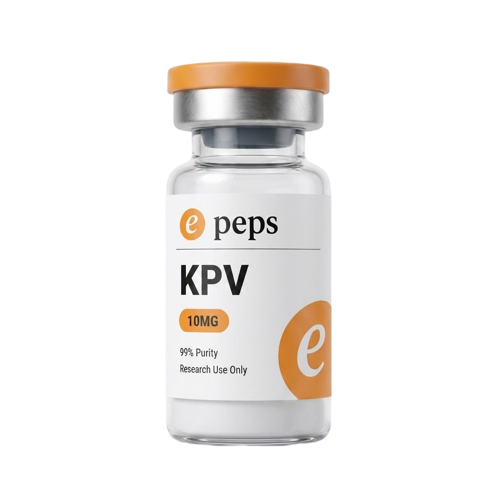
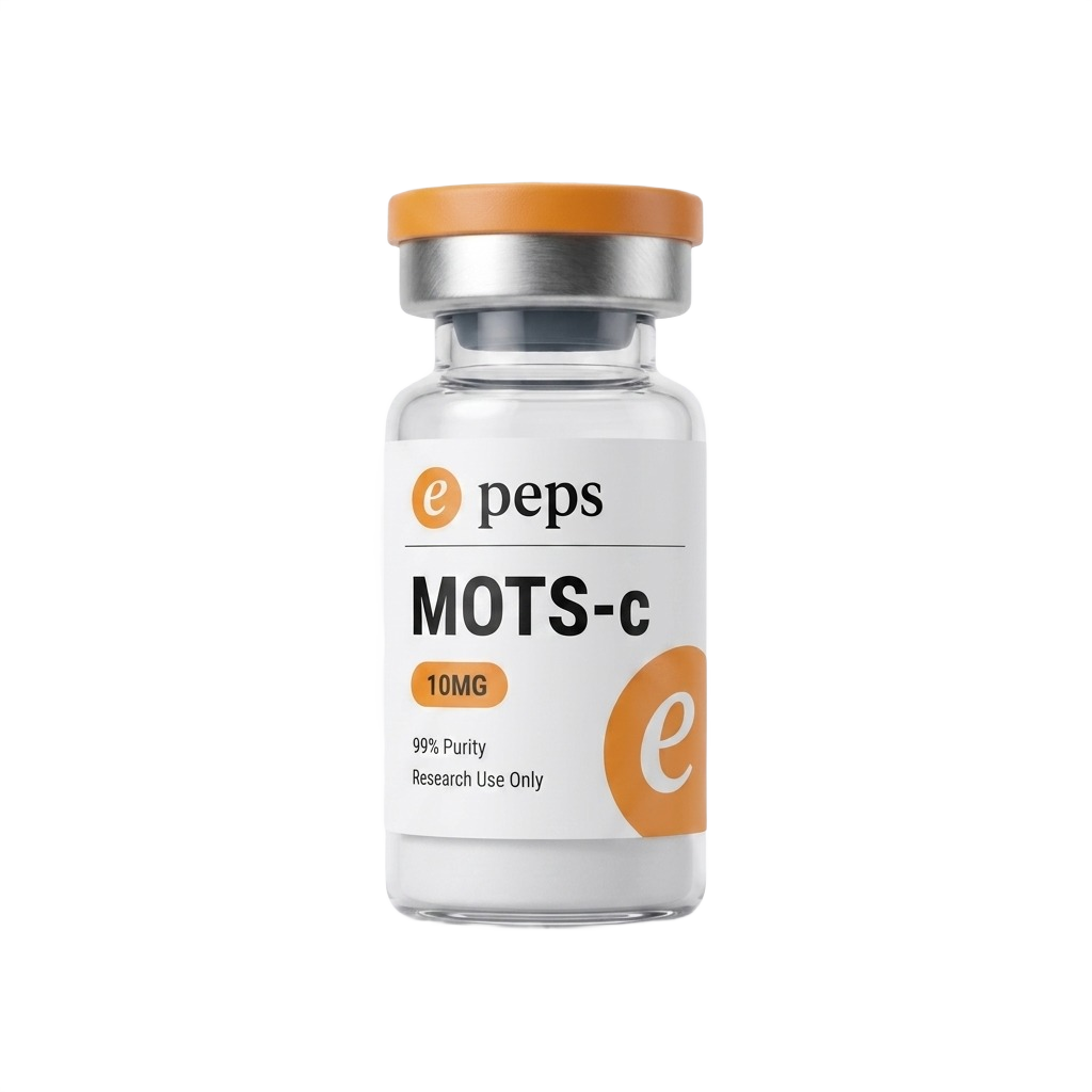
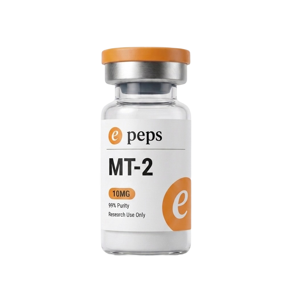
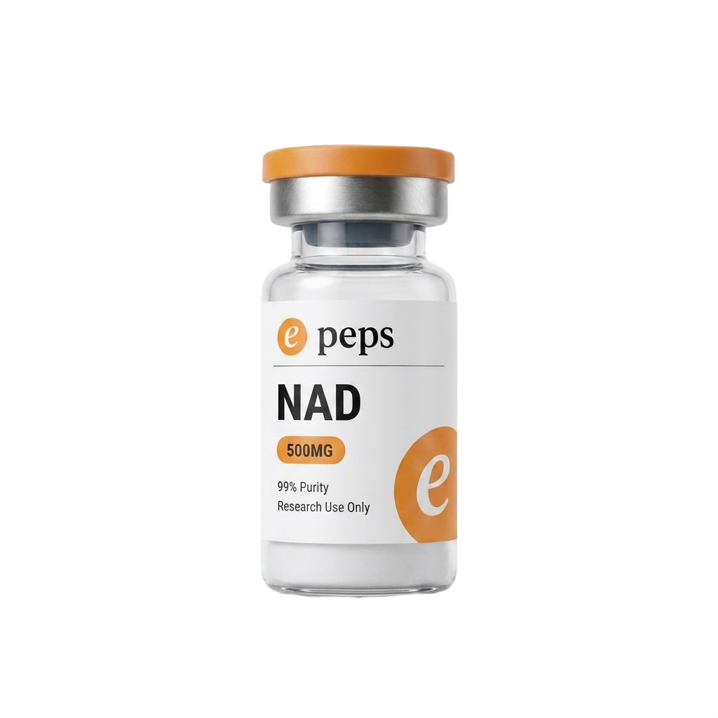
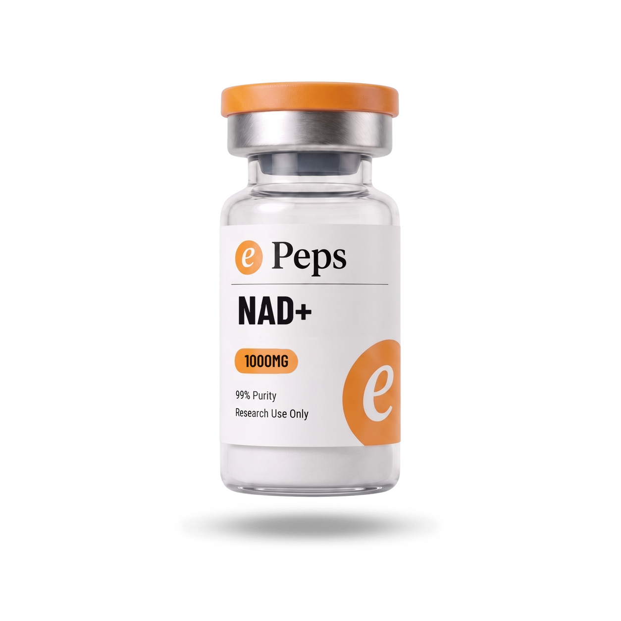
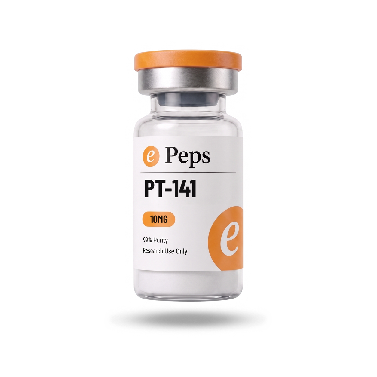
Pure white, and the vial standing in it. Seamless white, one soft key from the front, a soft grey contact shadow directly under the glass. Nothing else in the frame. It is where the label is quietest and most legible, and it is the tile on every grid.
Every SKU has one and it is 1:1. Square, vial centred and upright, label square to camera, the cropped disc reading on the right of the label. The powder is visible through the glass; it is never retouched out.
The card is the only frame that may be cut out. On a cream page it can sit with no background at all. The three dark frames keep their ground, always.
White is white. #FFFFFF, lit flat, never warmed to match the page. The warmth in the picture comes from the cap and the disc.
 5-Amino-1MQ
 ADAMAX
 AOD 9604
 ARA290 (Cibinetide)ePeps Brand BookThe card
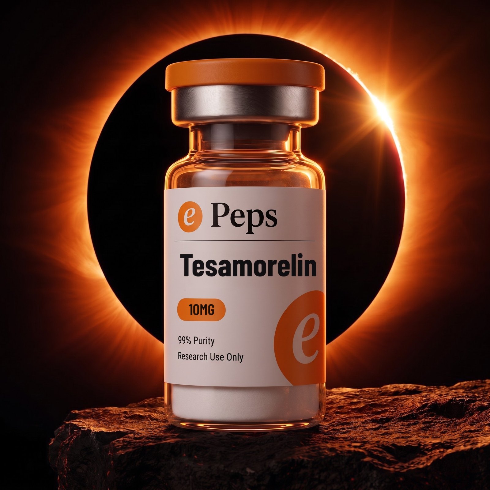
The eclipse
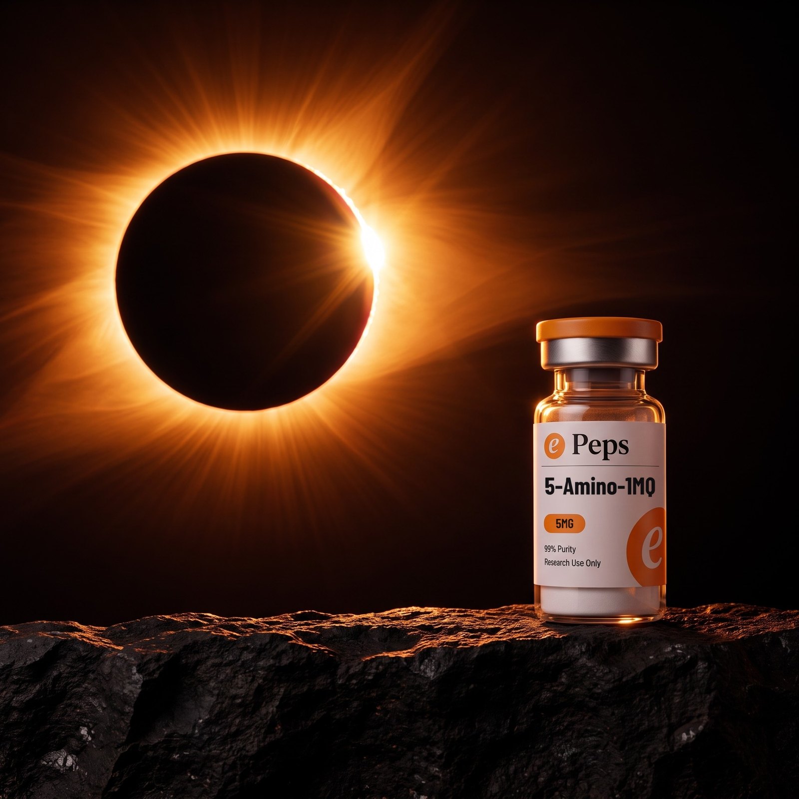
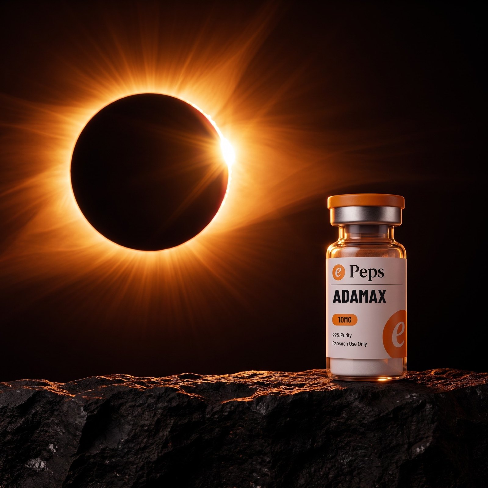
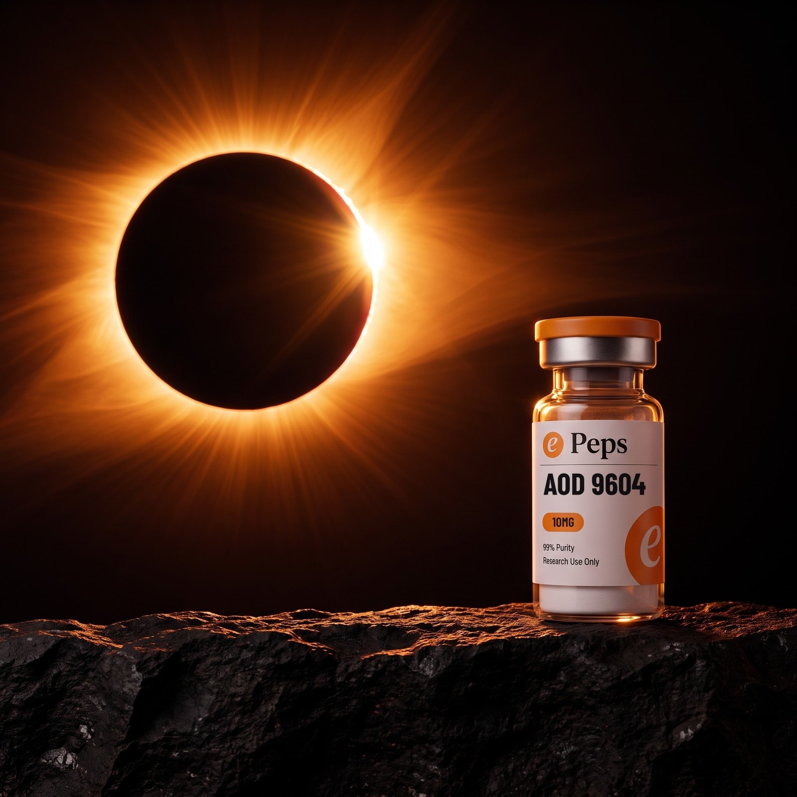
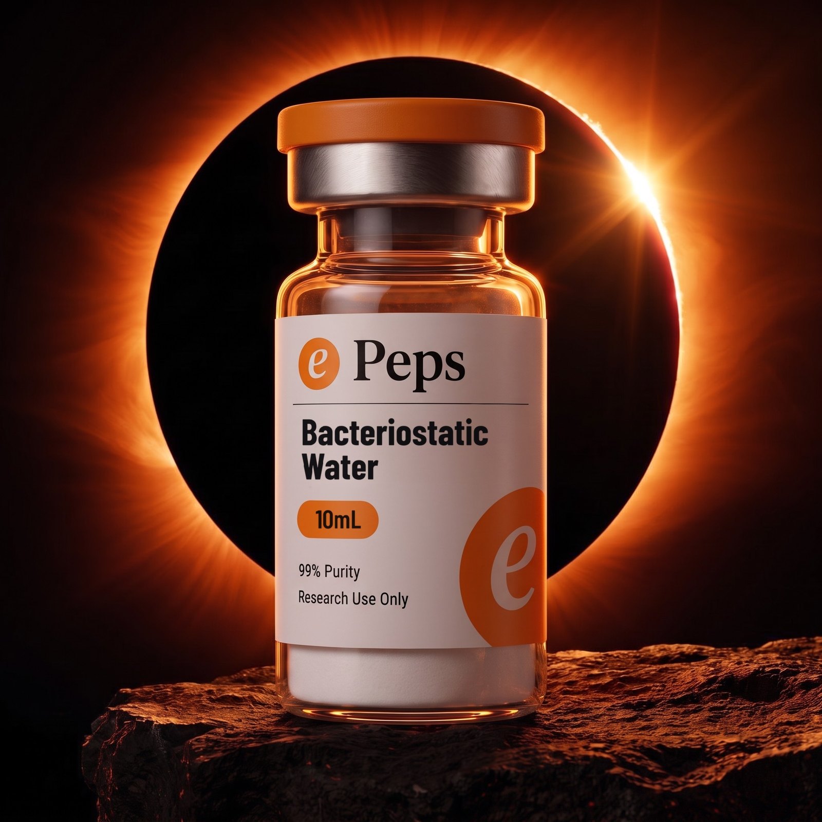
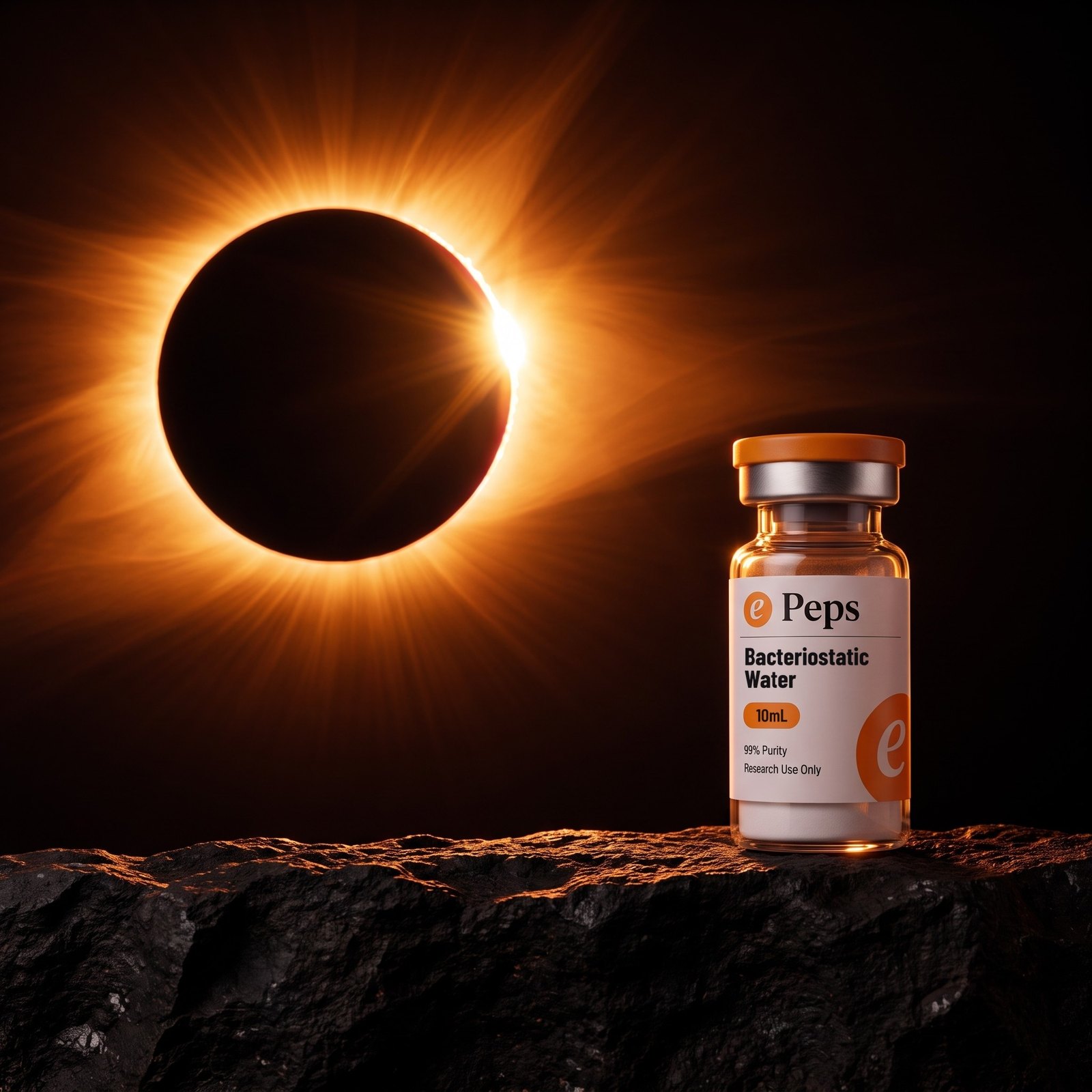
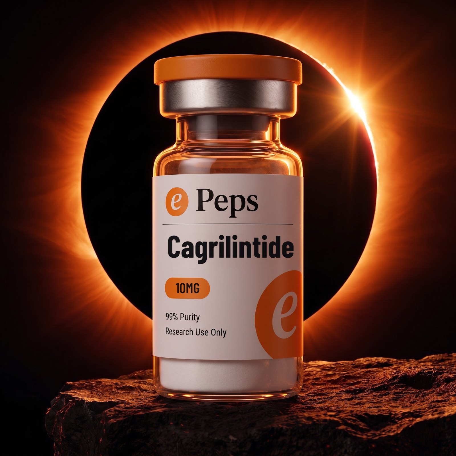
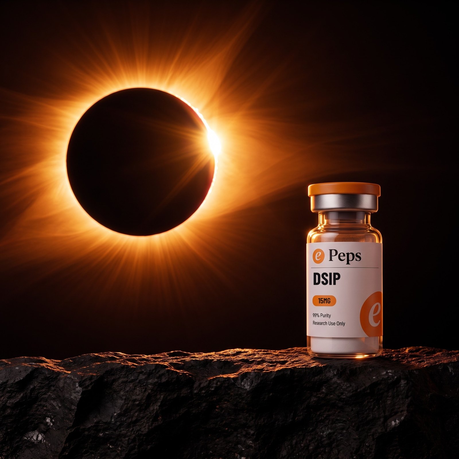
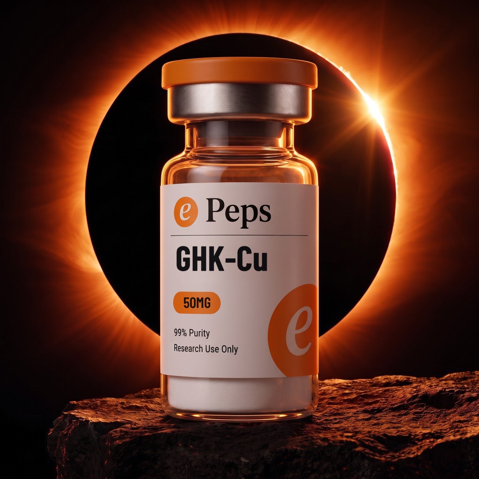
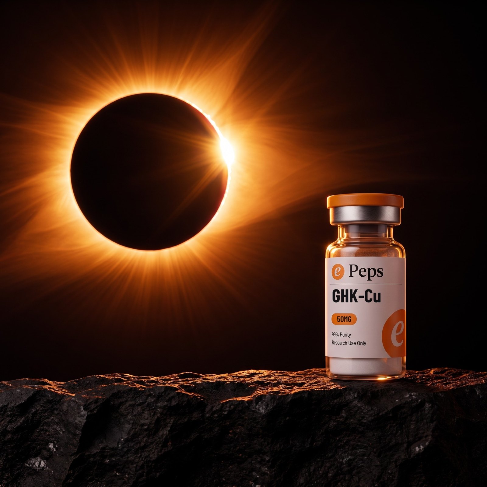
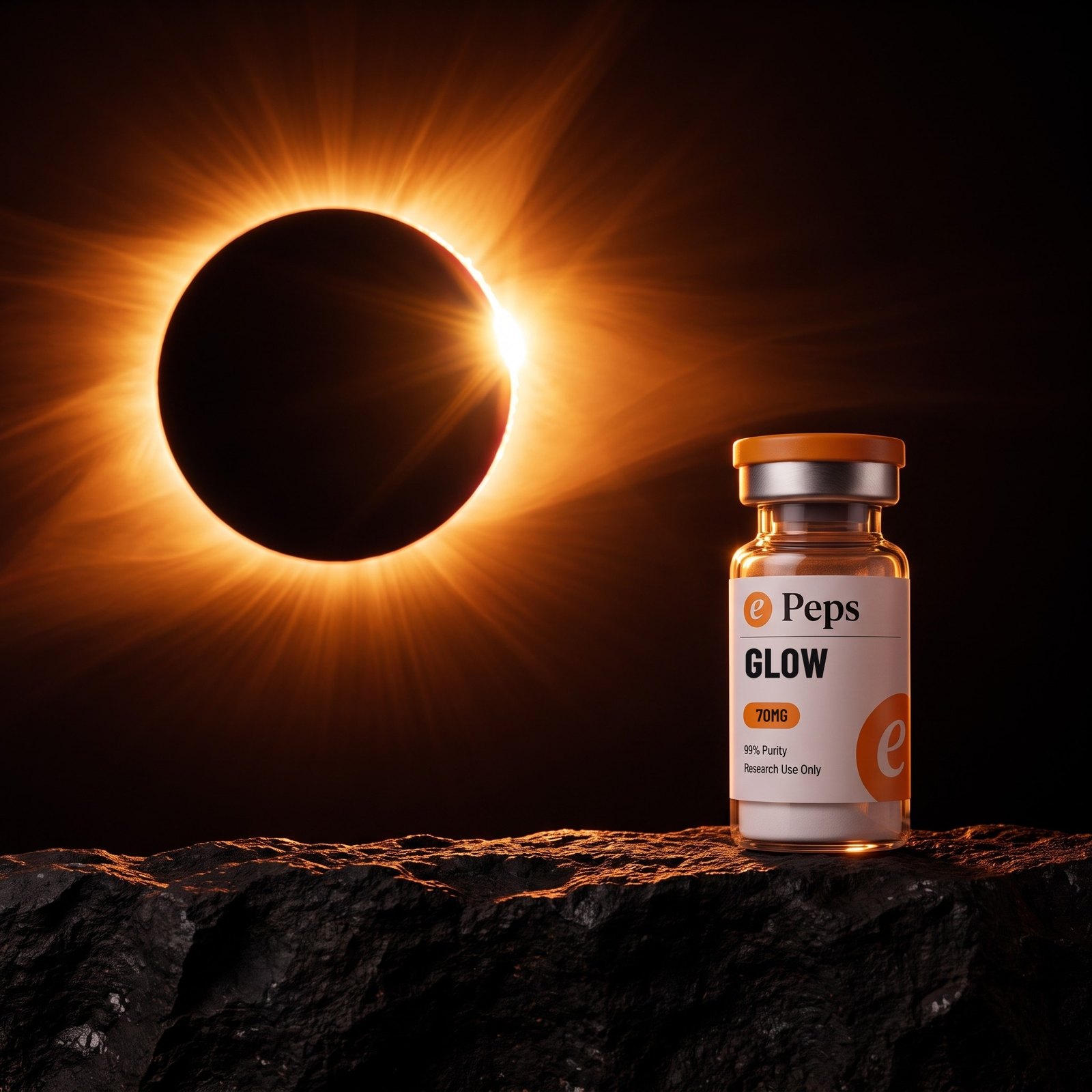
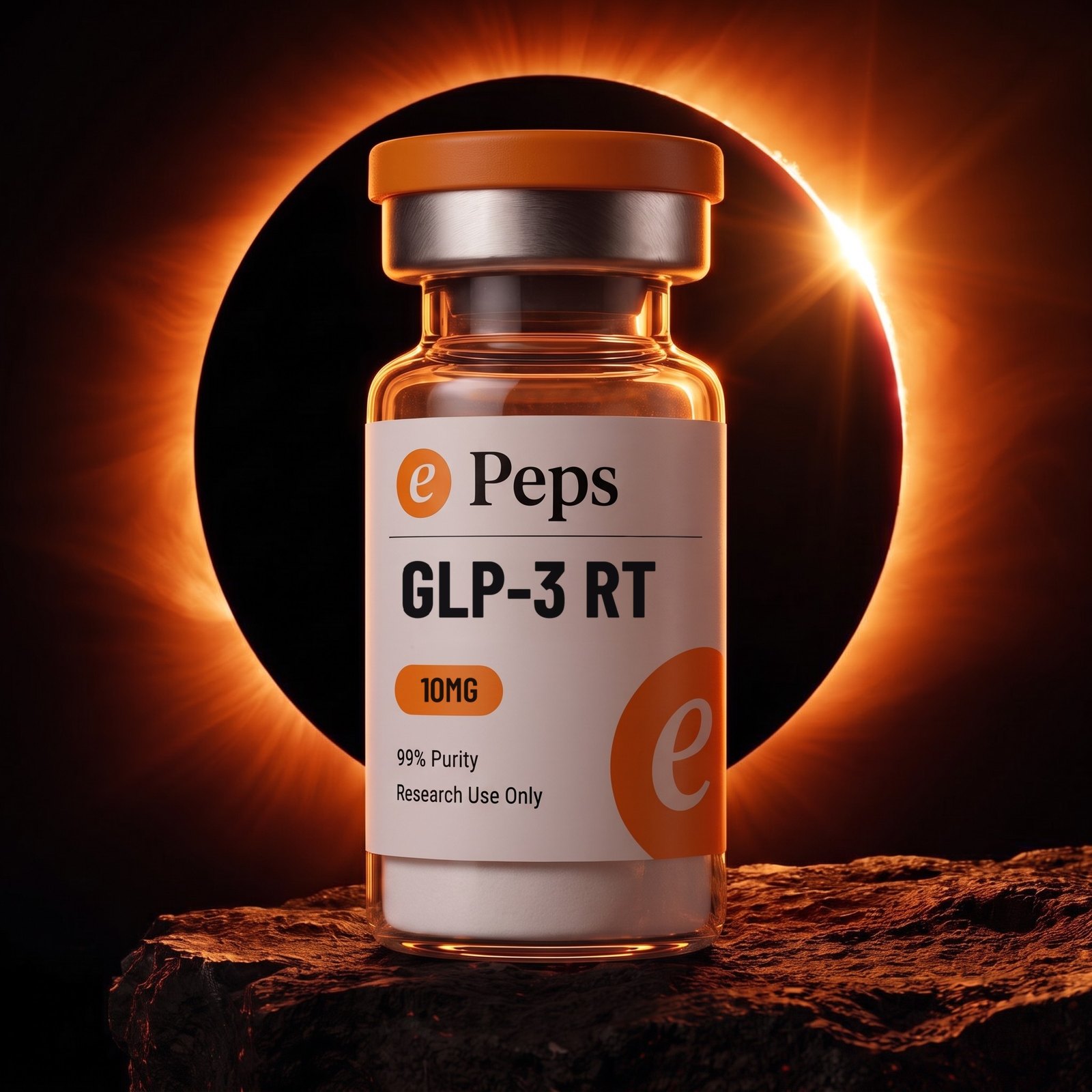
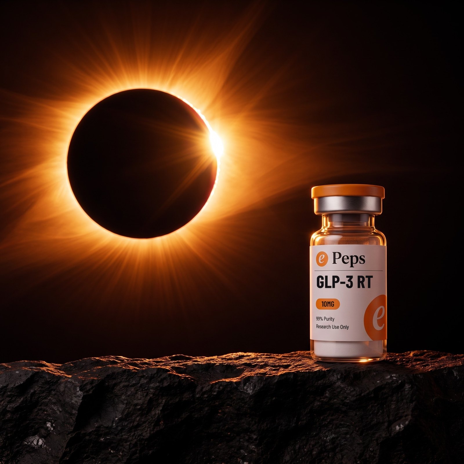
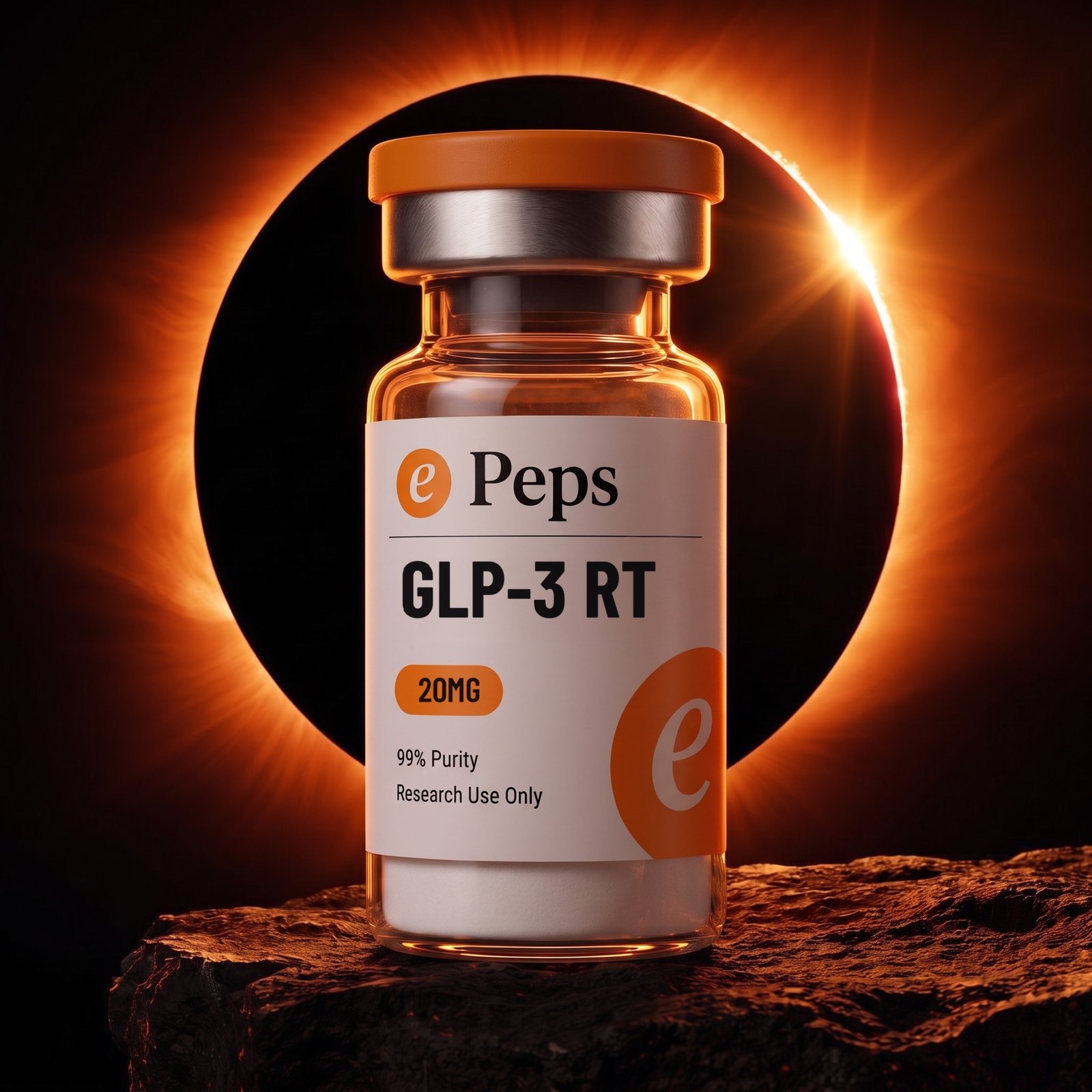
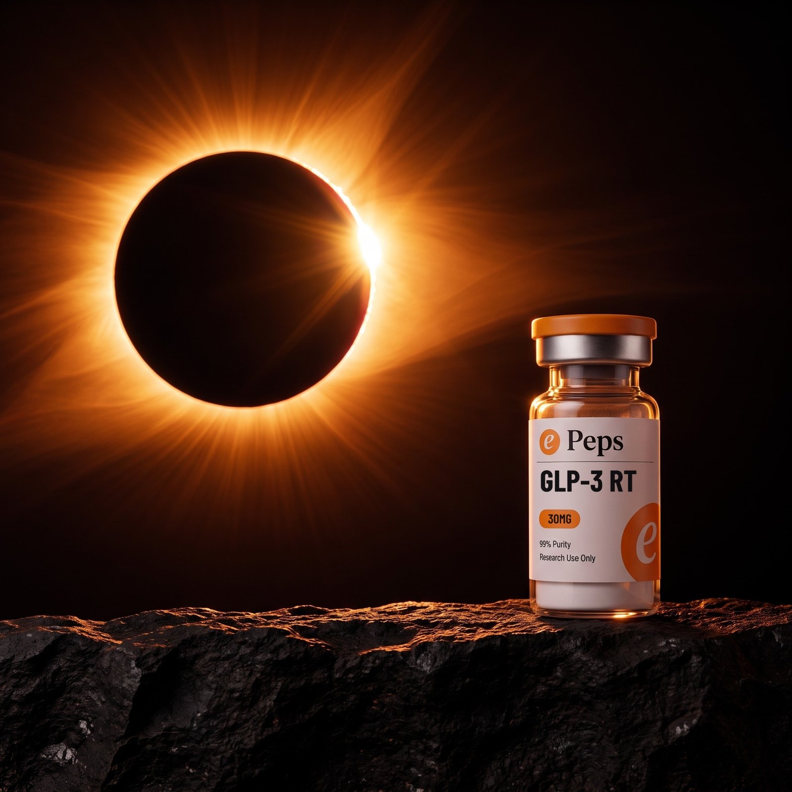
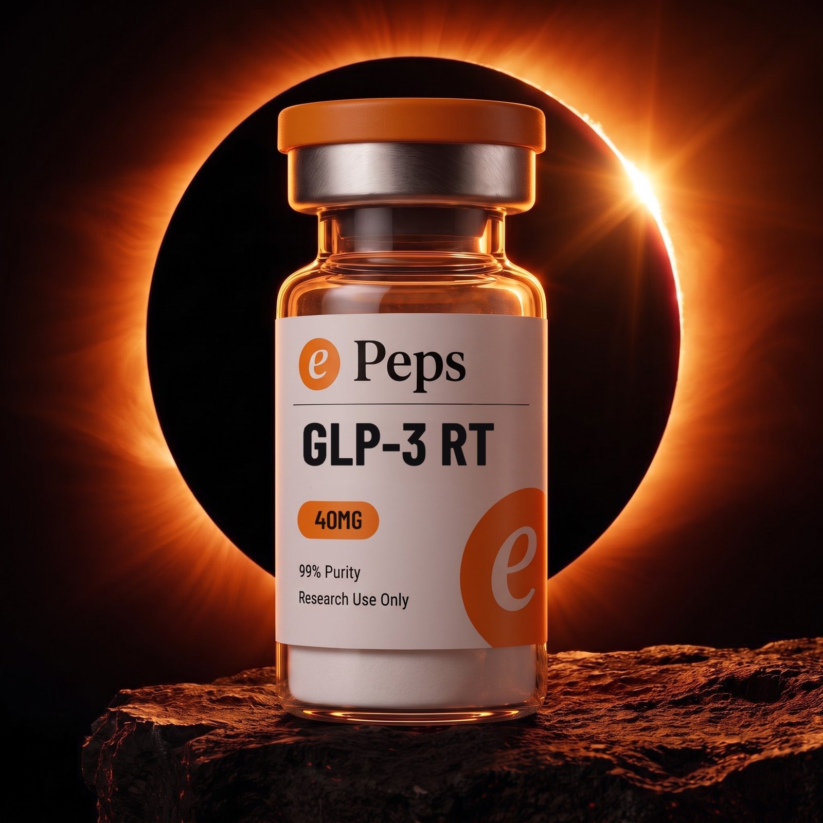
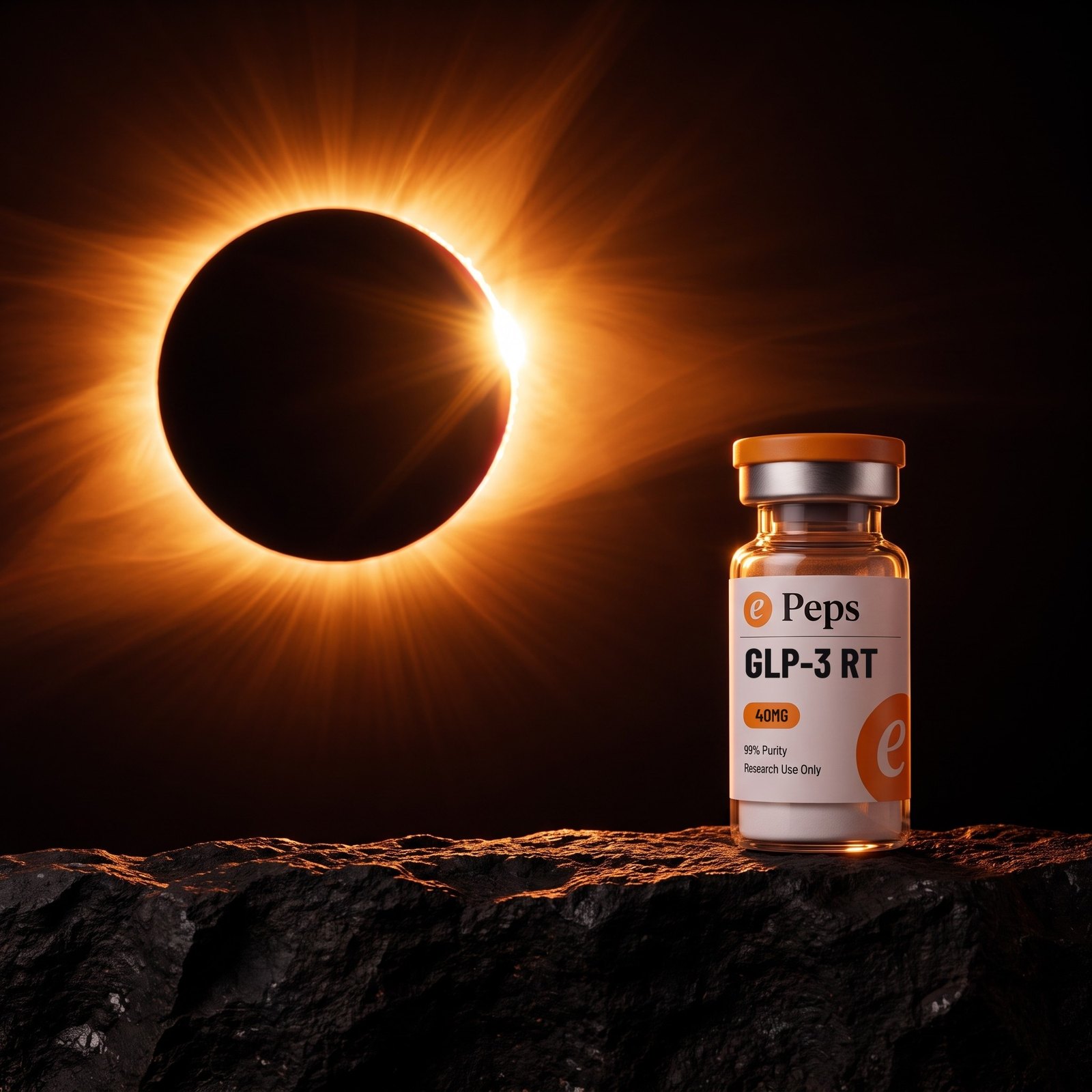
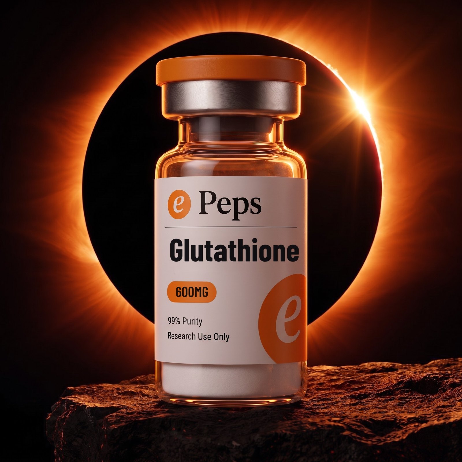
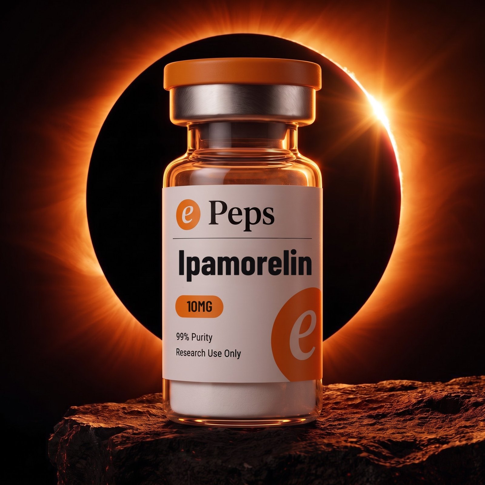
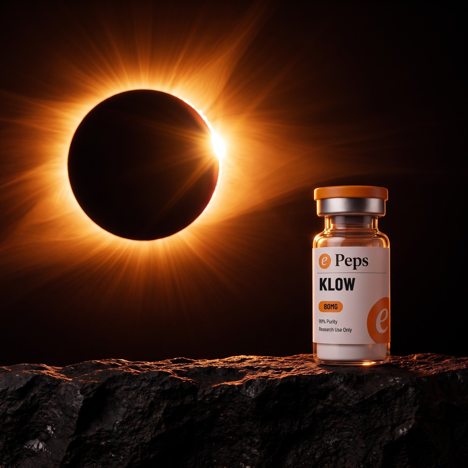
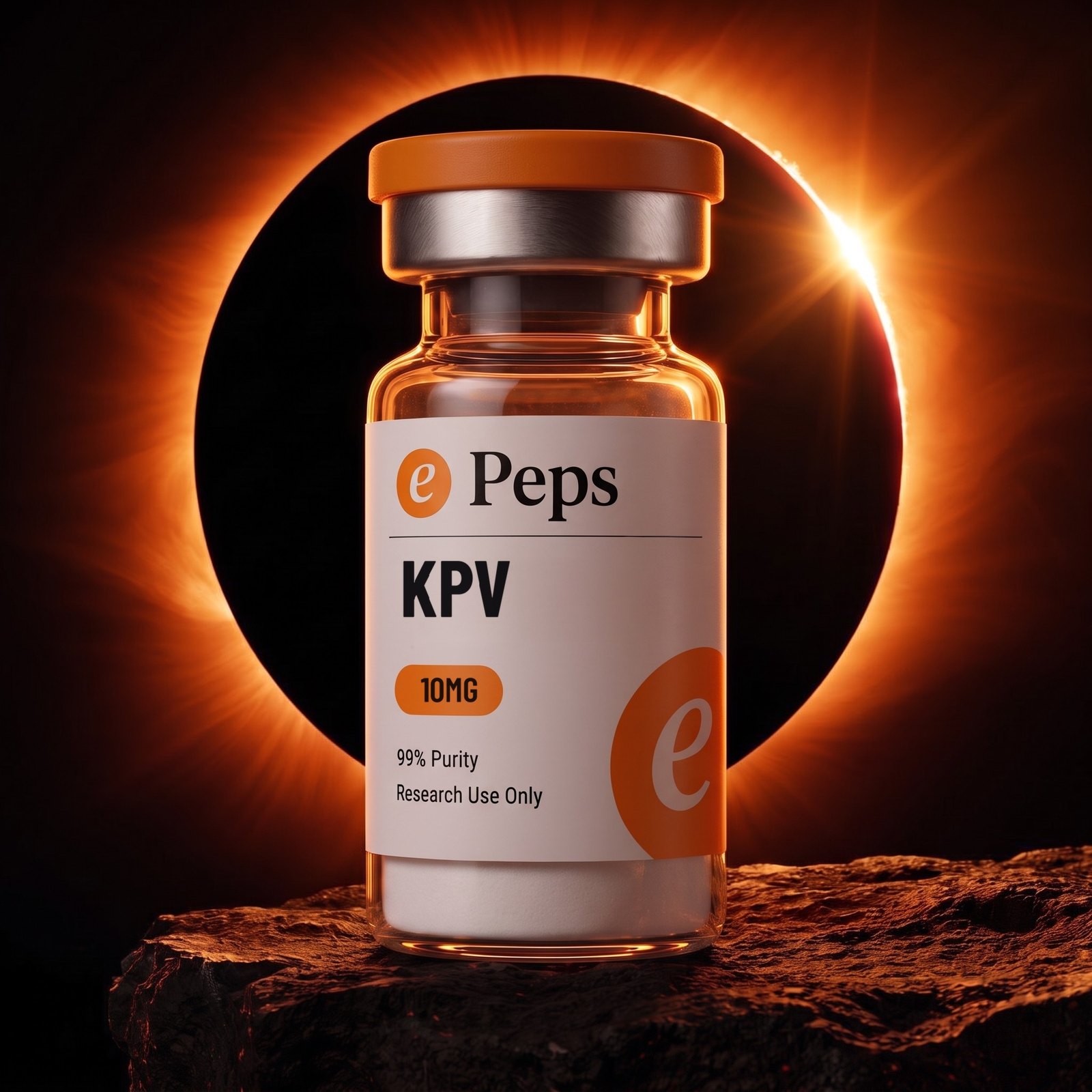
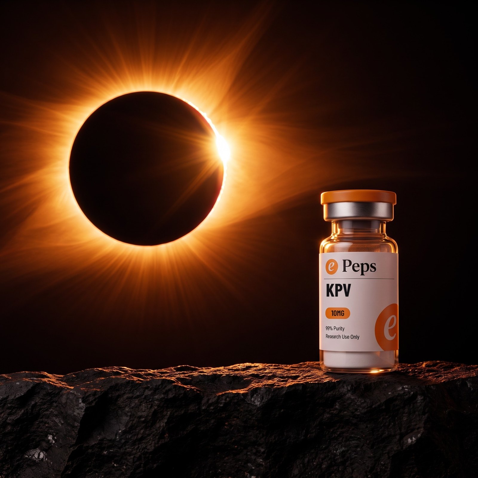
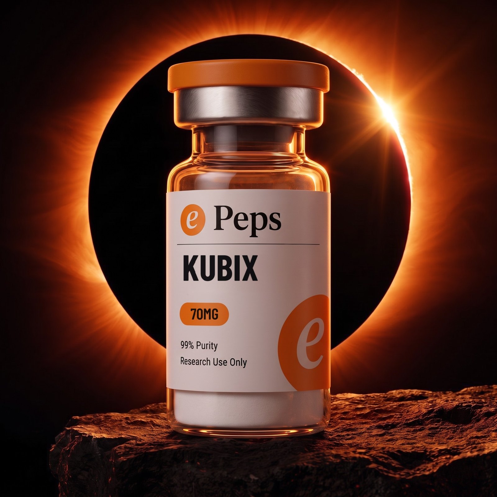
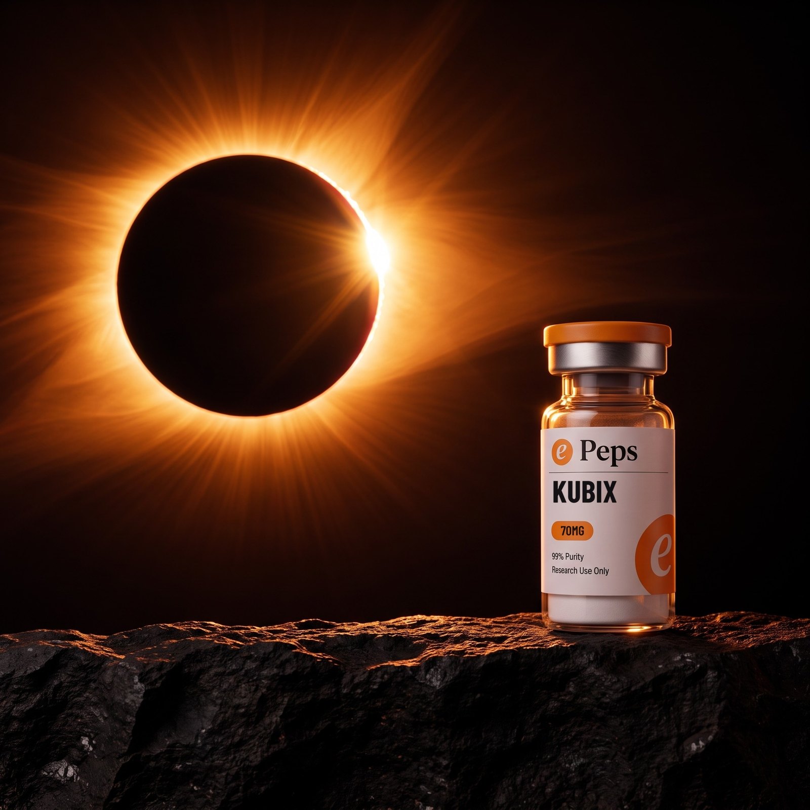
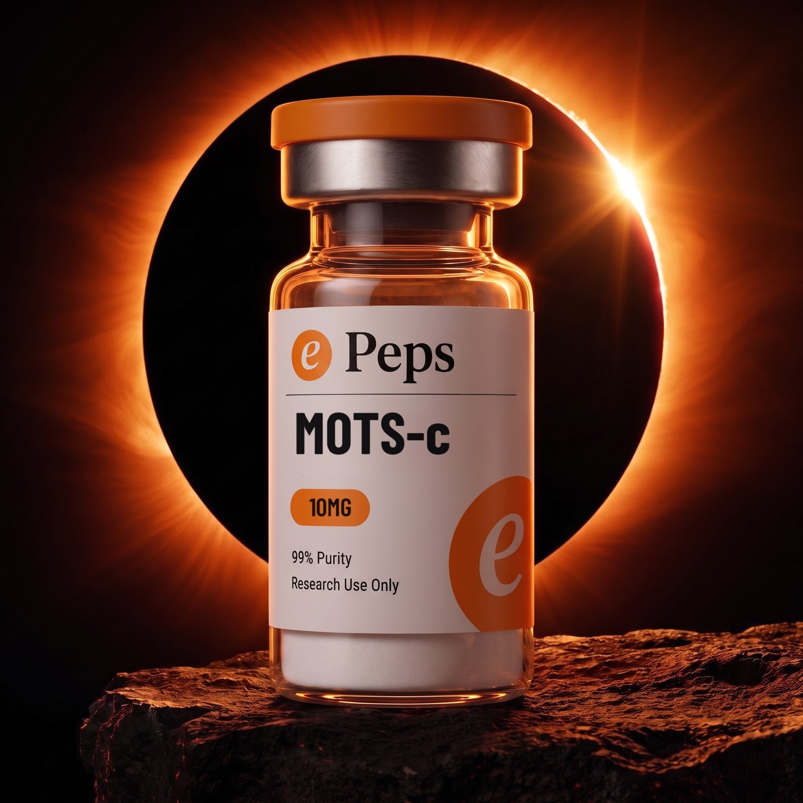
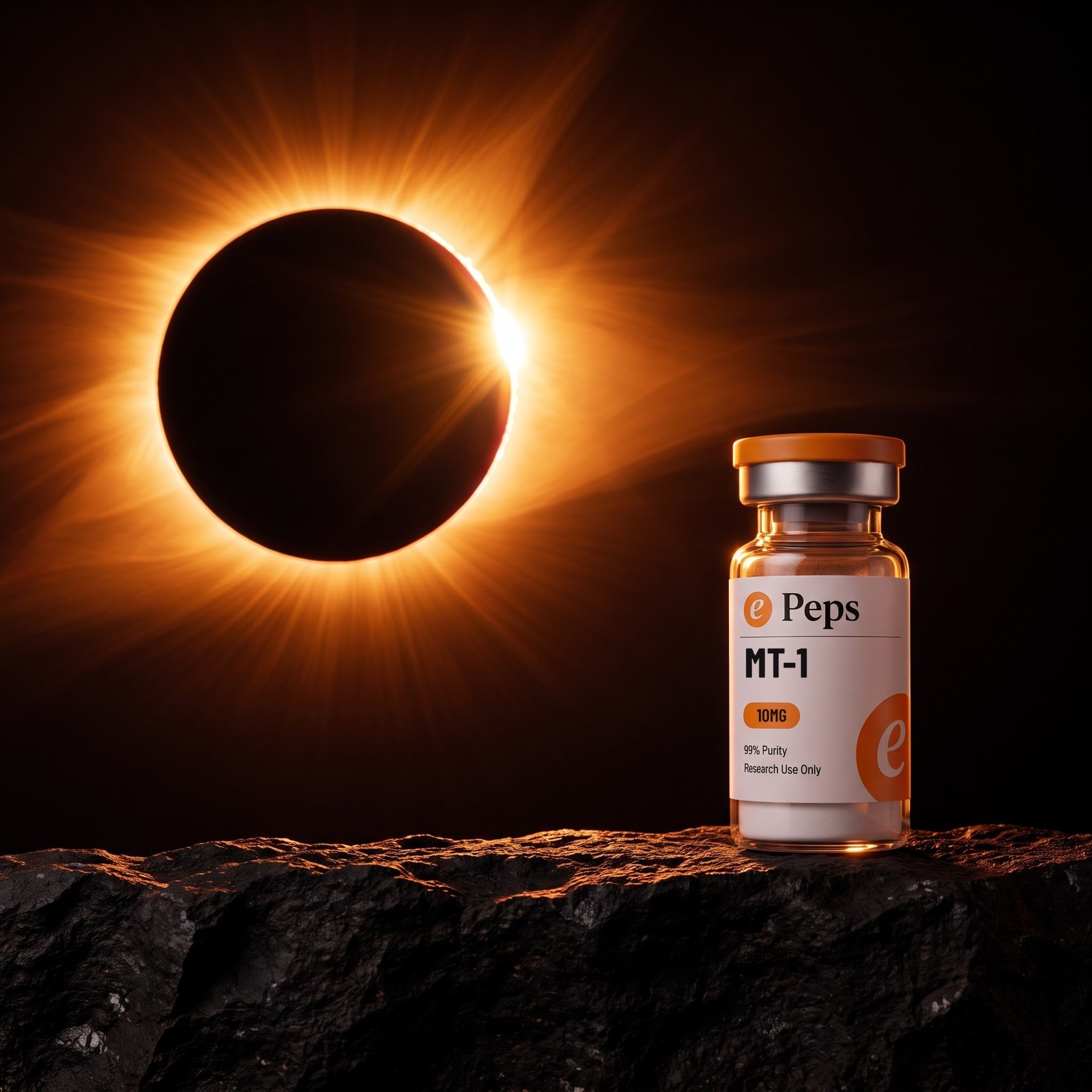
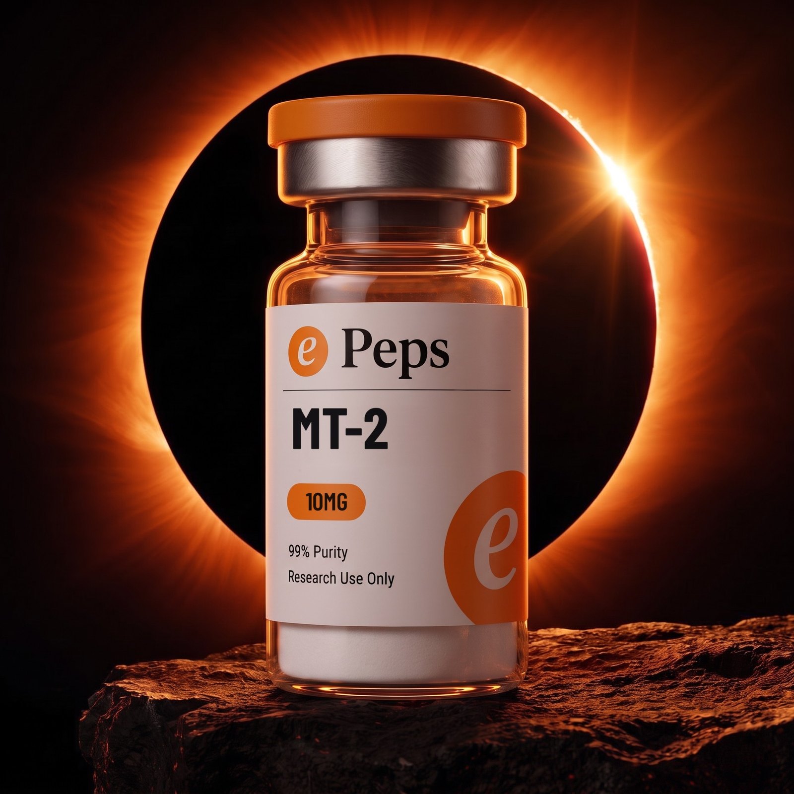
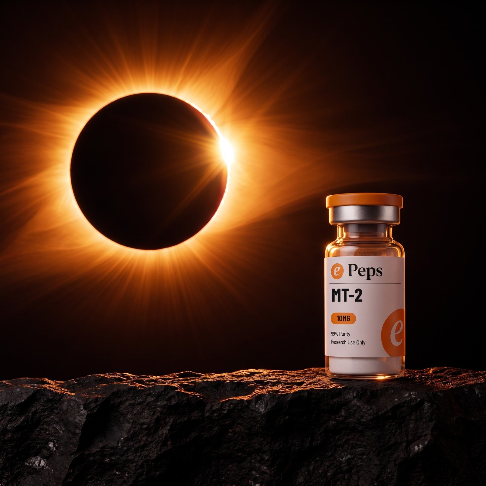
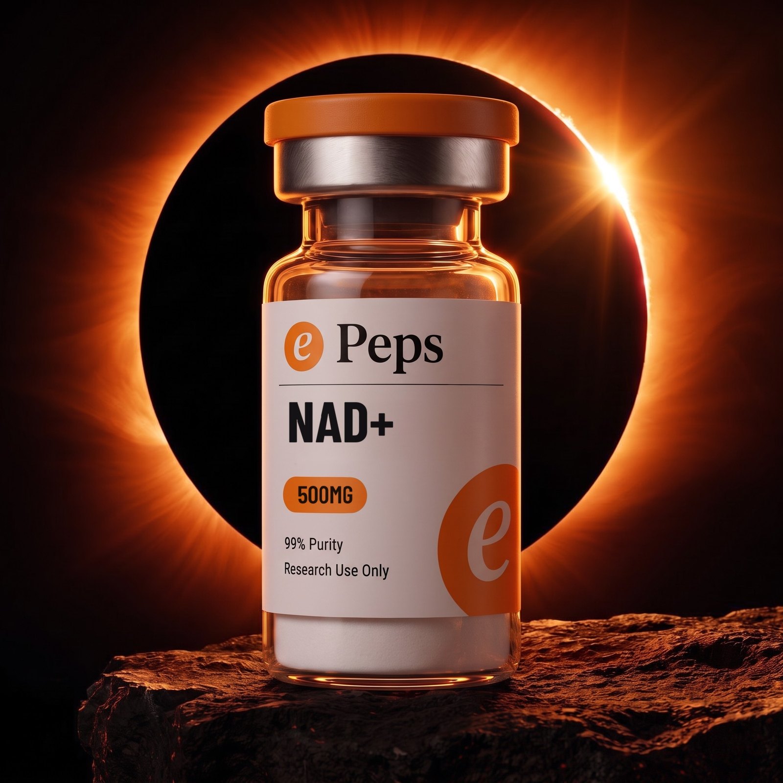
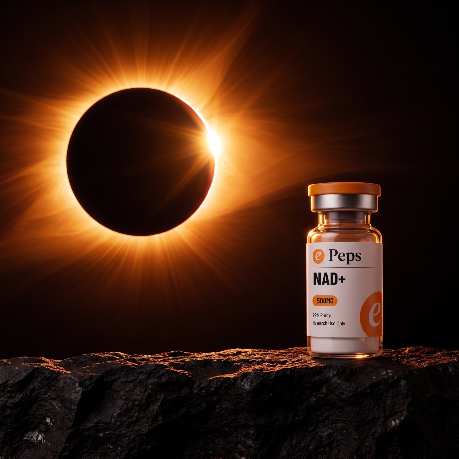
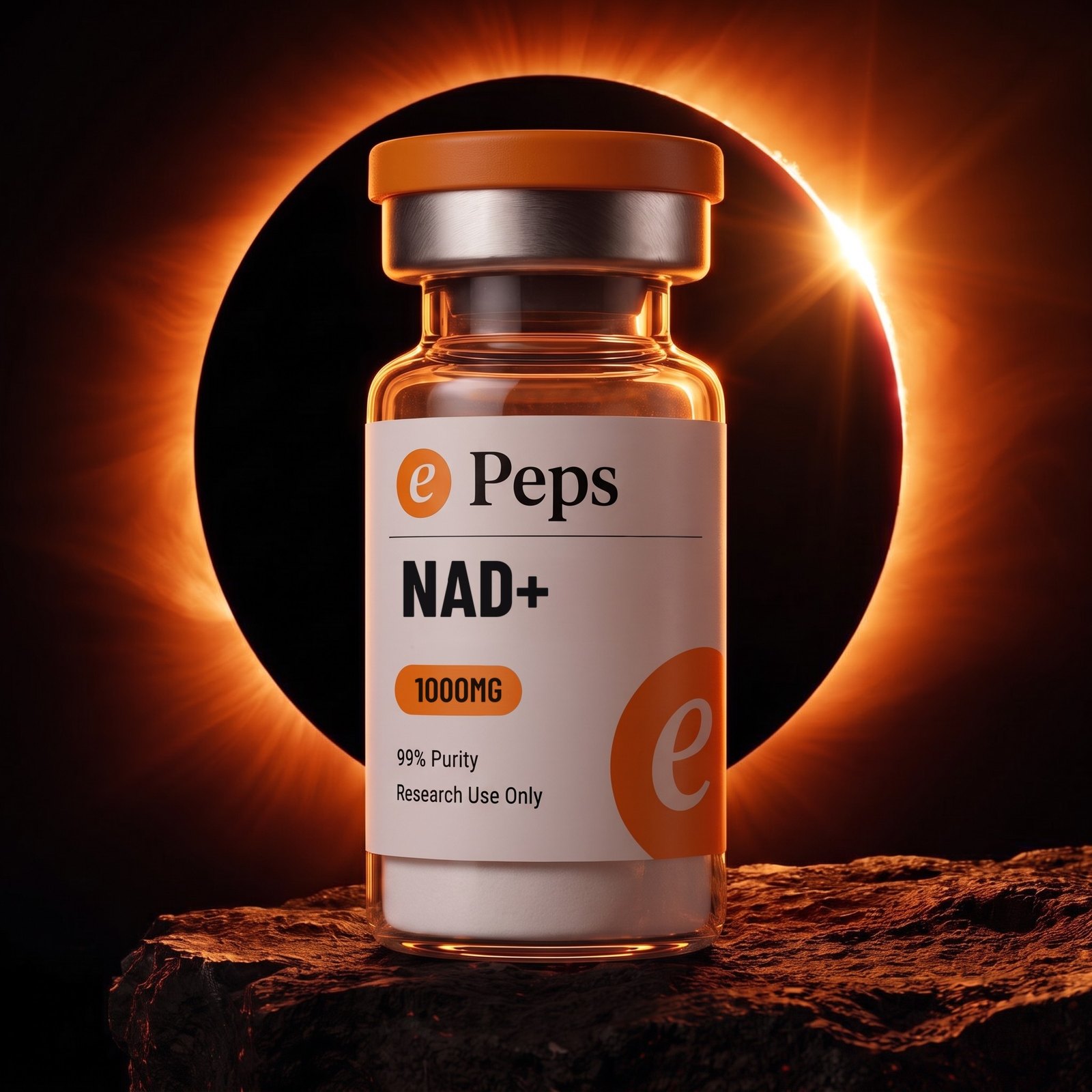
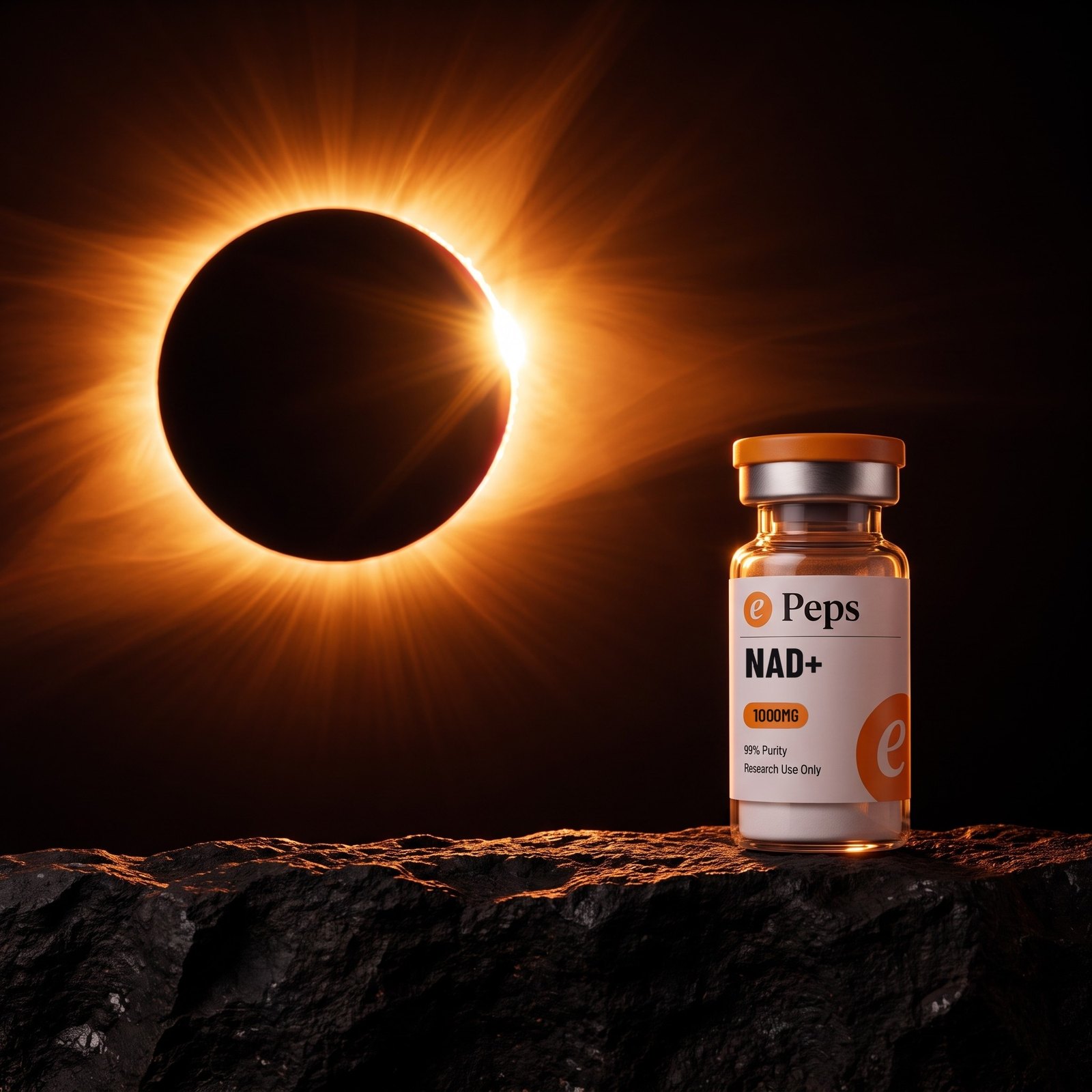
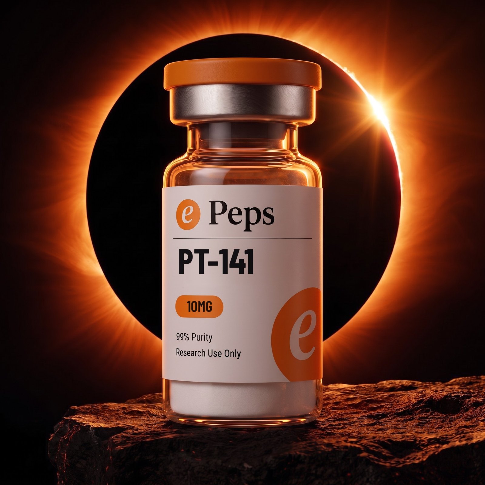
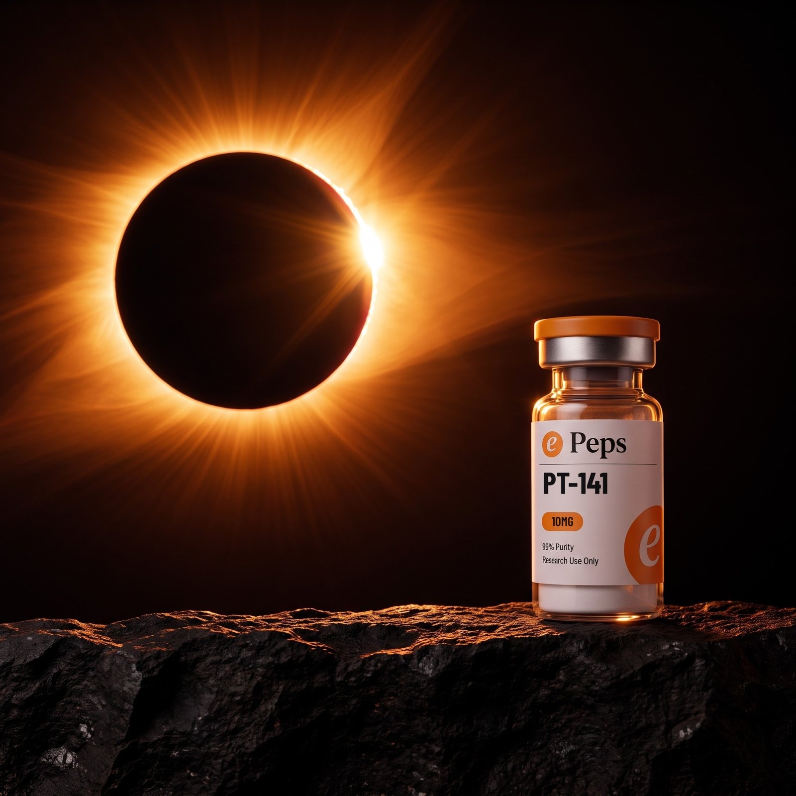
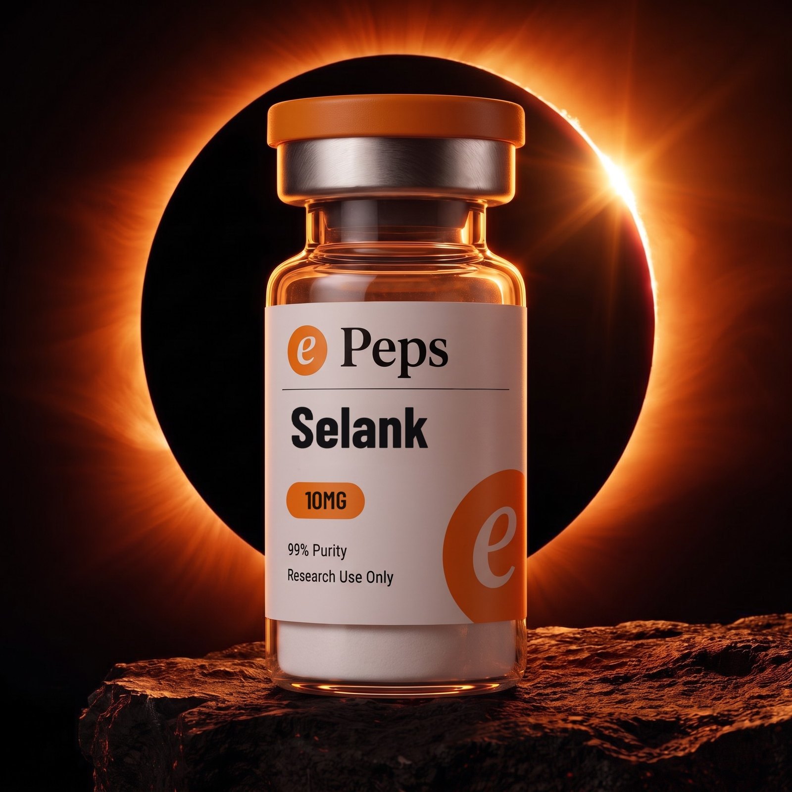
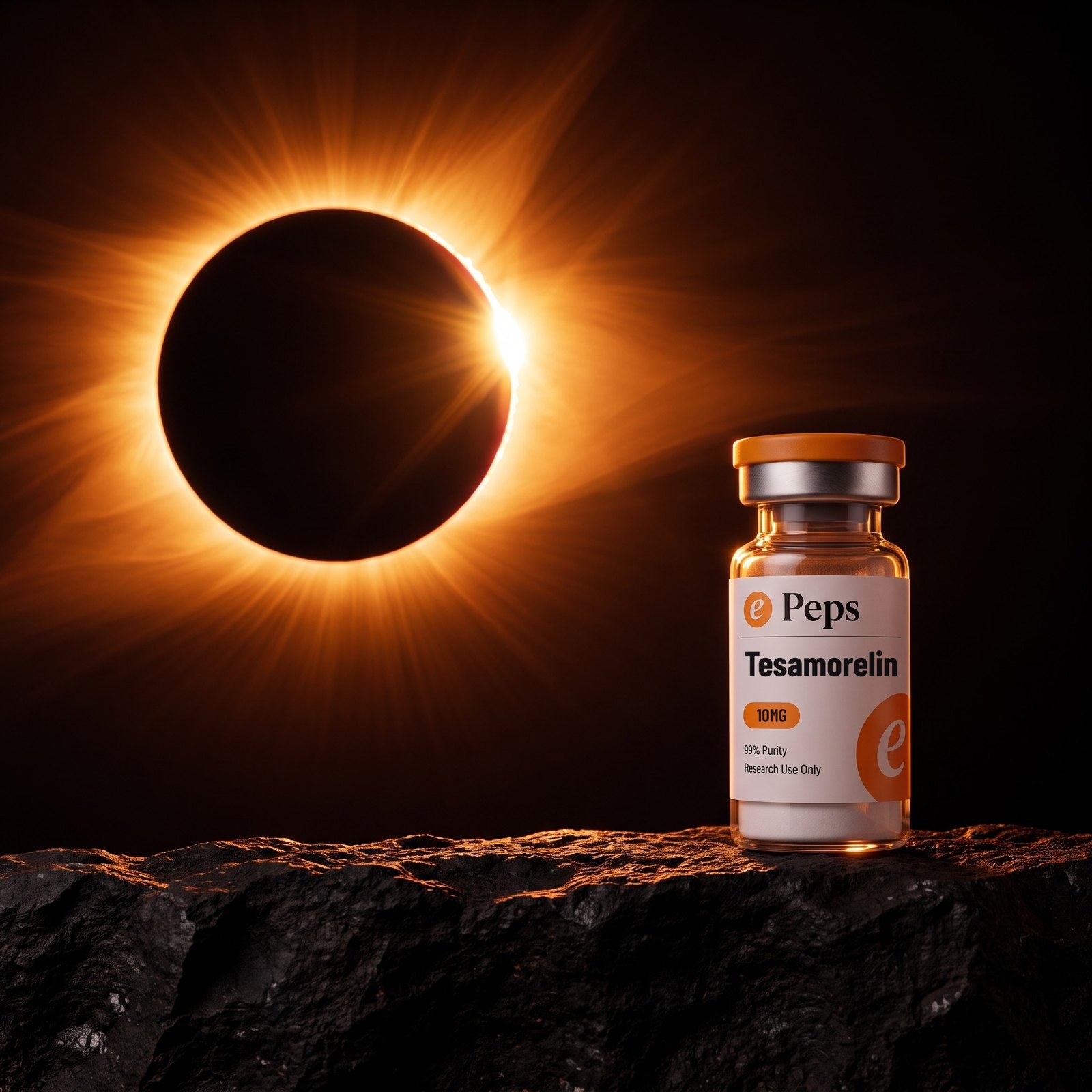
The brand’s one piece of theatre. A total eclipse behind the vial: a black disc with an ember corona burning around it, a single hard flare at the edge, and the vial standing on dark rock lit warm from that one source.
The light is the whole trick. One source, behind and above, raking the rock and lighting the glass from inside so the vial glows amber and the label stays white. No second light, no fill, no lens flare added afterwards. It is a lighting decision, never an effect.
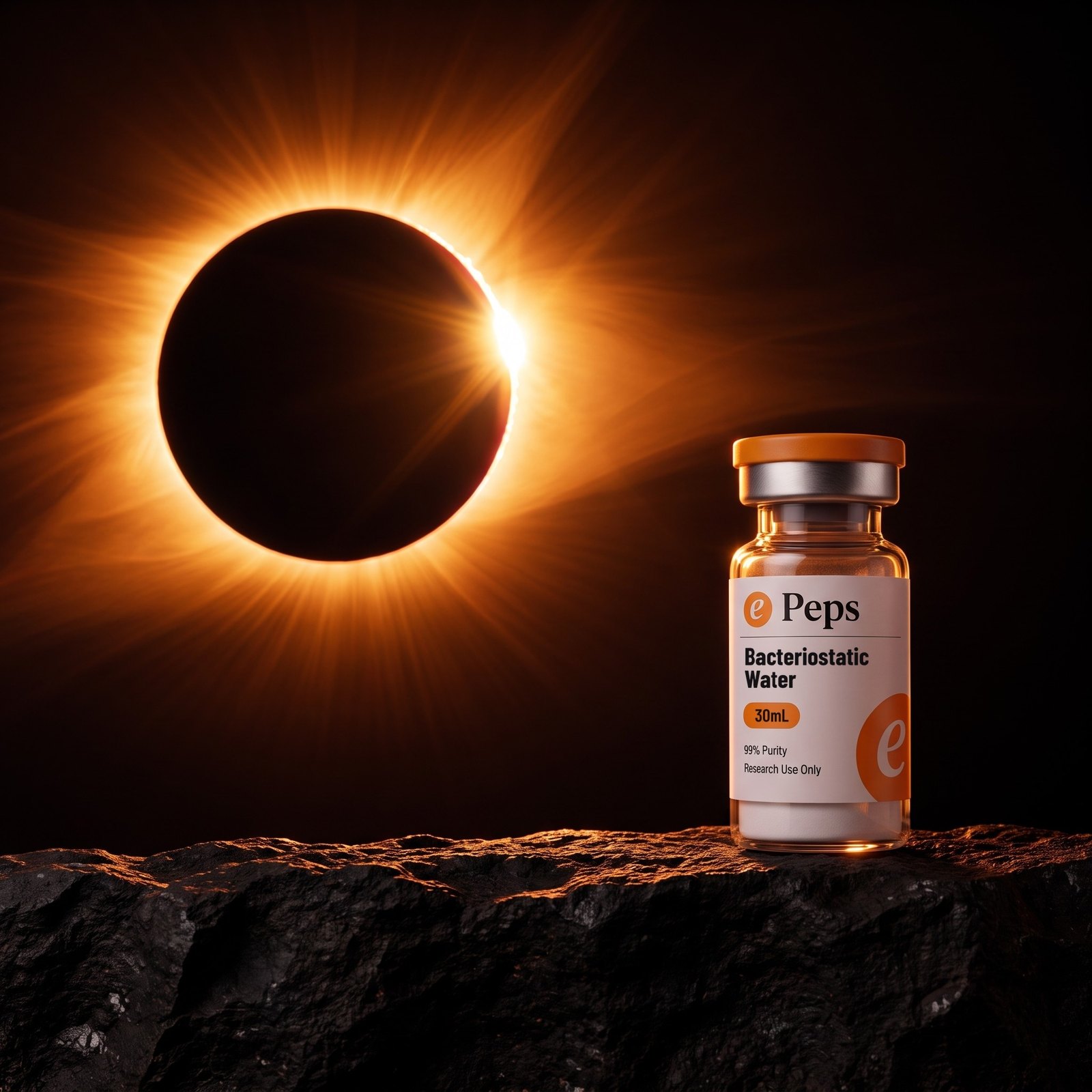
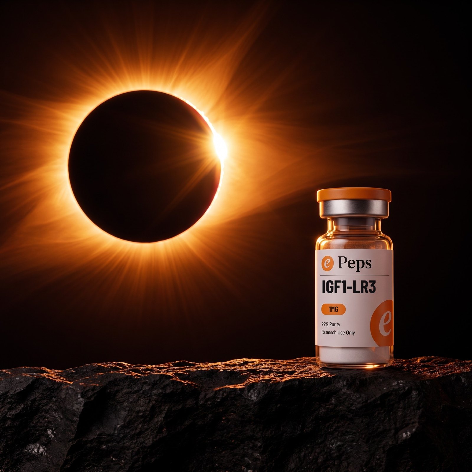
It comes as a pair. The corona is square, vial centred, eclipse directly behind — that is the tile and the carousel frame. The wide sets the eclipse left and the vial right on a ledge, and that is the frame that carries a headline.
Where it goes: campaign, paid media, video, the top of a landing page. Where it does not: a product grid, a spec table, anywhere the job is reading rather than looking.
The corona · 1:1 · the carouselThe wide · carries a headlineePeps Brand BookThe eclipseThe ring
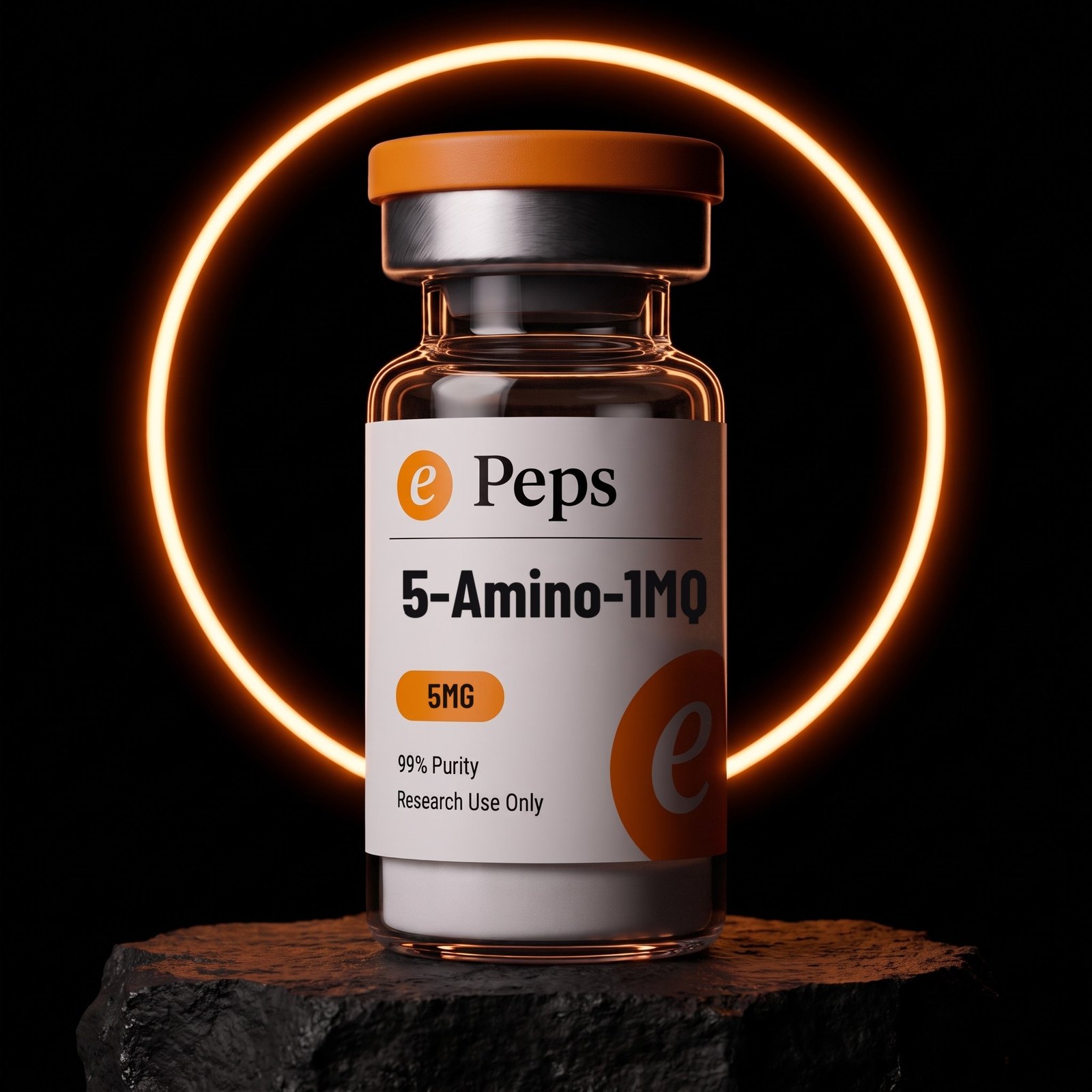
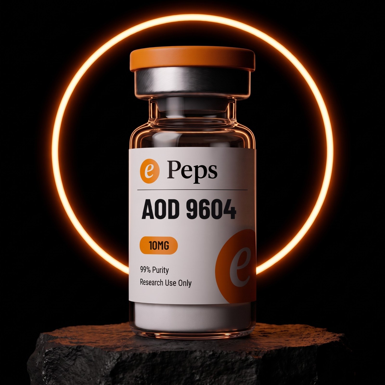
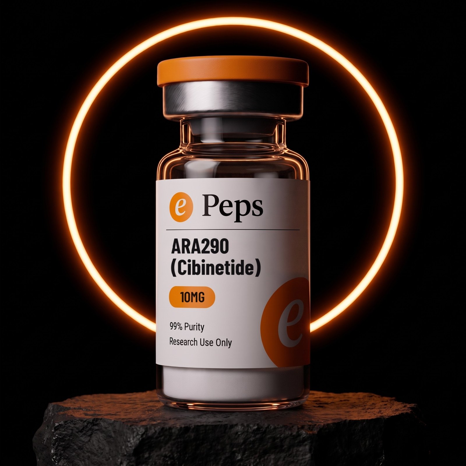
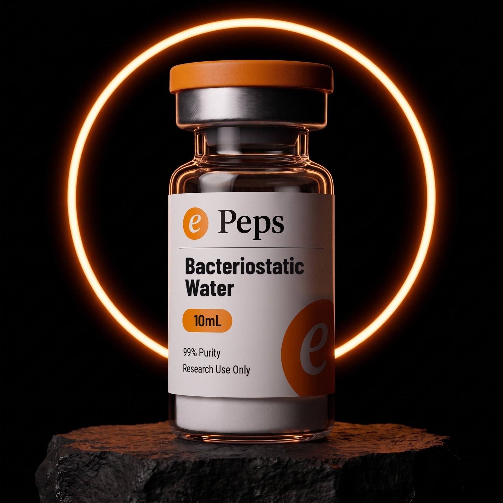
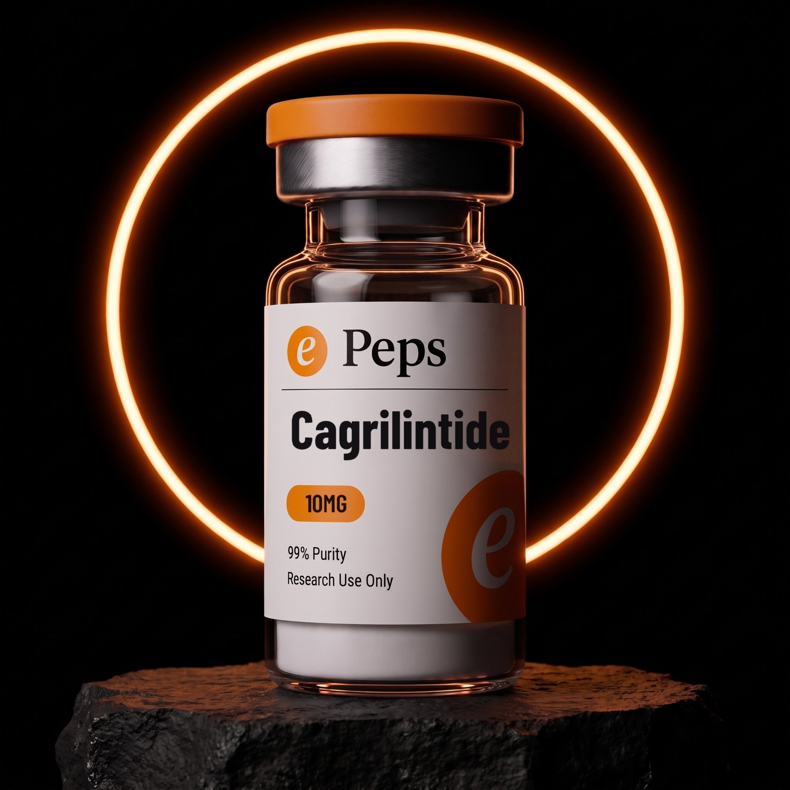
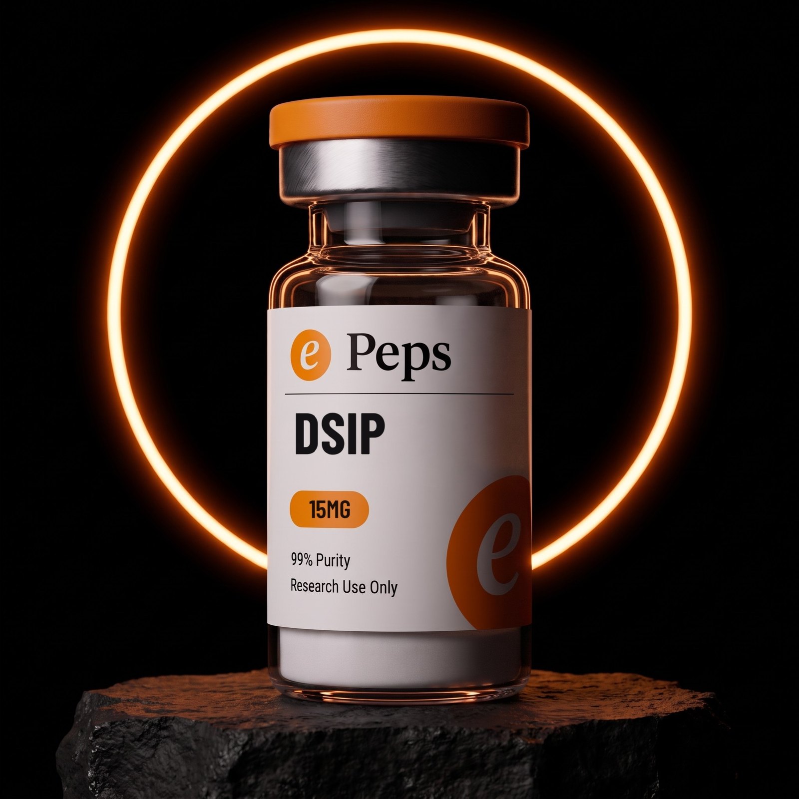
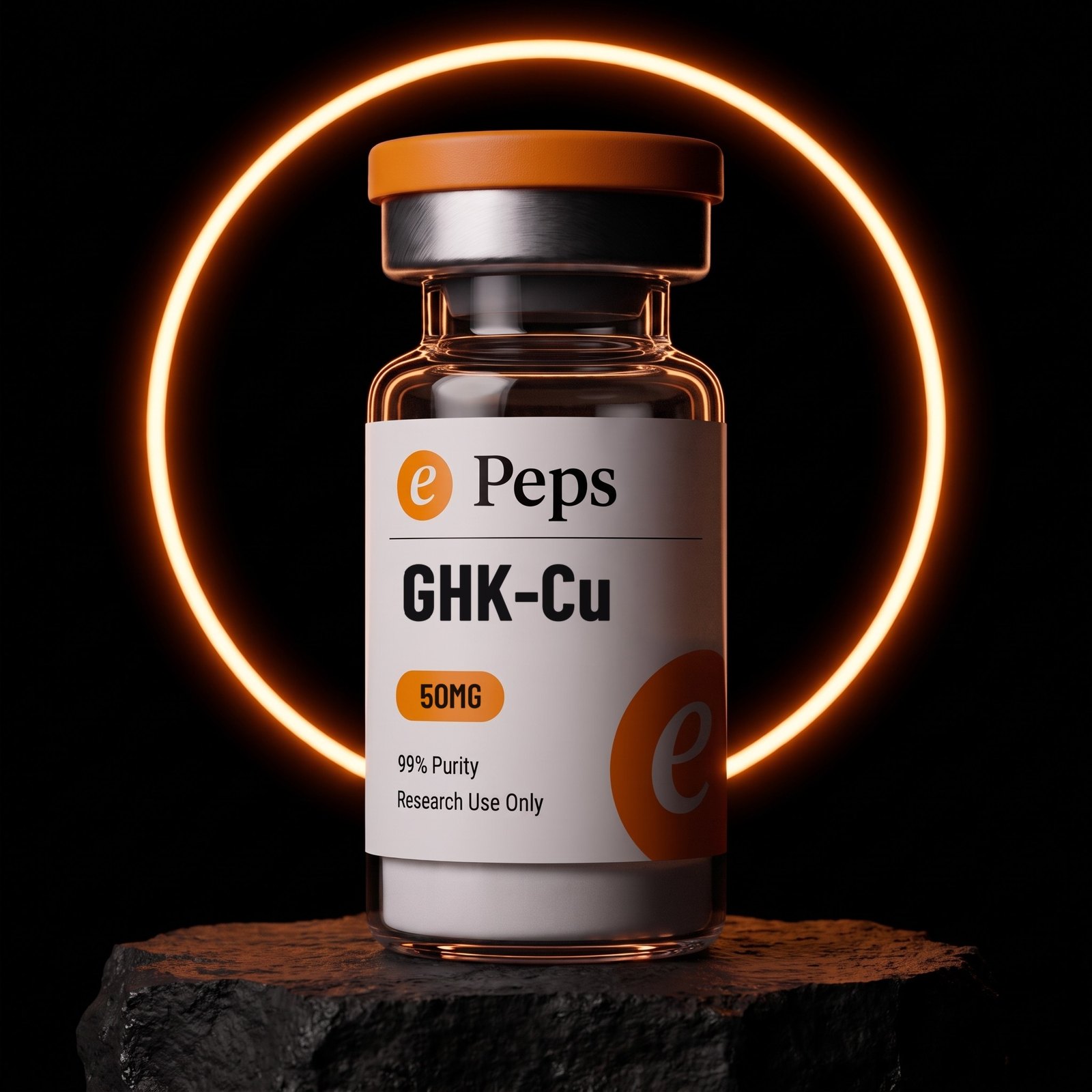
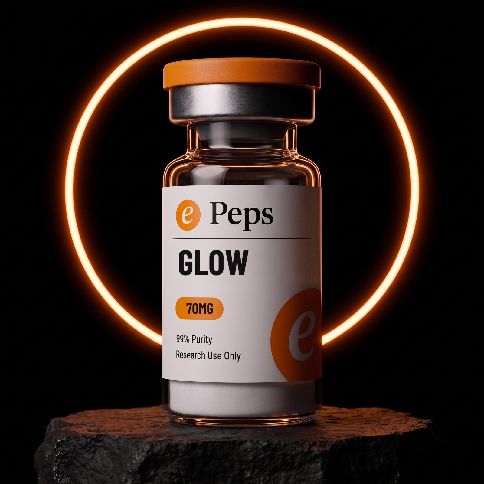
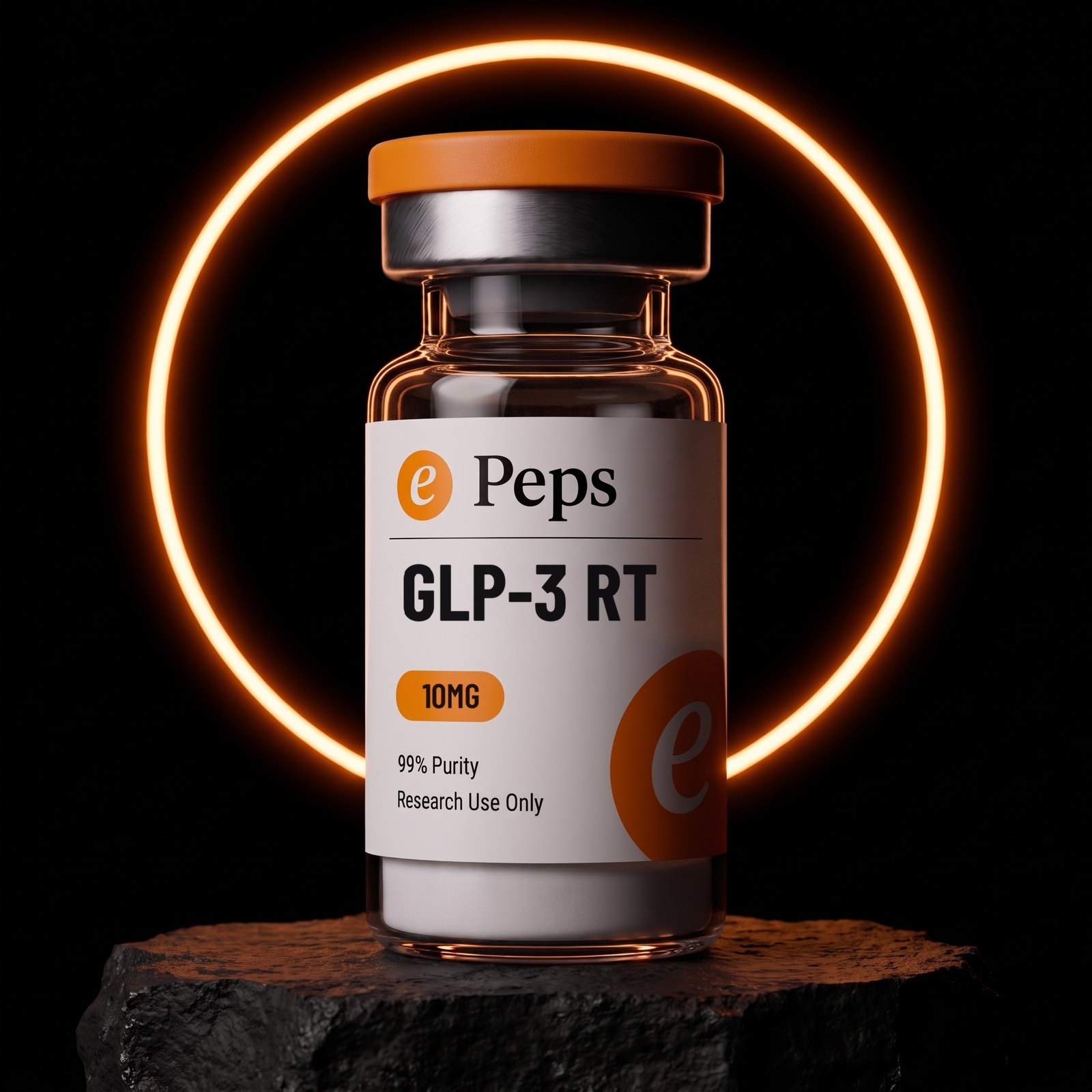
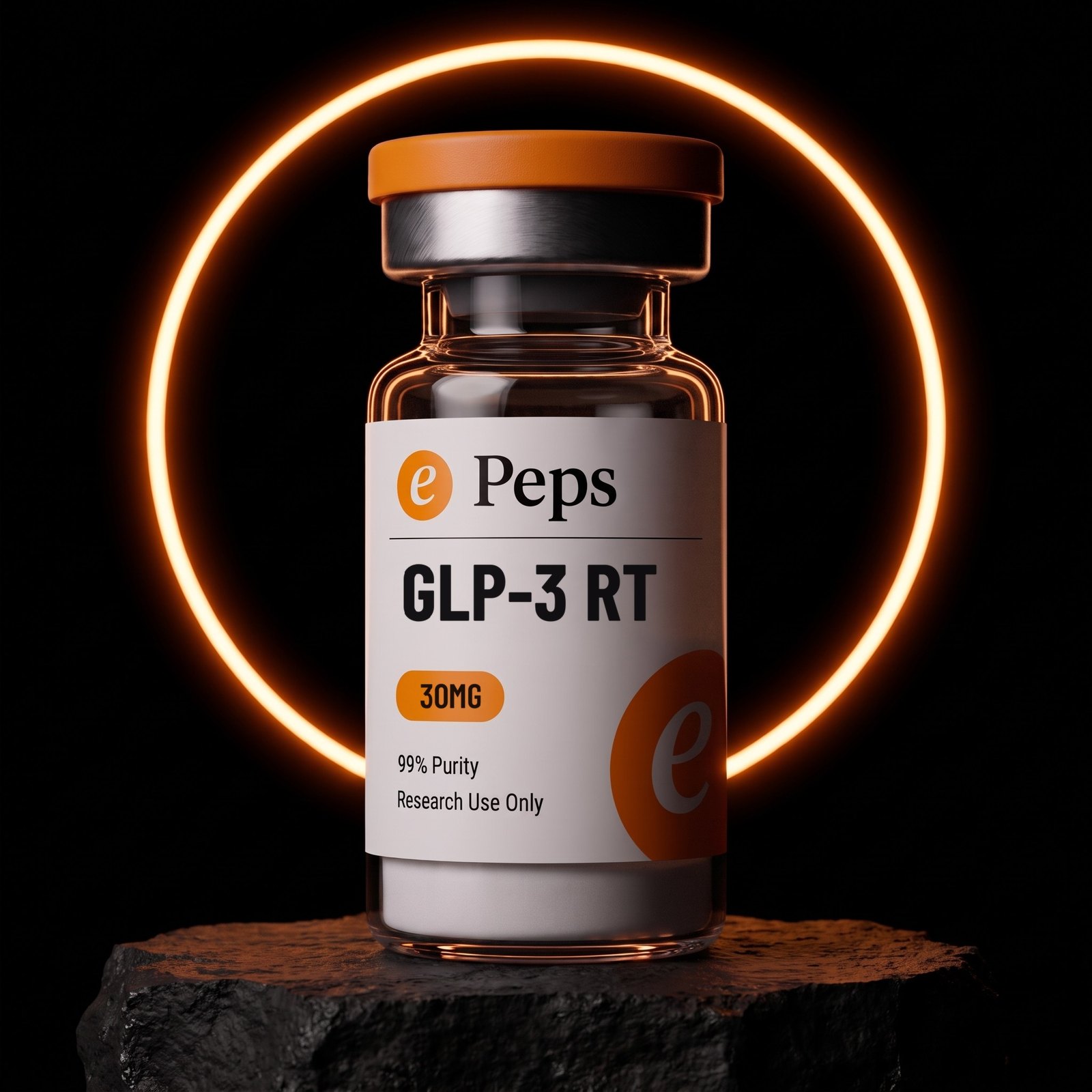
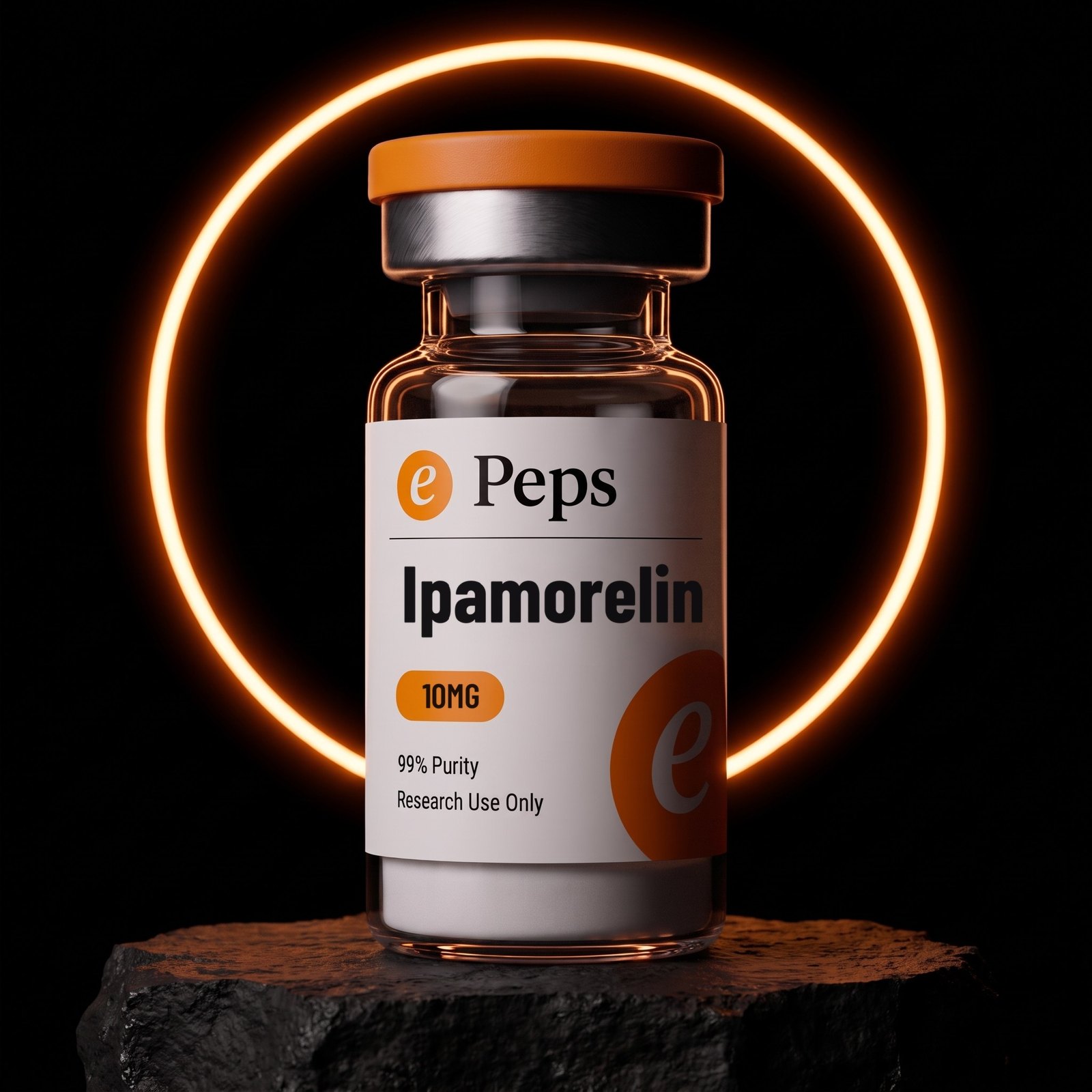
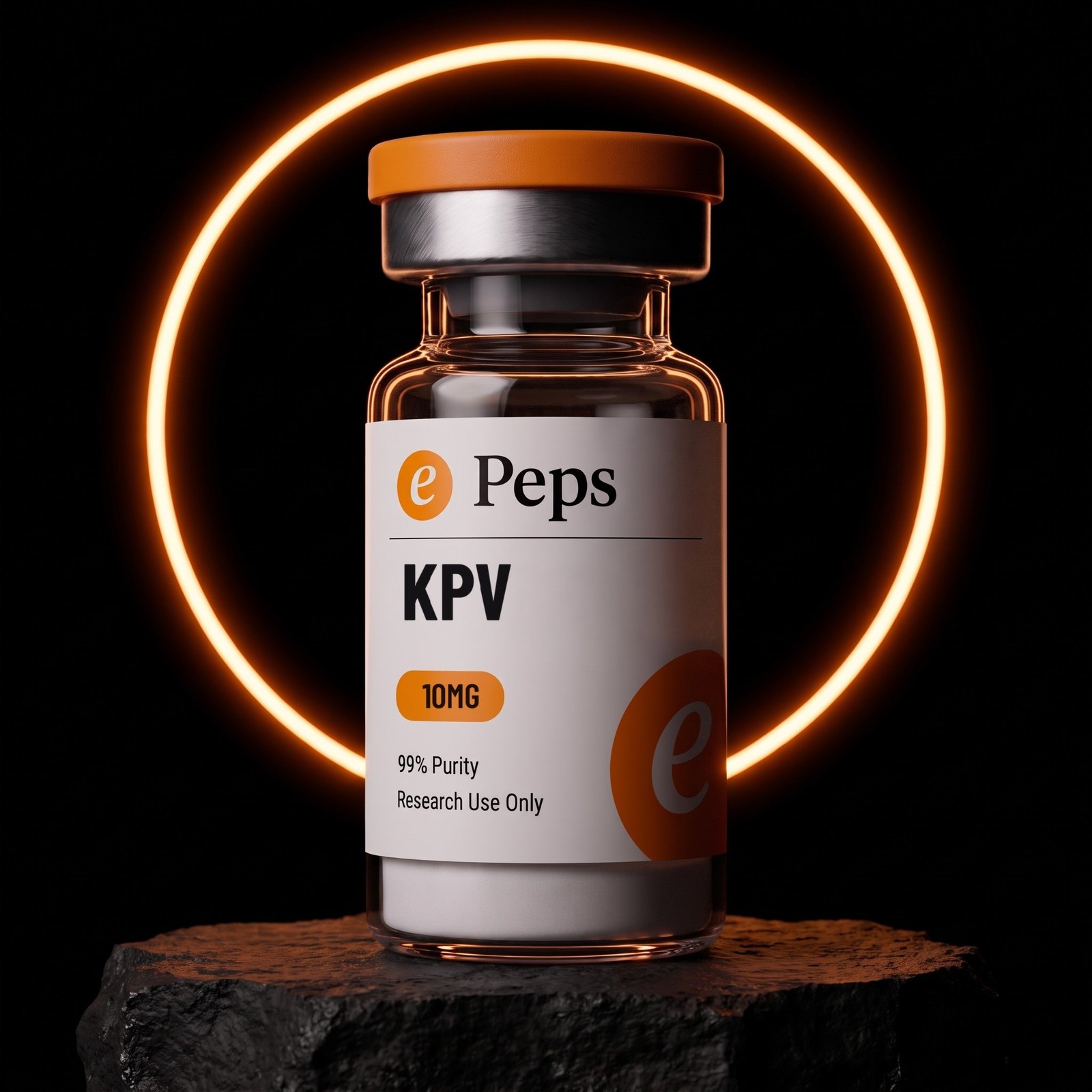
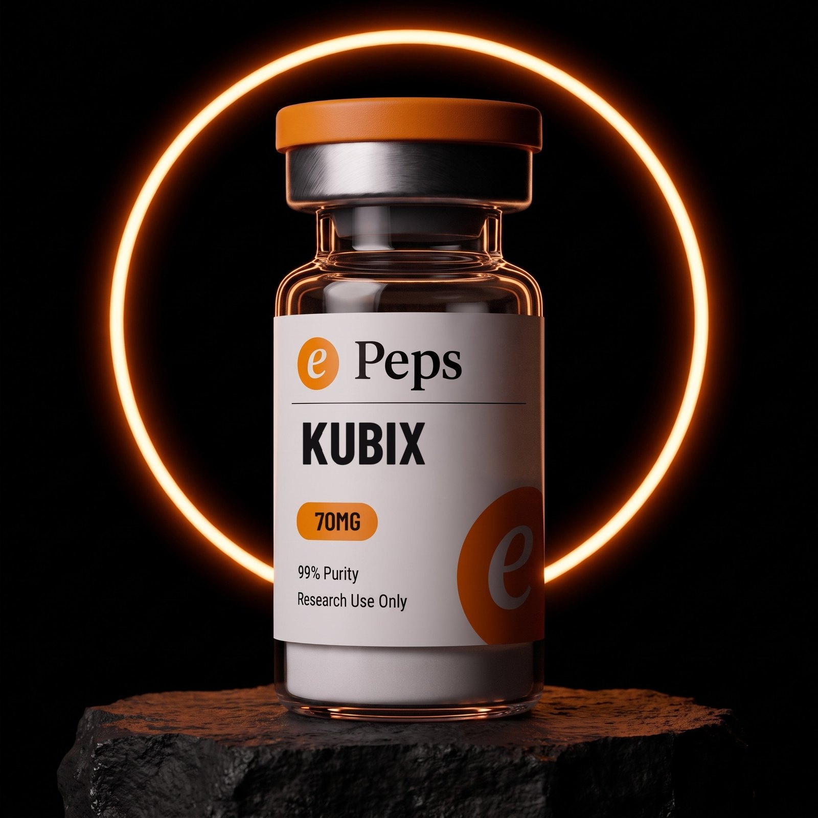
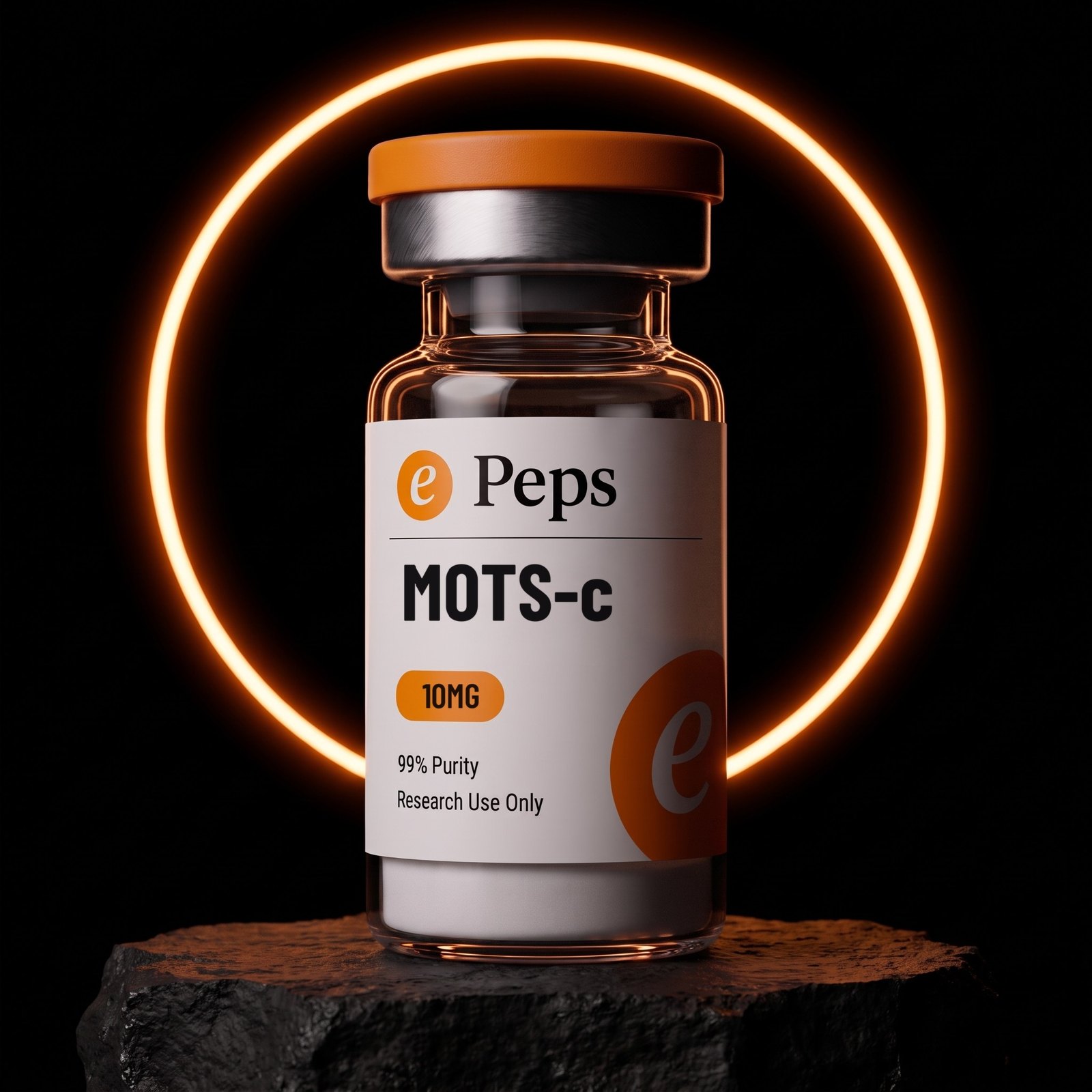
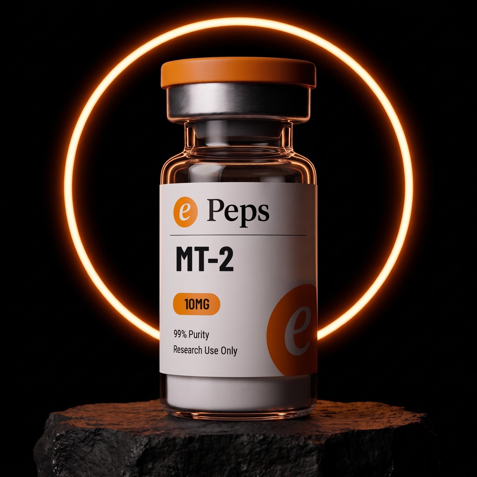
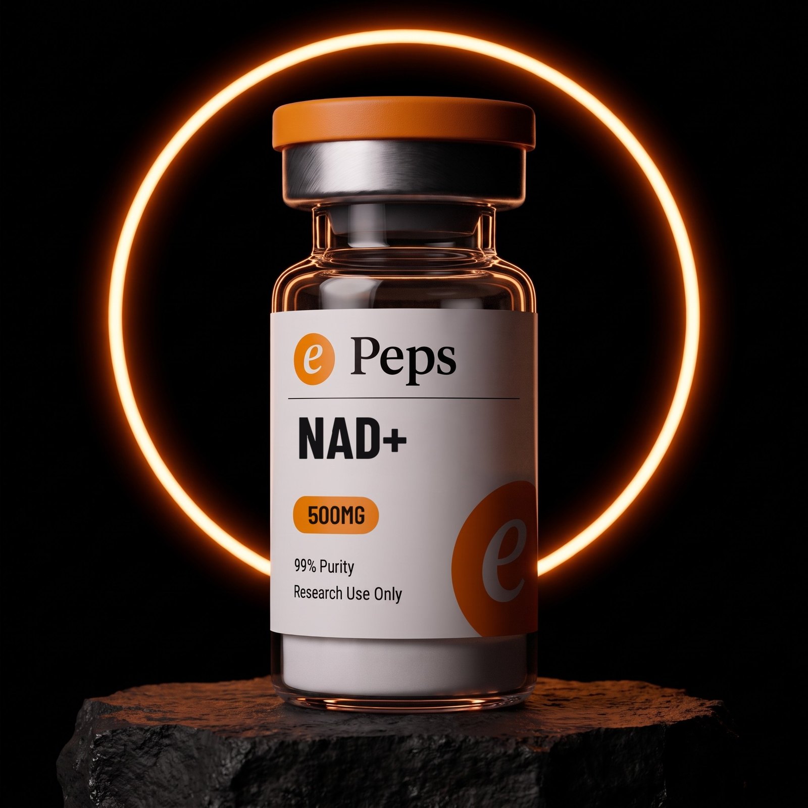
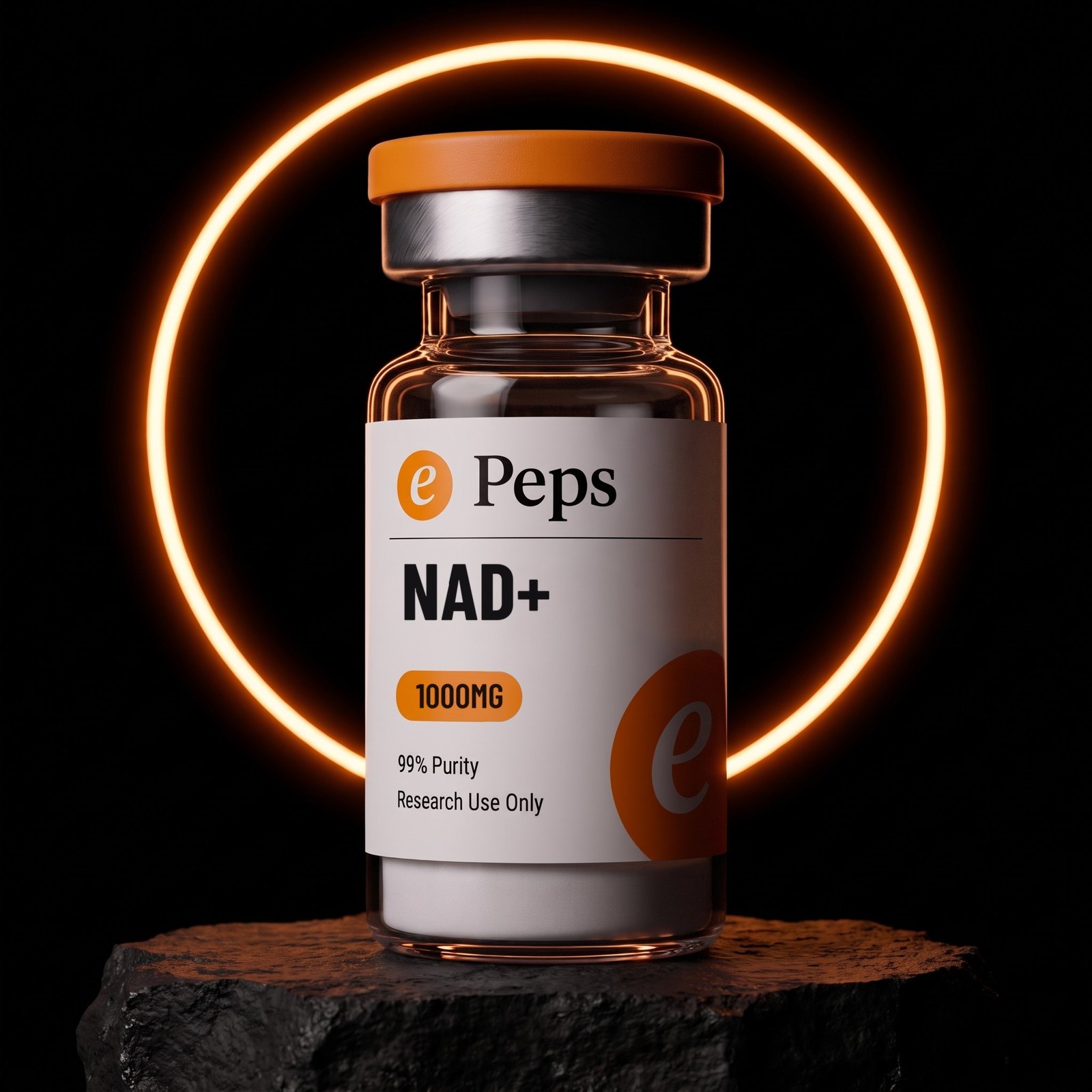
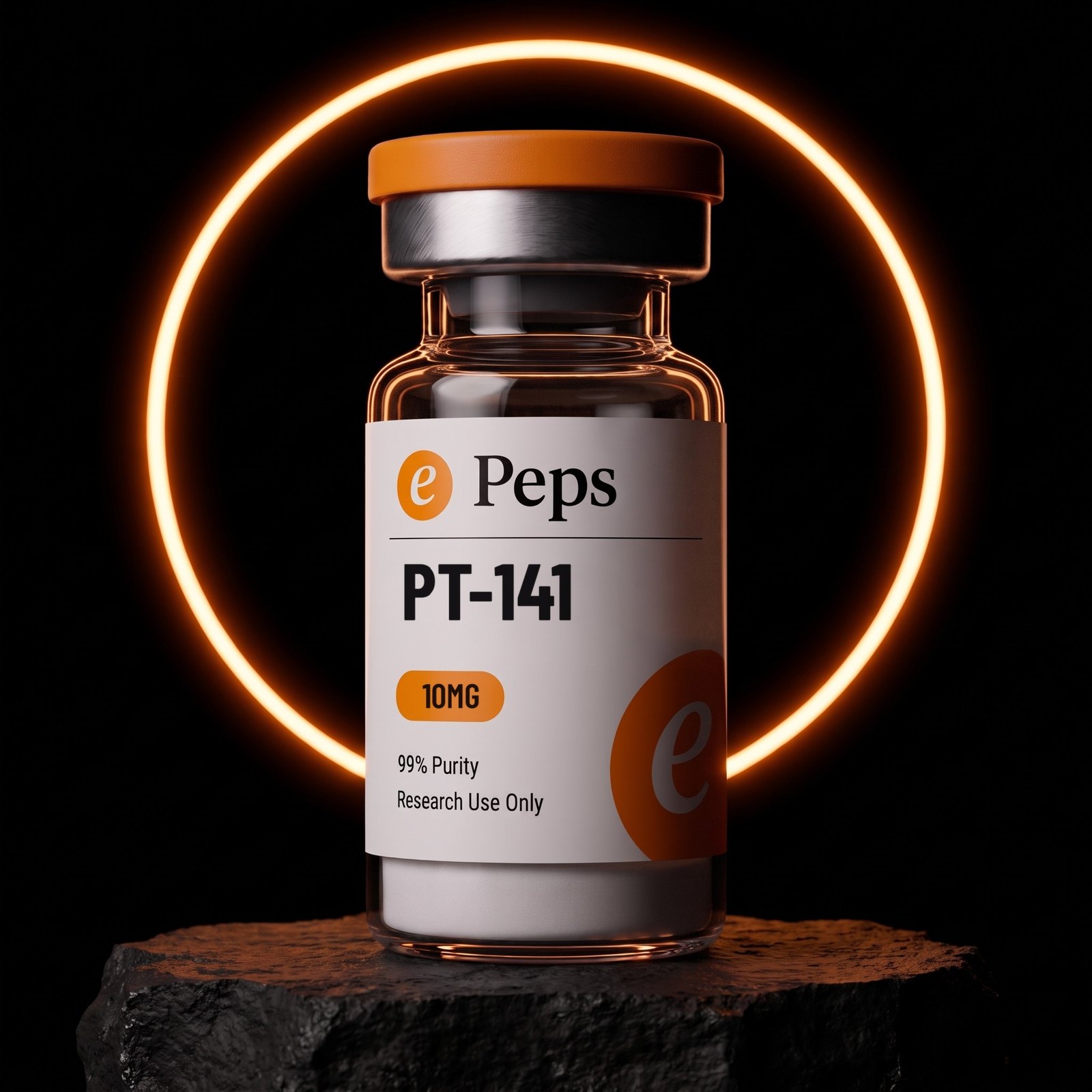
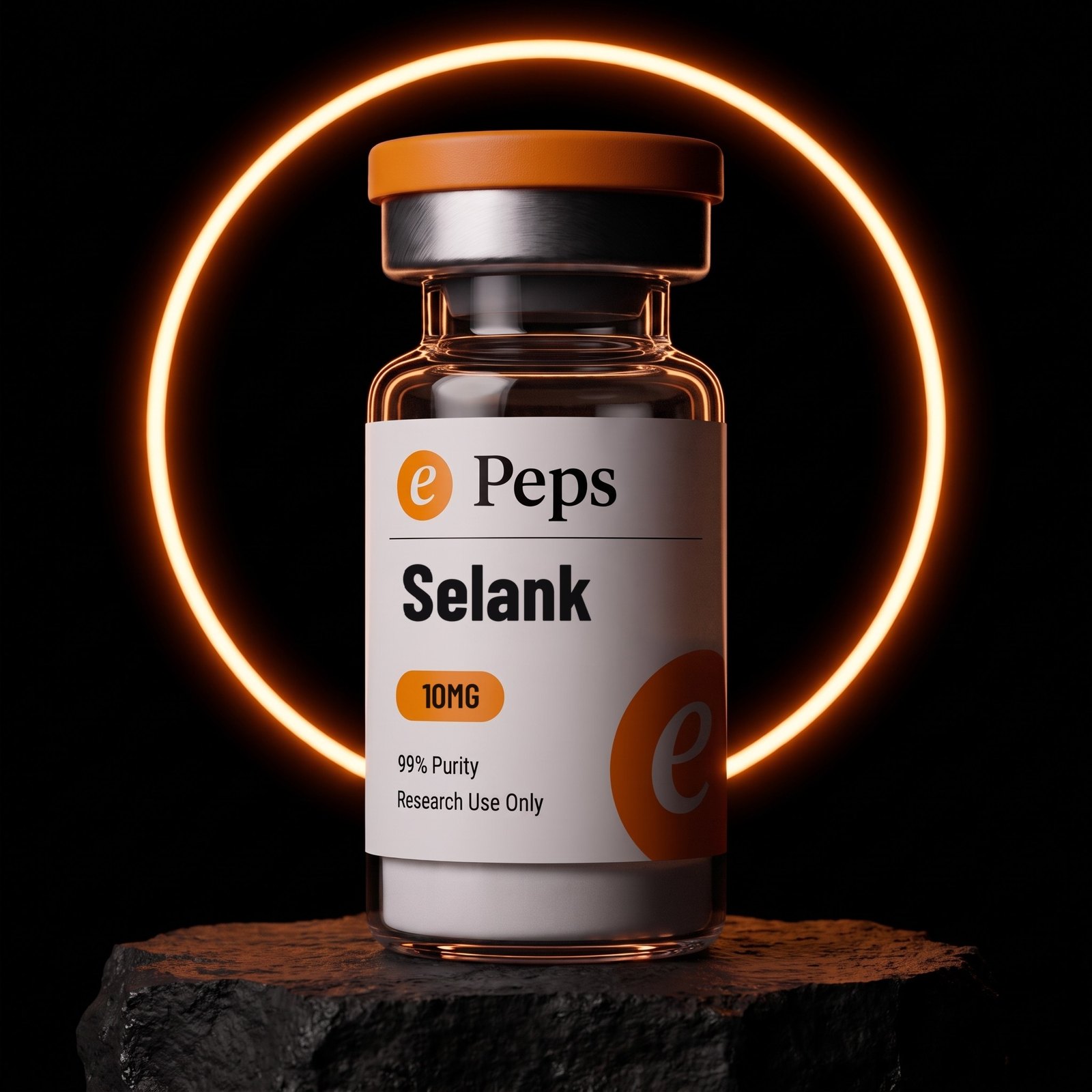
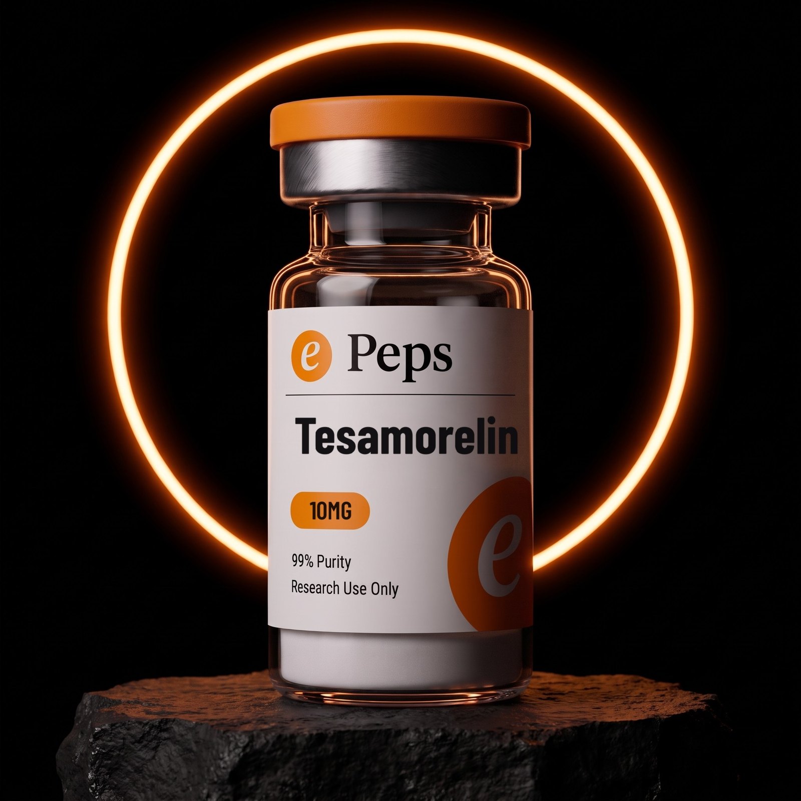
The quiet half of the dark set. One amber light-ring on pure black, the vial on the same dark rock, the ring passing behind the glass and reading through it. Where the eclipse is weather, the ring is a studio.
The ring is a light, not a graphic. It has falloff, it lights the rock, and the glass picks it up. Drawing a circle behind a vial in a layout tool is the failure mode this set exists to prevent.
It is the second frame, never the first. It is what runs when a page already has the eclipse and needs a second dark image that does not compete with it.
One ring. It never doubles, never becomes an arc, never changes colour away from amber.
 5-Amino-1MQ
 ADAMAX
 AOD 9604ePeps Brand BookThe ring
The bench
The only set with a person in it, and you never see them. A white nitrile glove holding one vial at the fingertips, a warm out-of-focus laboratory behind — amber glassware, bokeh, no readable equipment.
It is the trust frame. It runs where the page is making a claim about how the product is made and handled: the top of the homepage, about, quality, COAs. It is not a product shot and it never appears in a product grid.
The glove is the whole figure. No face, no arm, no lab coat, no second hand, no second vial. Anything more and the frame starts making a medical suggestion the brand does not make.
The vial keeps its printed label and stays square enough to read. The background stays unreadably soft on purpose.
The bench · the trust frameWhere it runs
Homepage hero · About · Quality · COAs · Batch documentation
Where it does notProduct grids · PDP galleries · Anything implying use in a person
ePeps Brand BookThe benchThe box
Black rigid box, white wordmark, black foam. The lid carries the full lockup in white, centred. The tray is cut foam holding one vial upright. It is the only place the brand is black on black.
It is always shot open and at an angle. Three-quarter, lid hinged back, one vial seated, warm light raking across the texture of the board so the black reads as a material rather than a hole.
It is the delivery promise, so it runs where delivery is the subject. Shipping, packaging, wholesale, the unboxing frame of a video. One box, one vial; a stack of boxes is a different, unmade picture.
The wordmark on the lid is the only white in the frame apart from the label. Nothing else is printed on the box.
The box · open · three-quarterThe lockup on the lidWhite, centred, nothing else printed
White, centred, nothing else printedePeps Brand BookThe boxThe product set
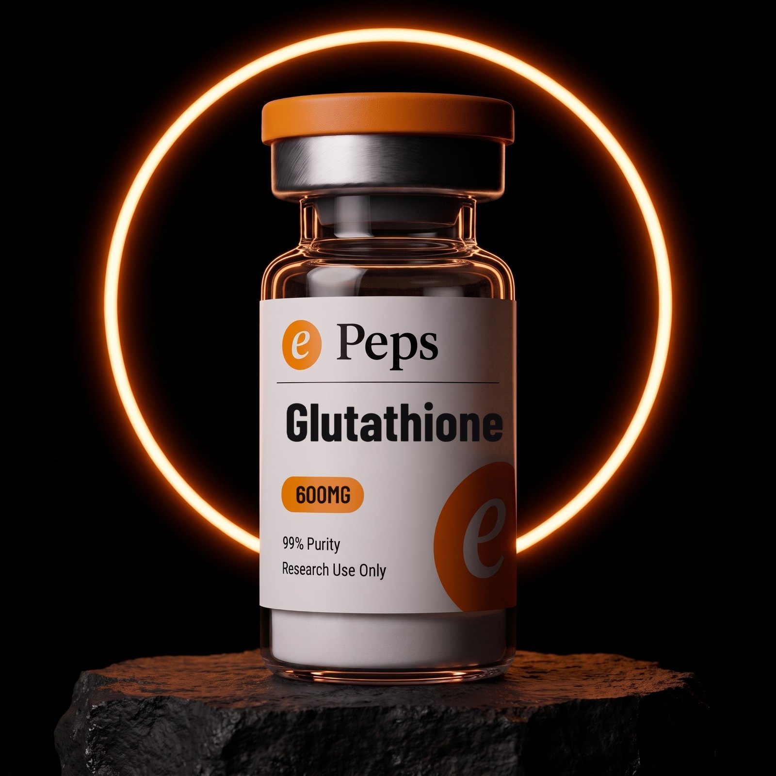
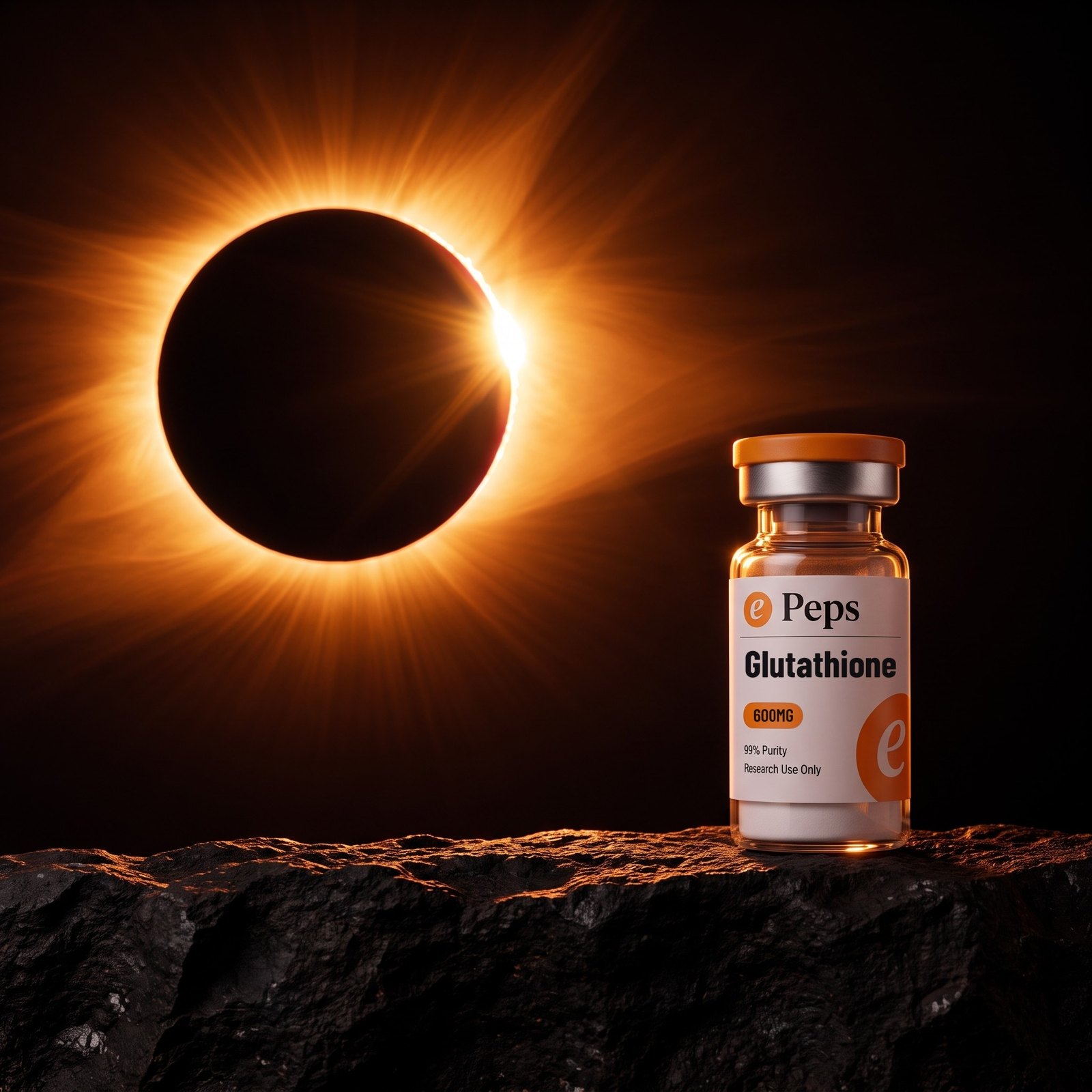
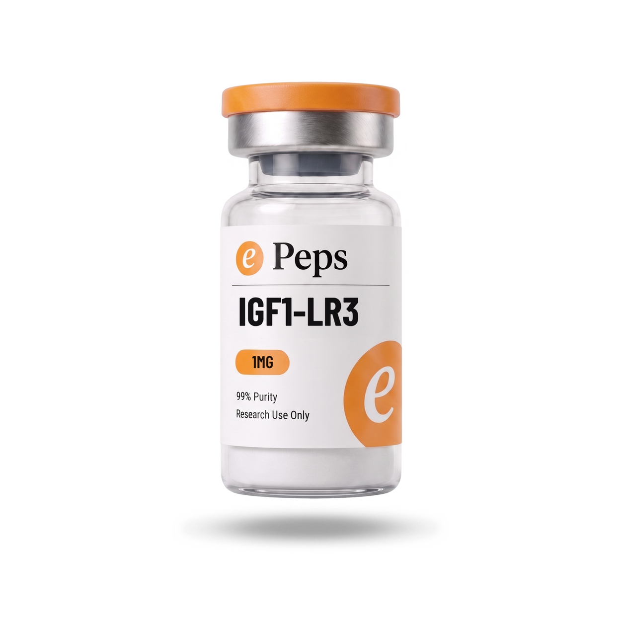
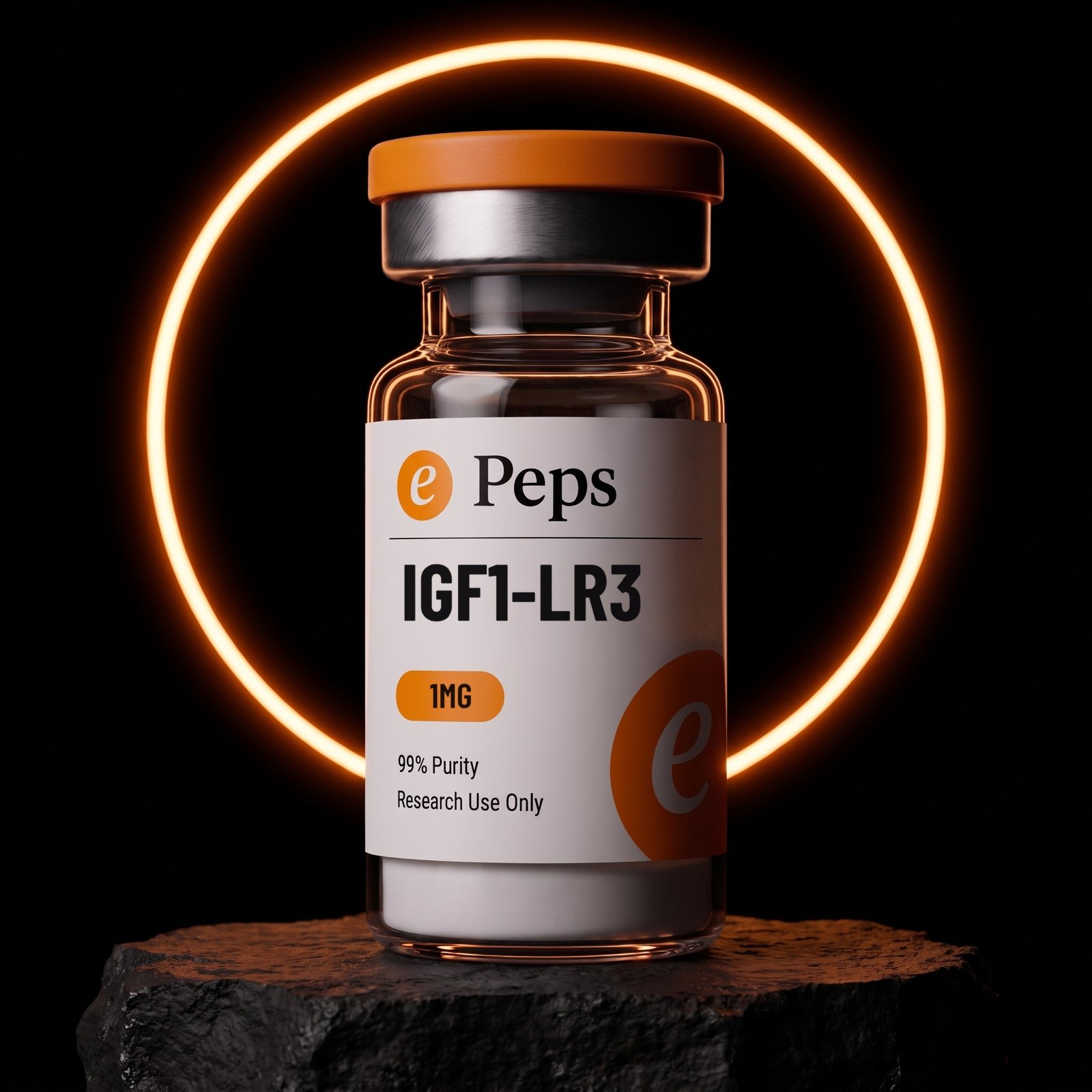
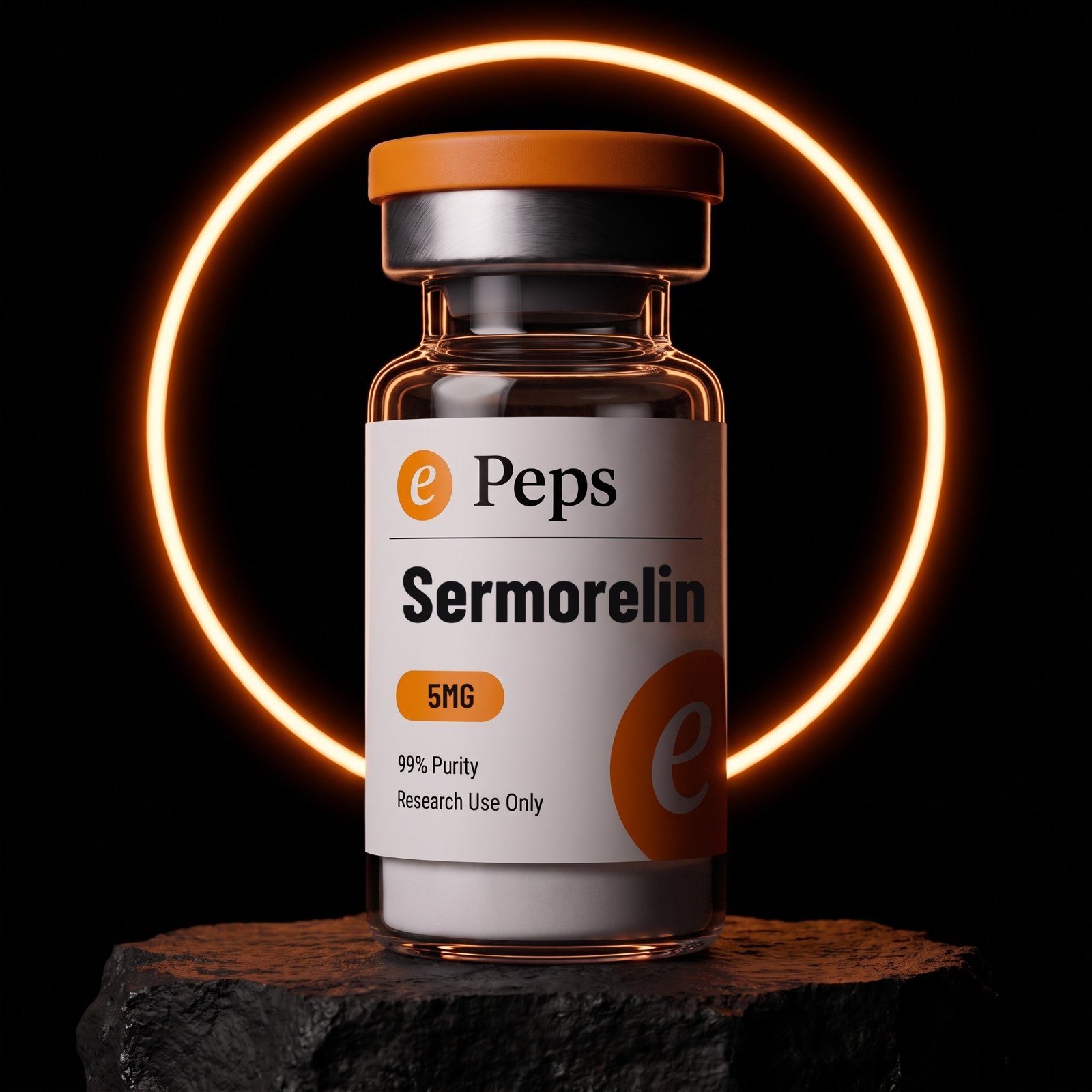
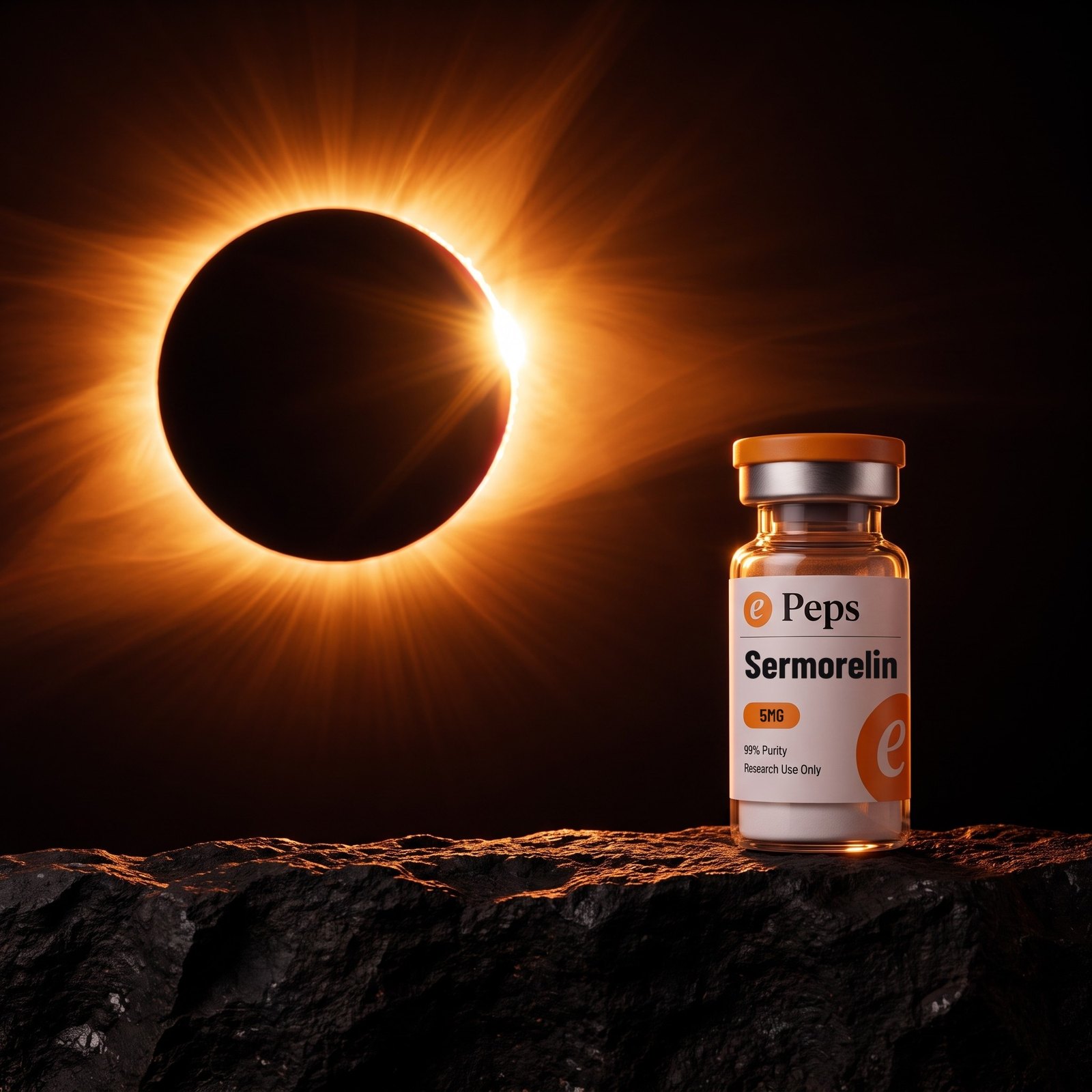
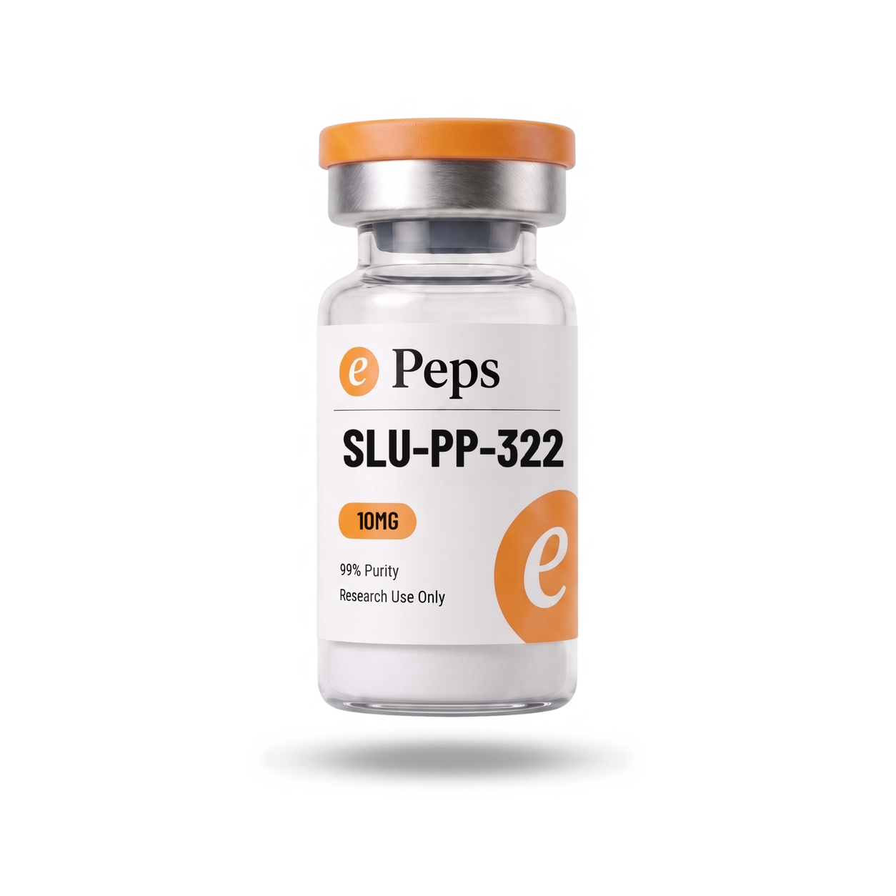
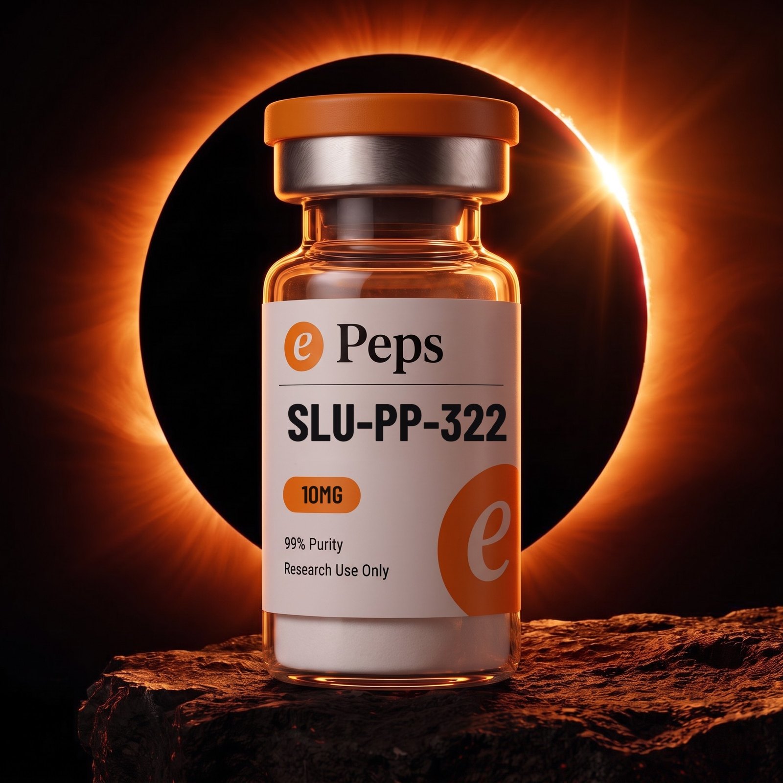
Every SKU gets the same four. The card on white, the corona, the ring, the wide. The card is the tile everywhere a product is listed; all four are the carousel, in that order.
The order is fixed and it is not copy. Card leads because a shopper scanning a grid is reading labels, not looking at photographs. The eclipse comes second because it is the brand’s best frame, and the ring third because it is the calm one.
Labels are checked at full zoom before anything goes live. Compound name, dose, purity and the research-use line have to be correct and legible in the master, not just in the thumbnail.
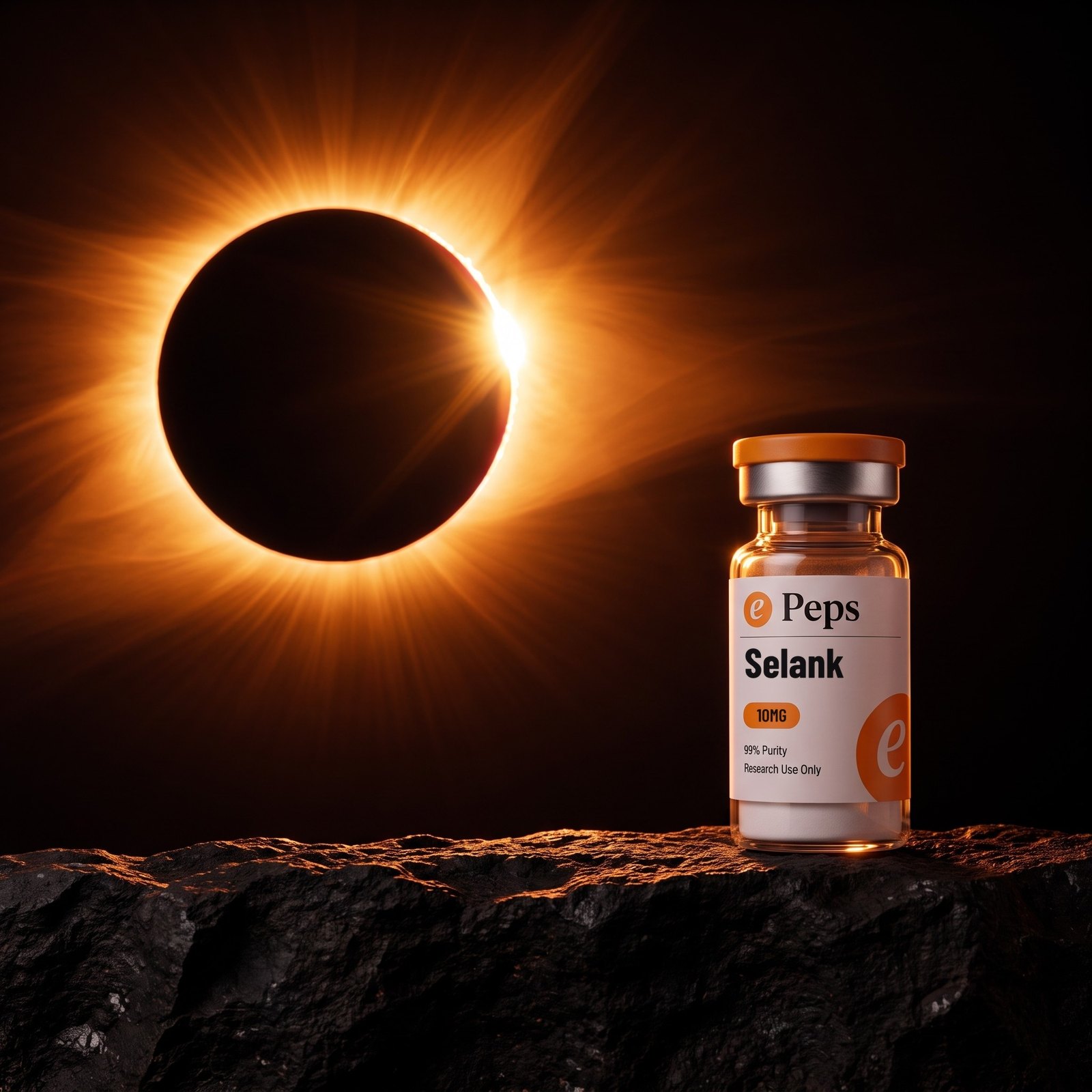
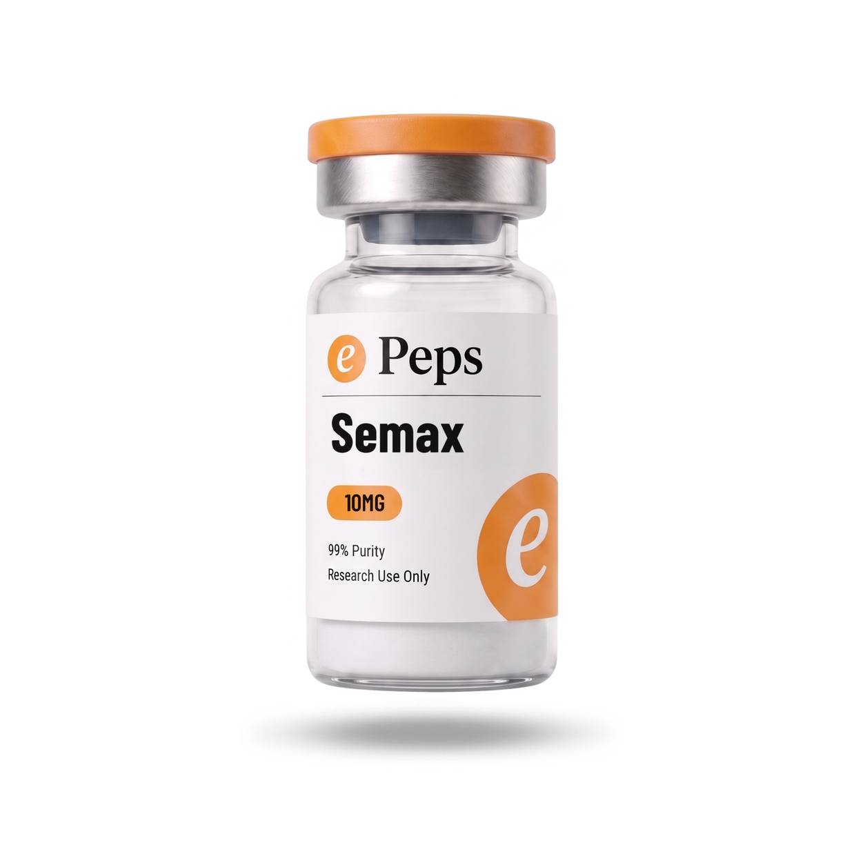
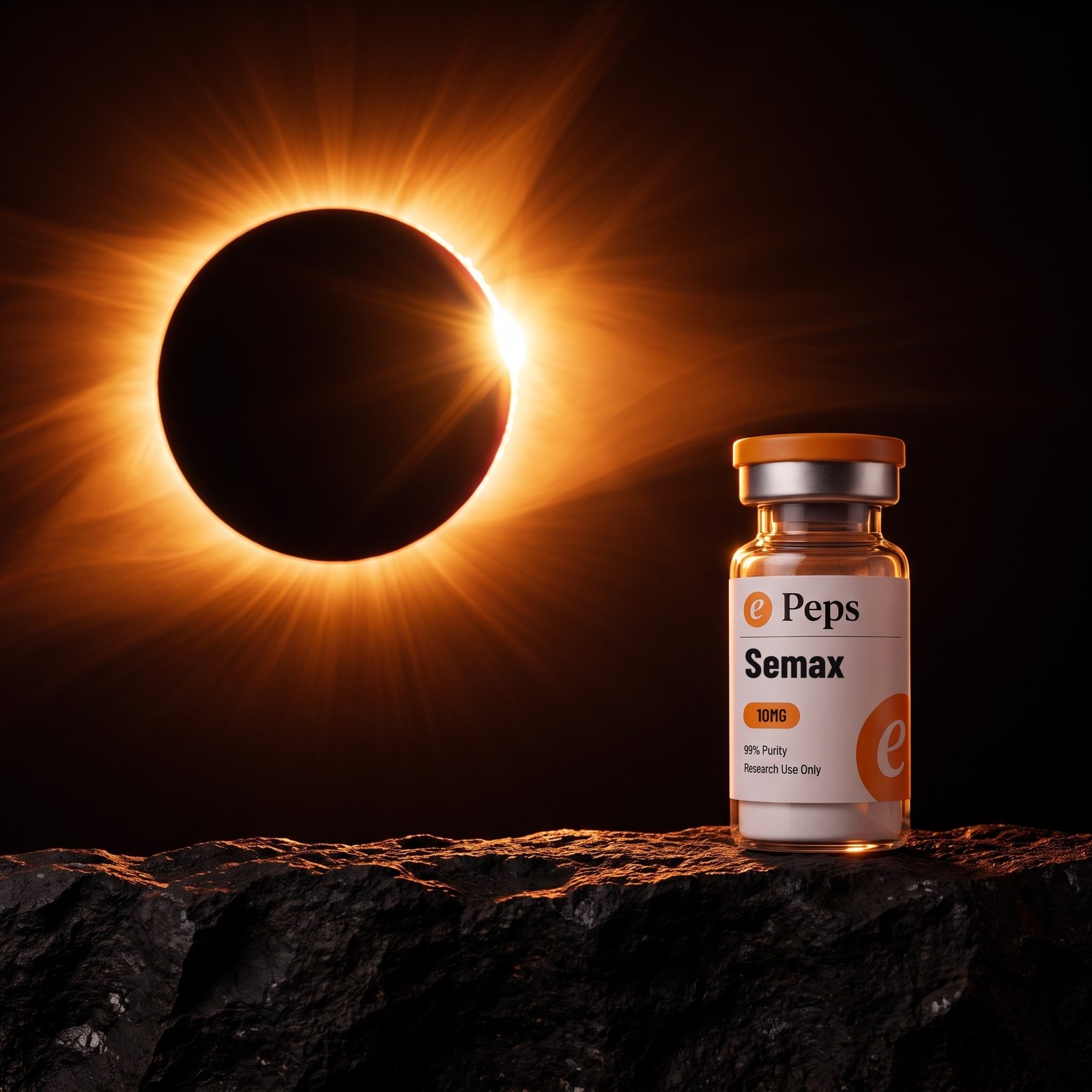
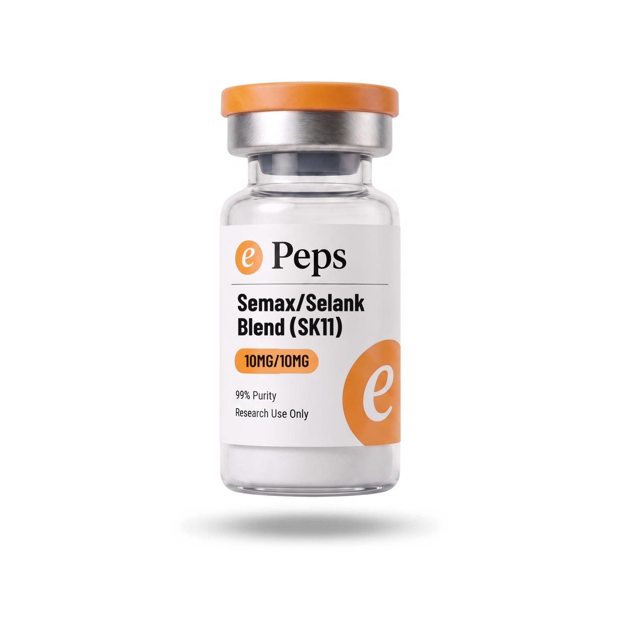
Rendered: 43 products, four core shots each, 172 plates. Every one of them is on the next sheet.
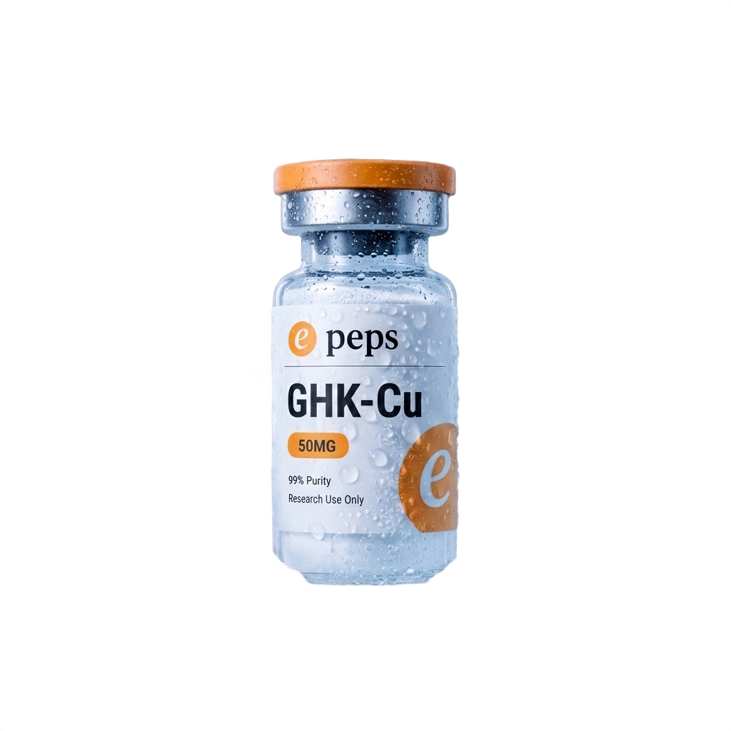
01 · Card · 1:102 · Corona · 1:103 · Ring · 1:104 · Wide · 1:1ePeps Brand BookThe product setEvery product
All 43, every shot. The four core frames in running order for each SKU. Tap any shot to open the master.
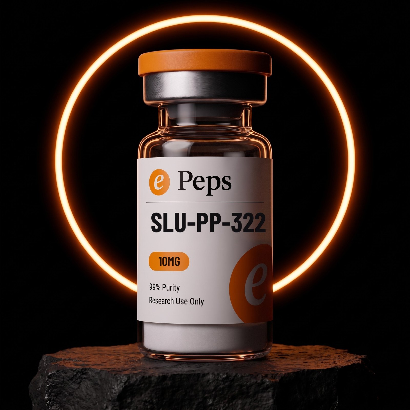
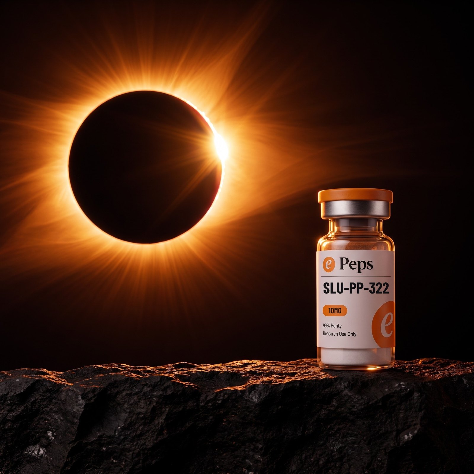
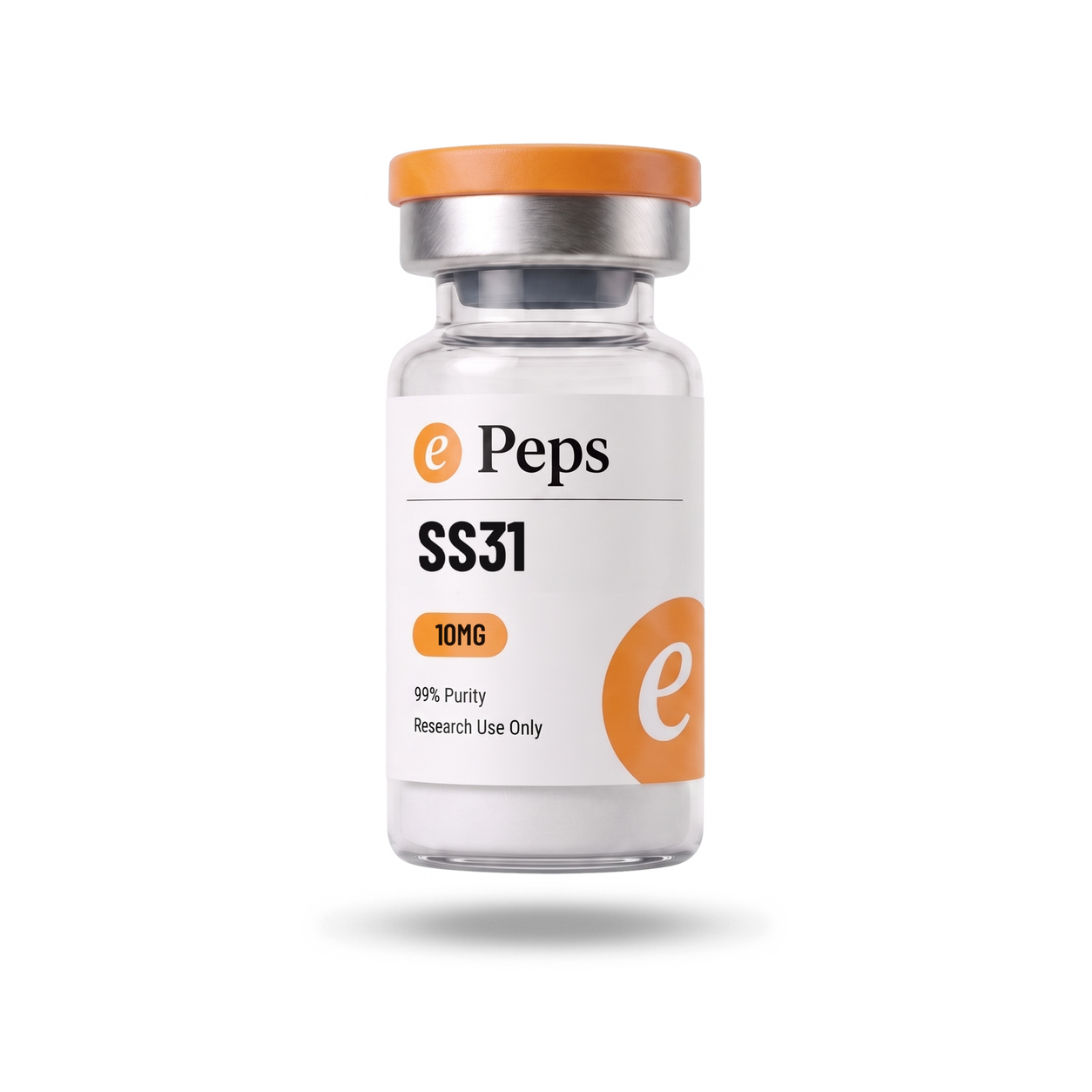
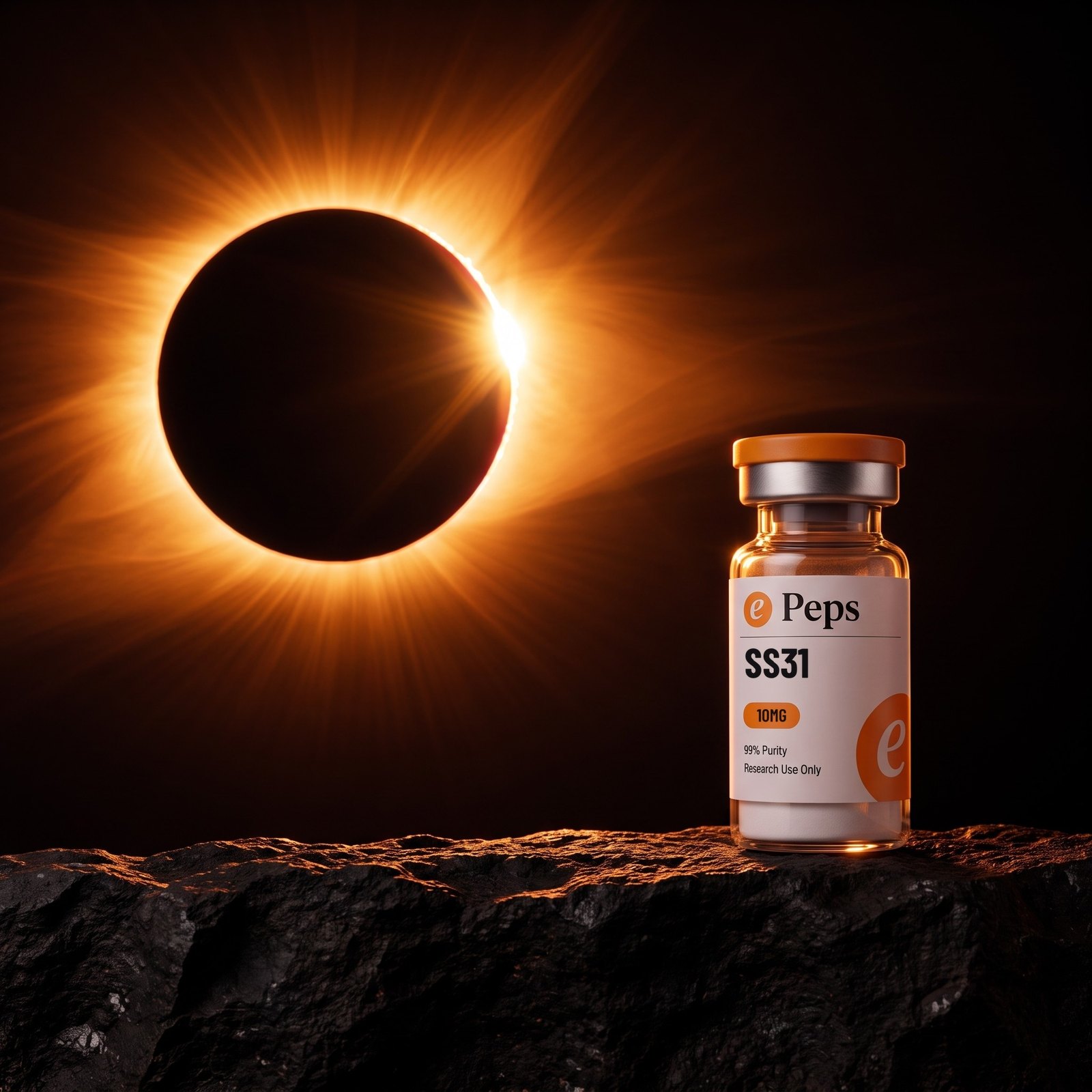
172 plates. Thumbnails here; the files are the masters in /epeps-products.
This sheet is generated from the catalogue and the plate folders themselves, so a gap here is a gap in the shoot, not in the book.




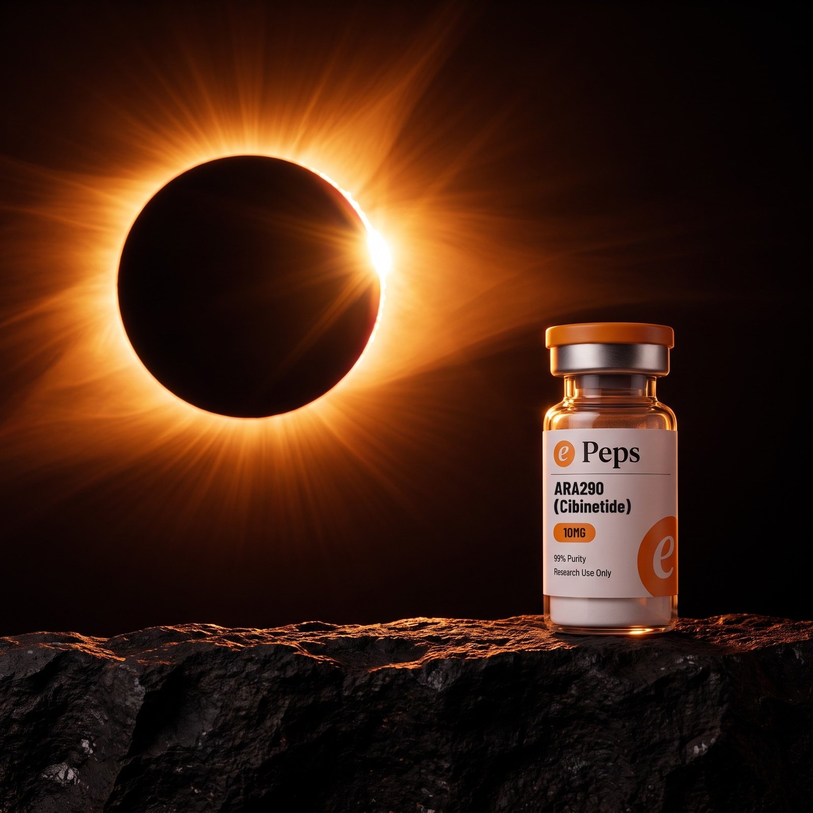
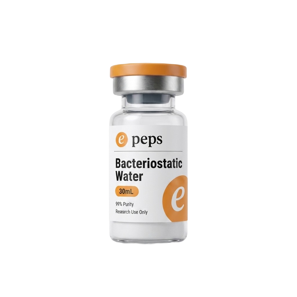
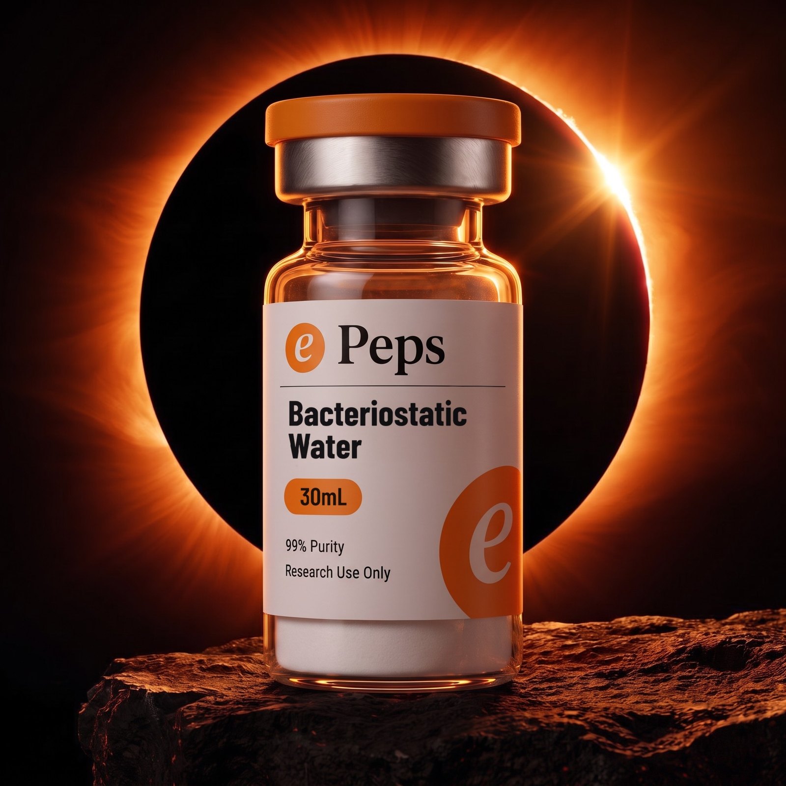
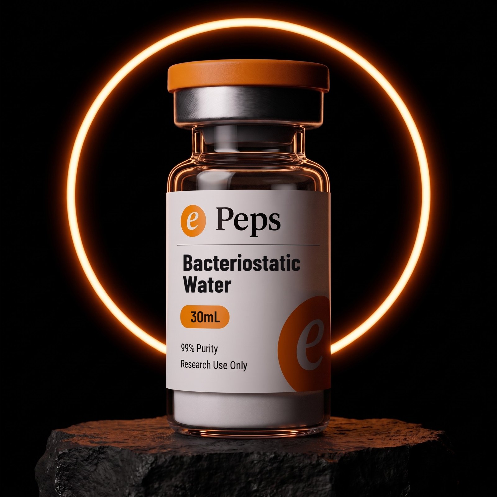
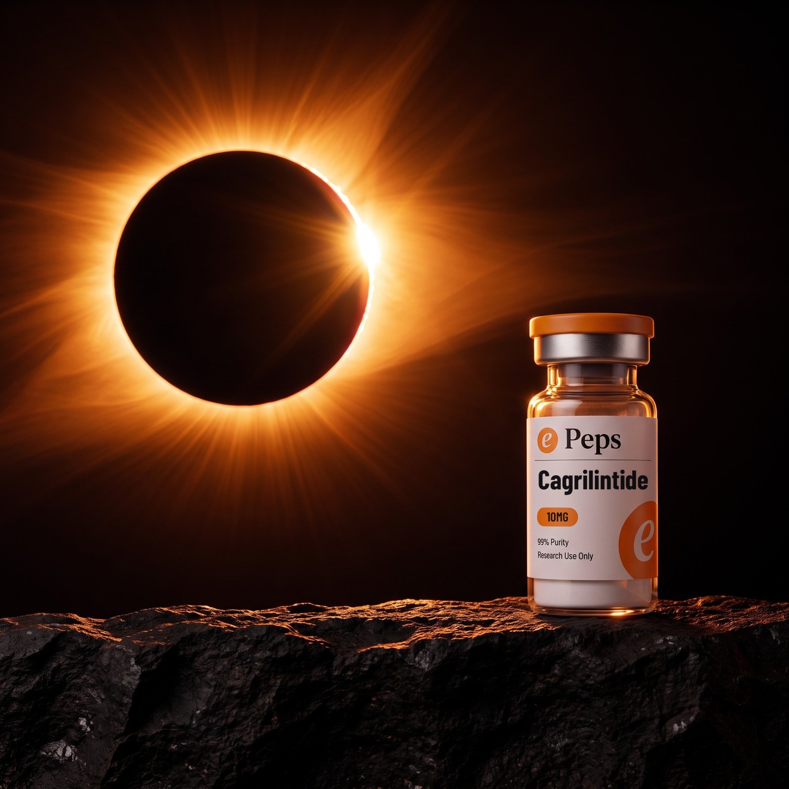
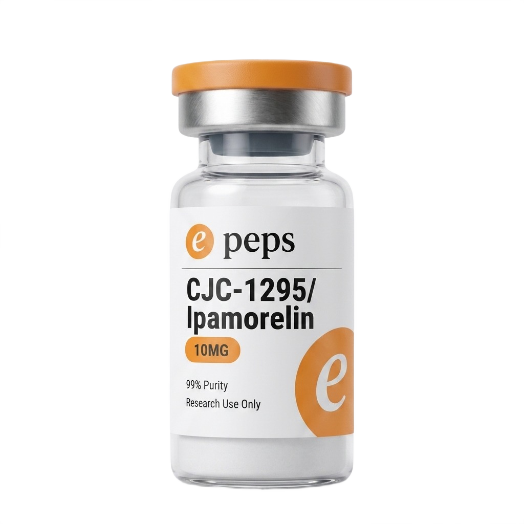
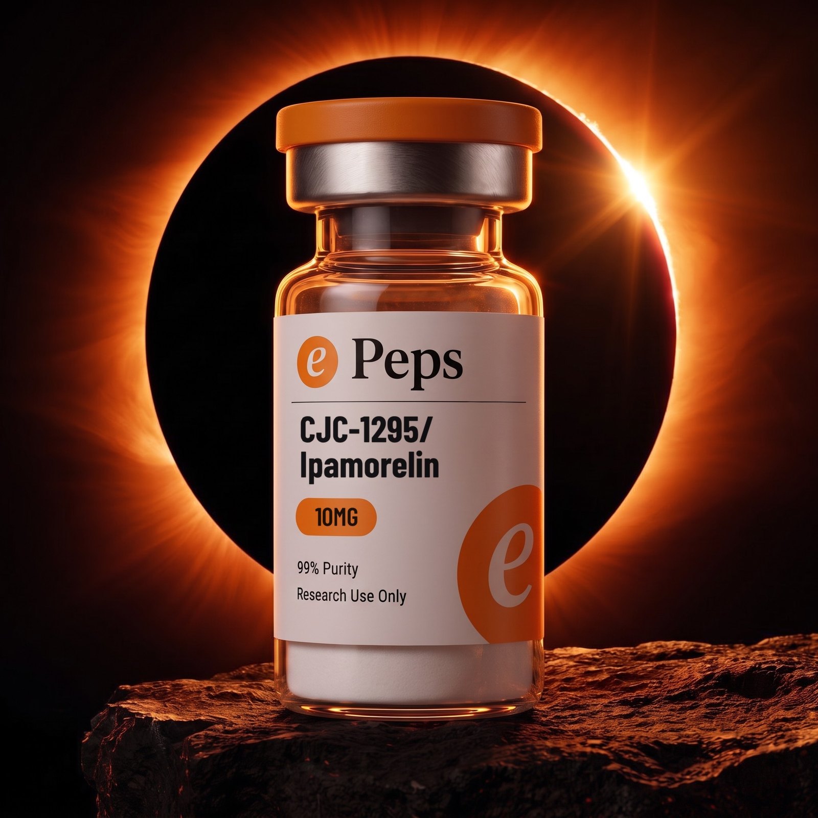
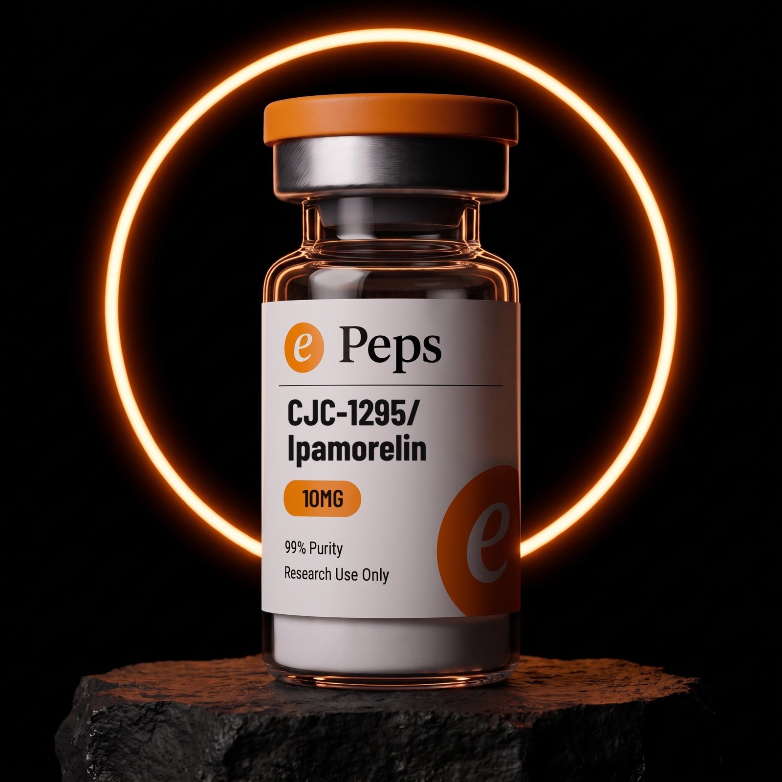
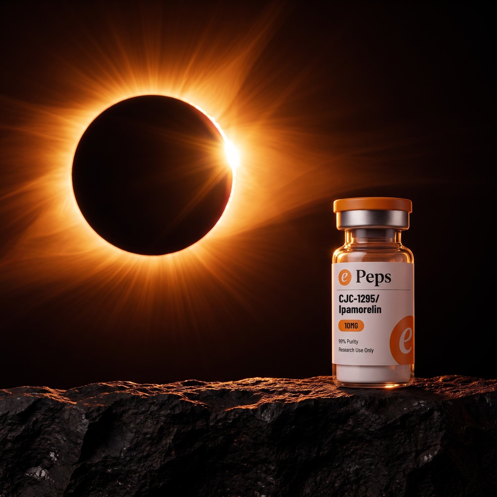
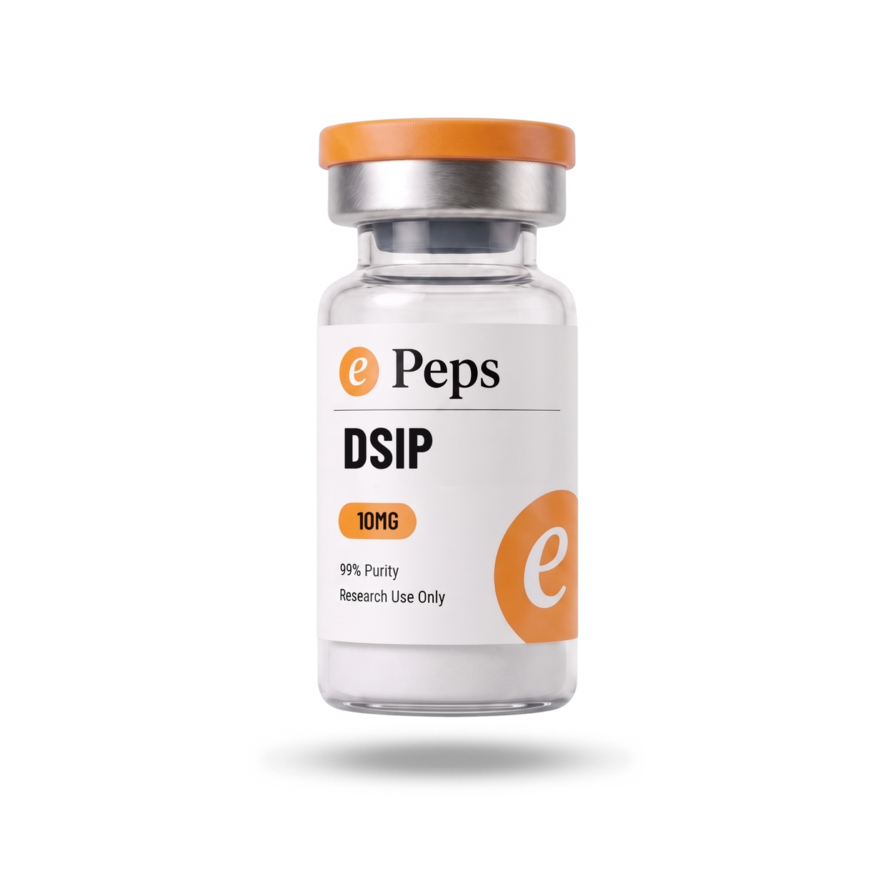

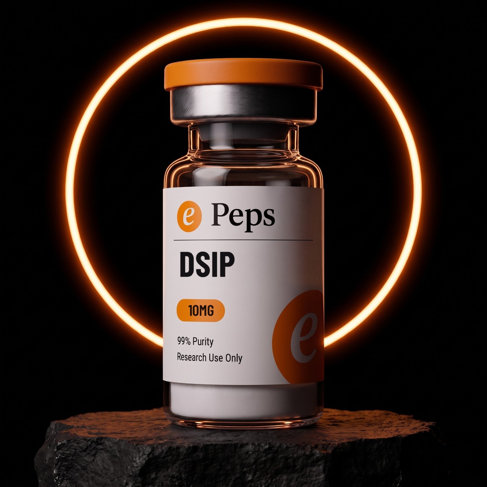
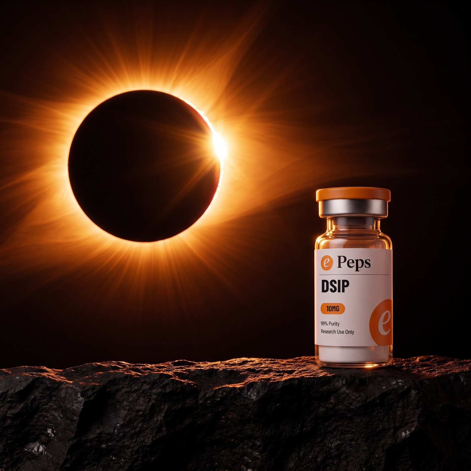



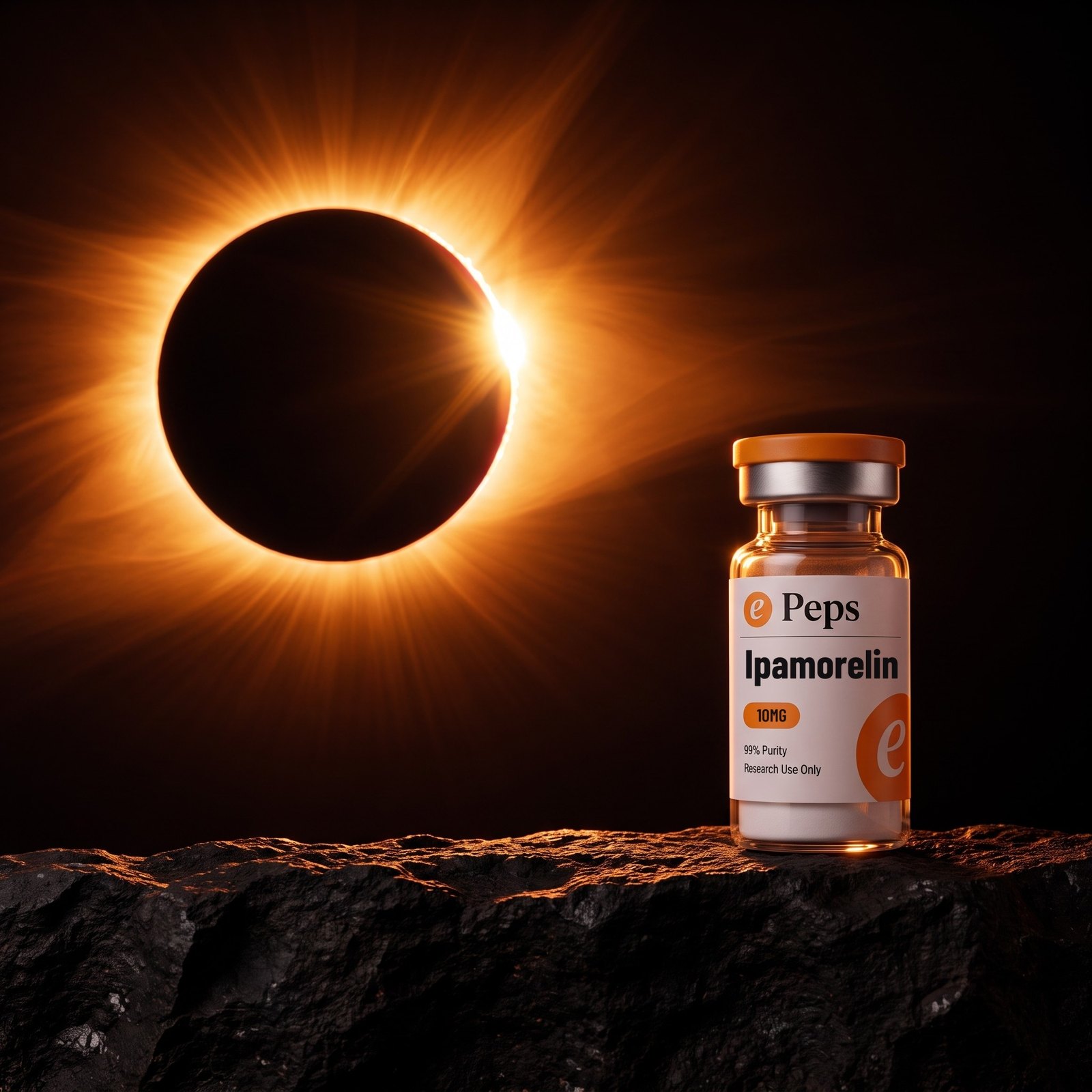
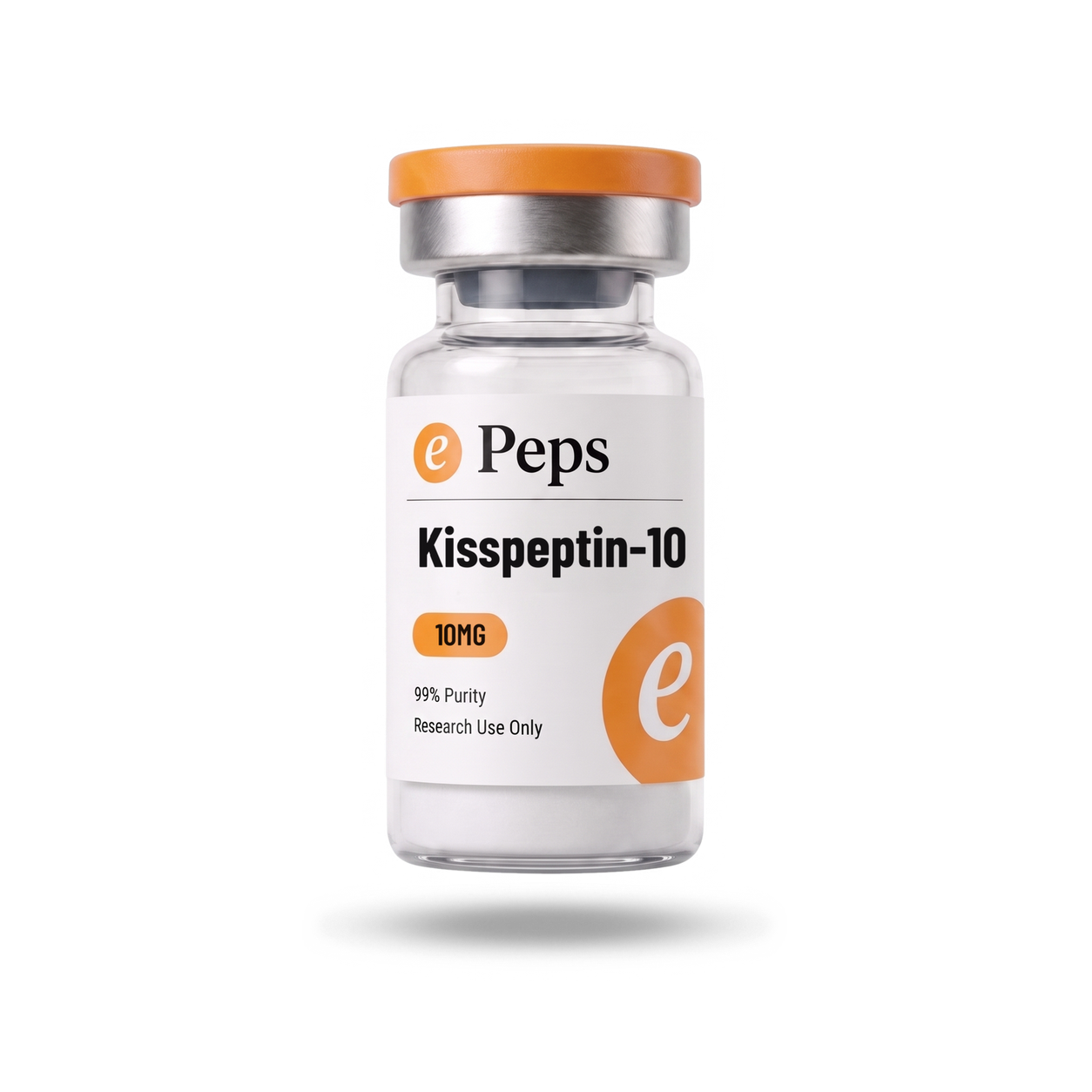
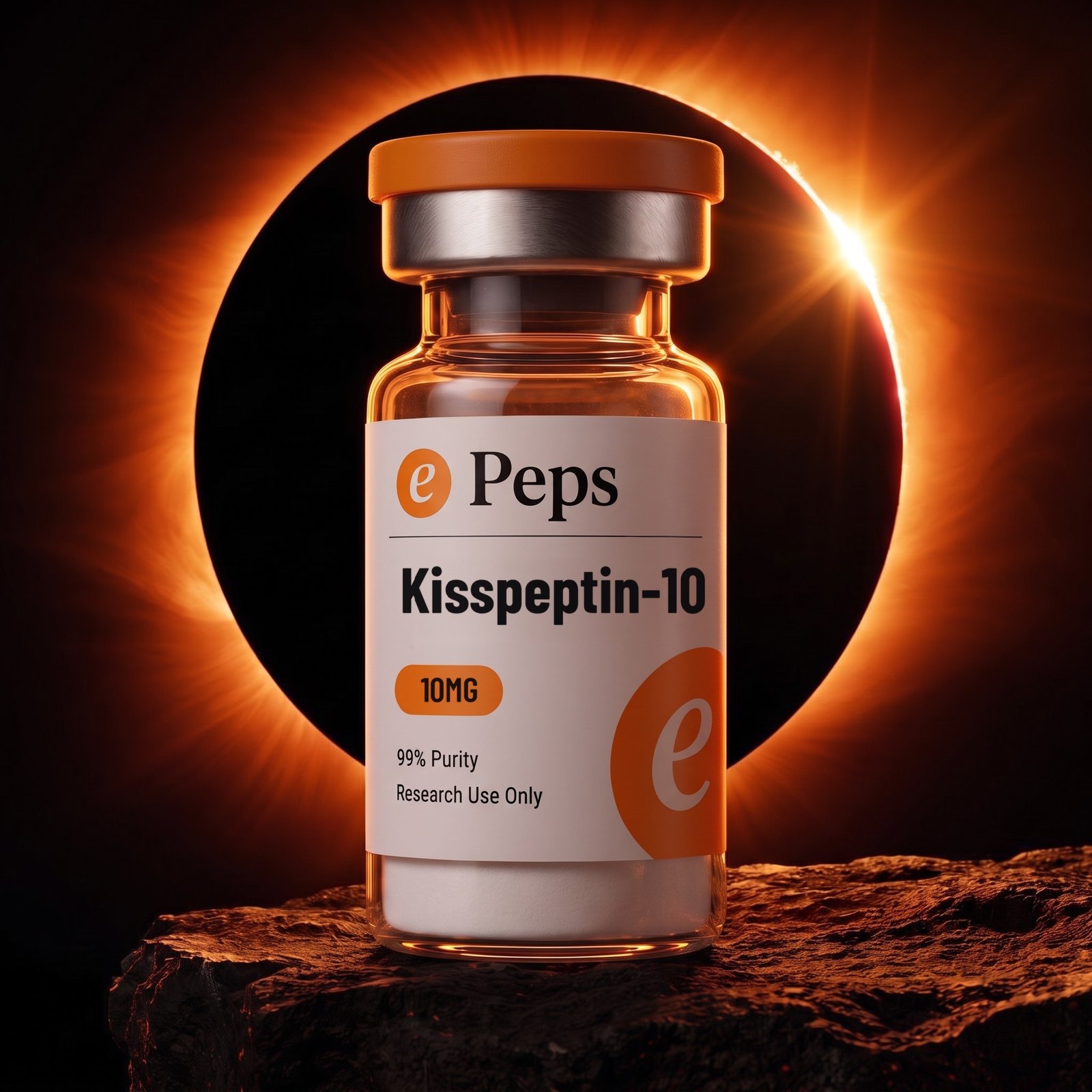
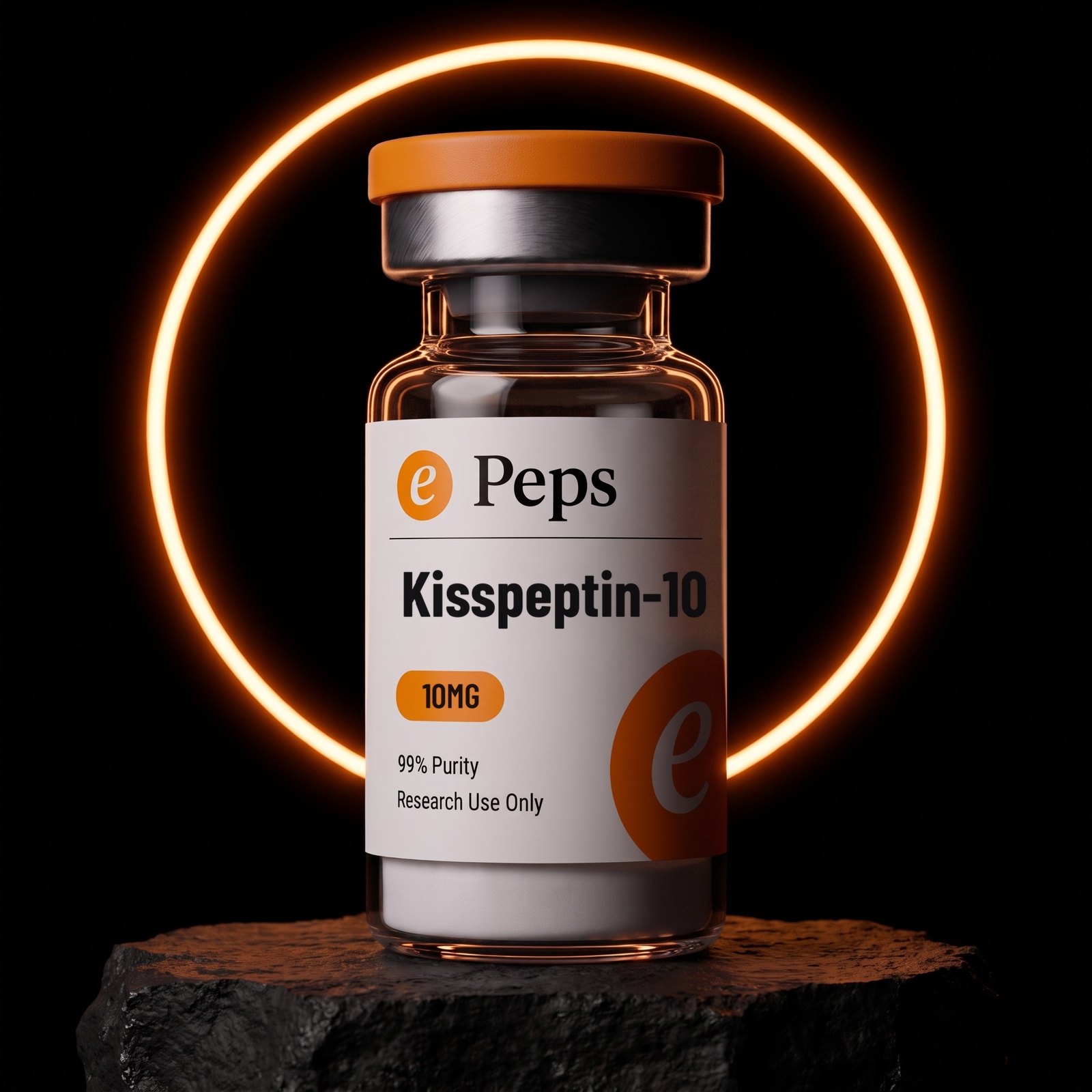





 ePeps Brand BookEvery product
Assets
The masters, as shipped. Every file below is the one the site serves — there is no second copy to drift out of sync.
Product plates are per-SKU and live on the previous sheet; these are the identity files and one of each photographic set.
Identity
The disc, transparent PNG, no baked background. The full lockup is built from the disc plus the word rather than shipped flat, because the disc stays ember while the word changes with the ground — inverting a flat lockup to get white text takes the disc to cyan. The lowercase wordmark below is the legacy file: it is here so it can be recognised and replaced, not used.

Plates
One of each set. The per-SKU versions of the four product frames are on the Every Product sheet.
Typefaces
Open Sauce One is self-hosted in this repository at app/fonts/ in seven weights. Barlow Condensed and Geist Mono load from Google Fonts. No licence file ships with the kit — confirm the Open Sauce One licence before using it outside the site.
ePeps Brand BookAssets